

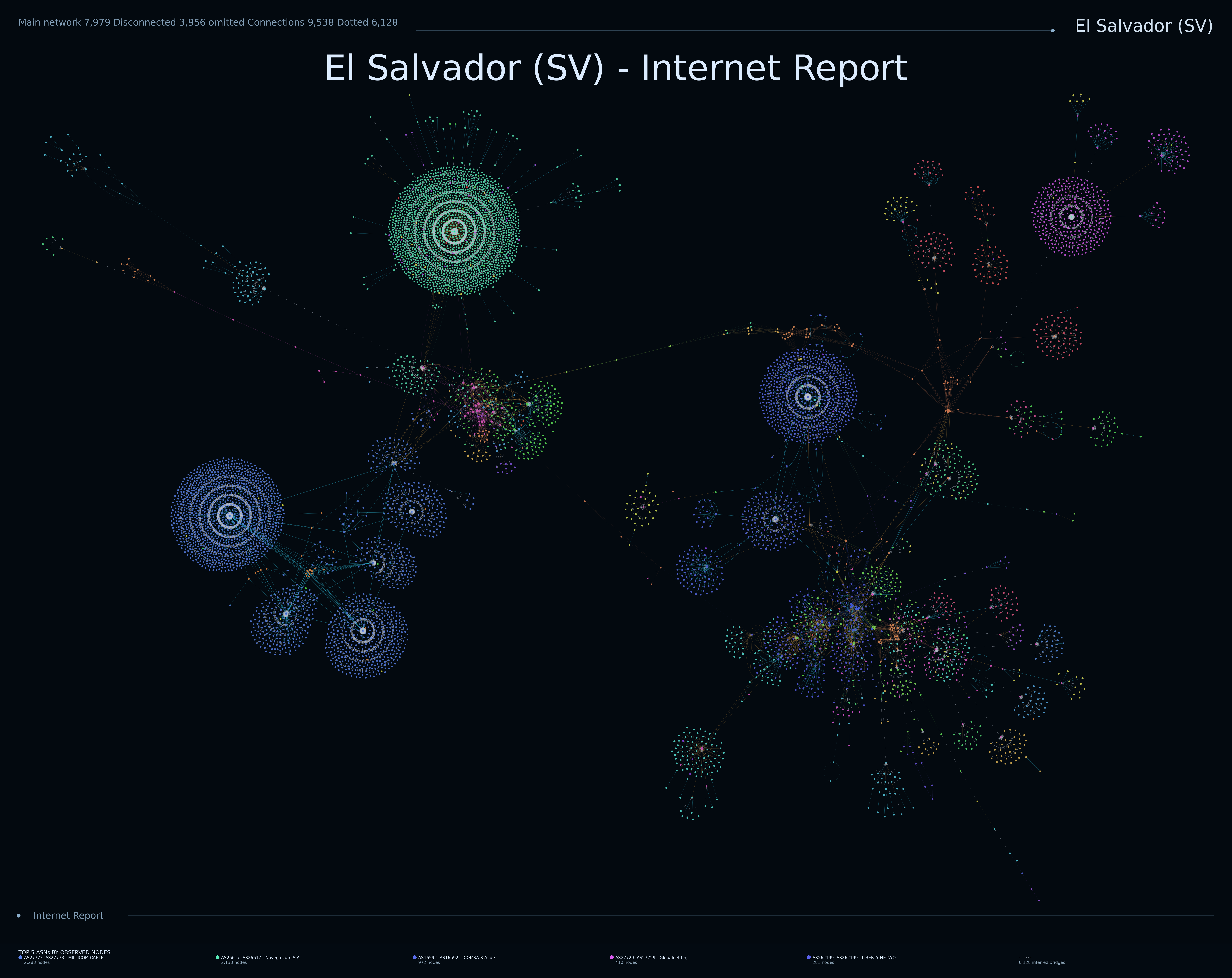

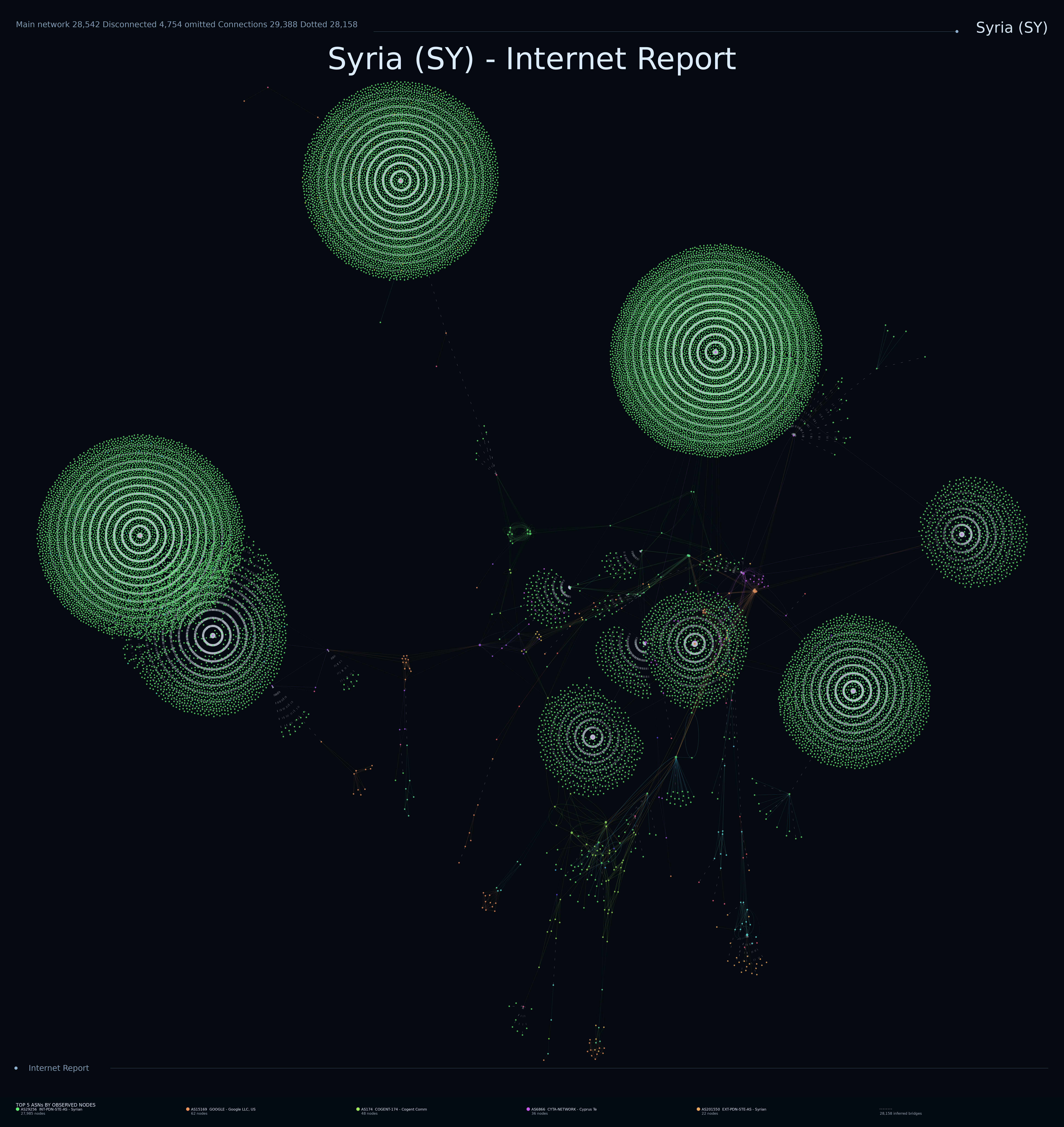
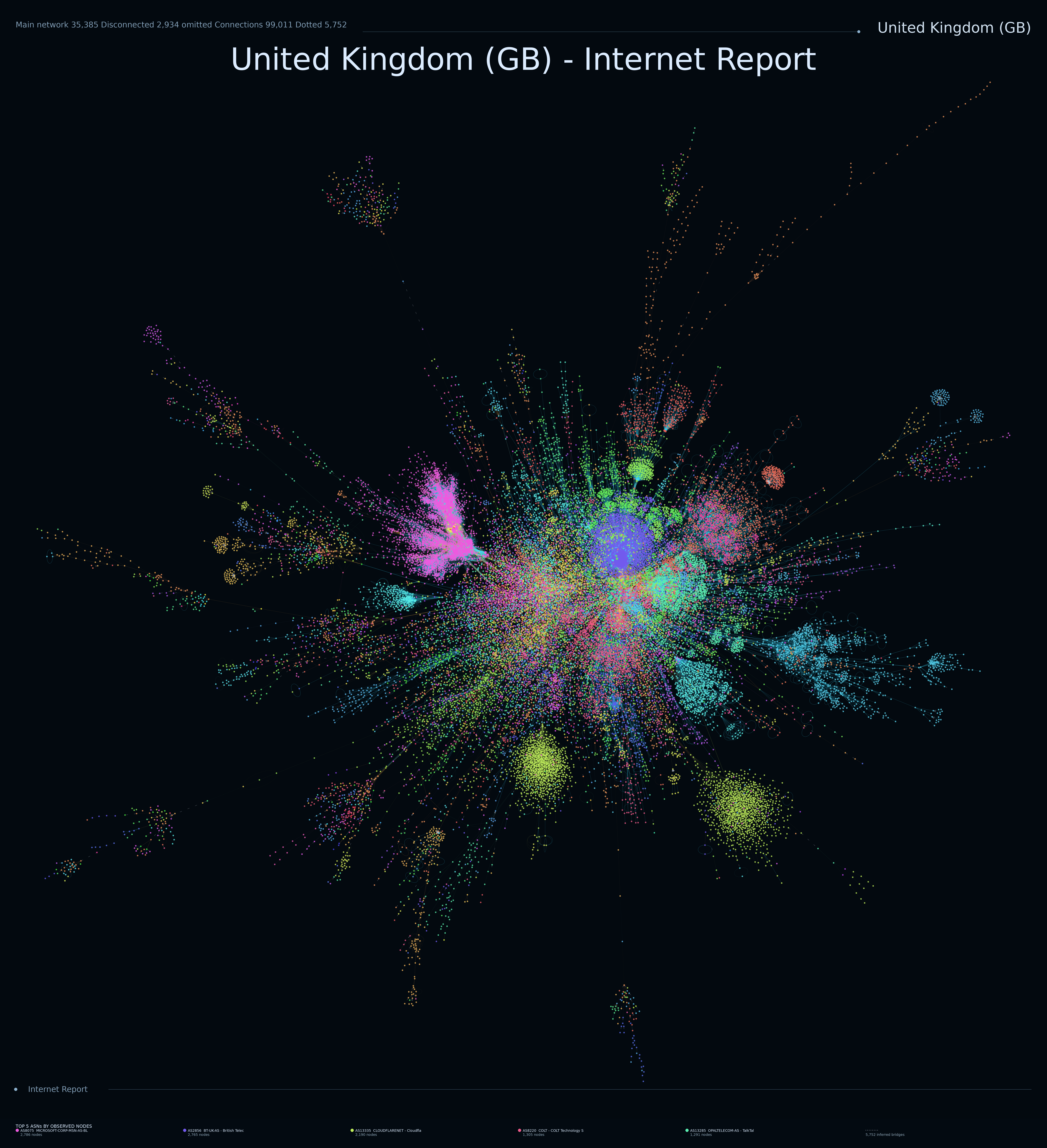
Mapping the visible Internet

An atlas of Internet topology.

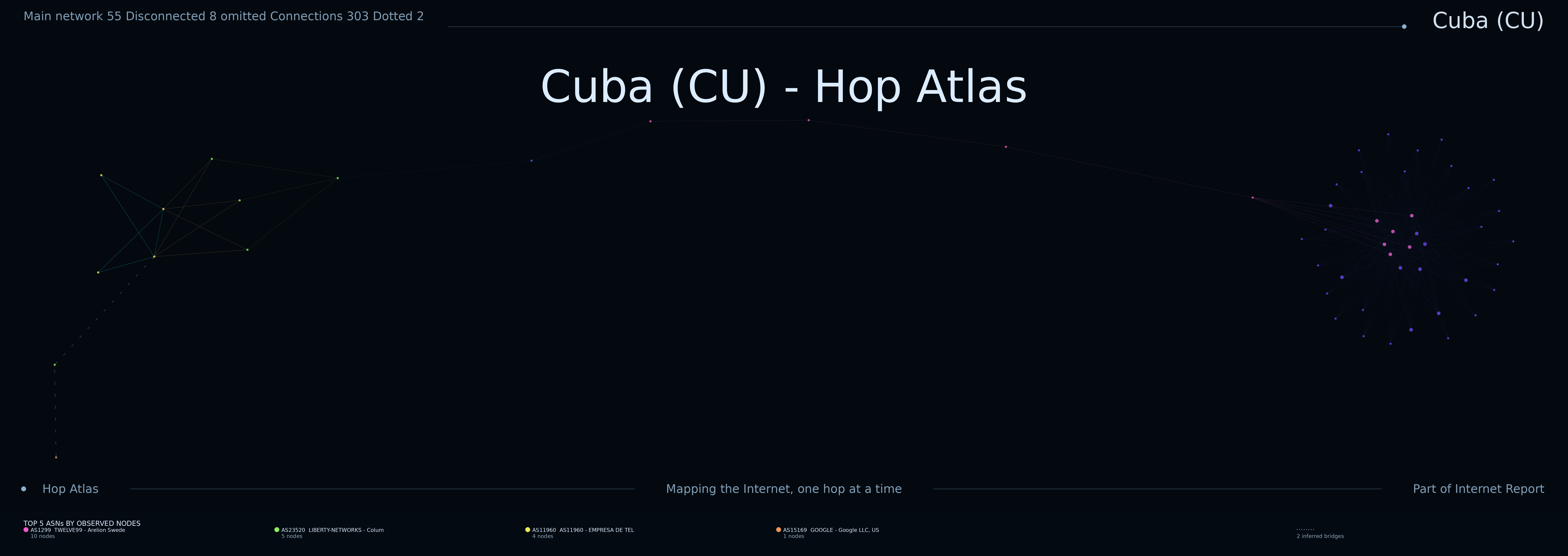
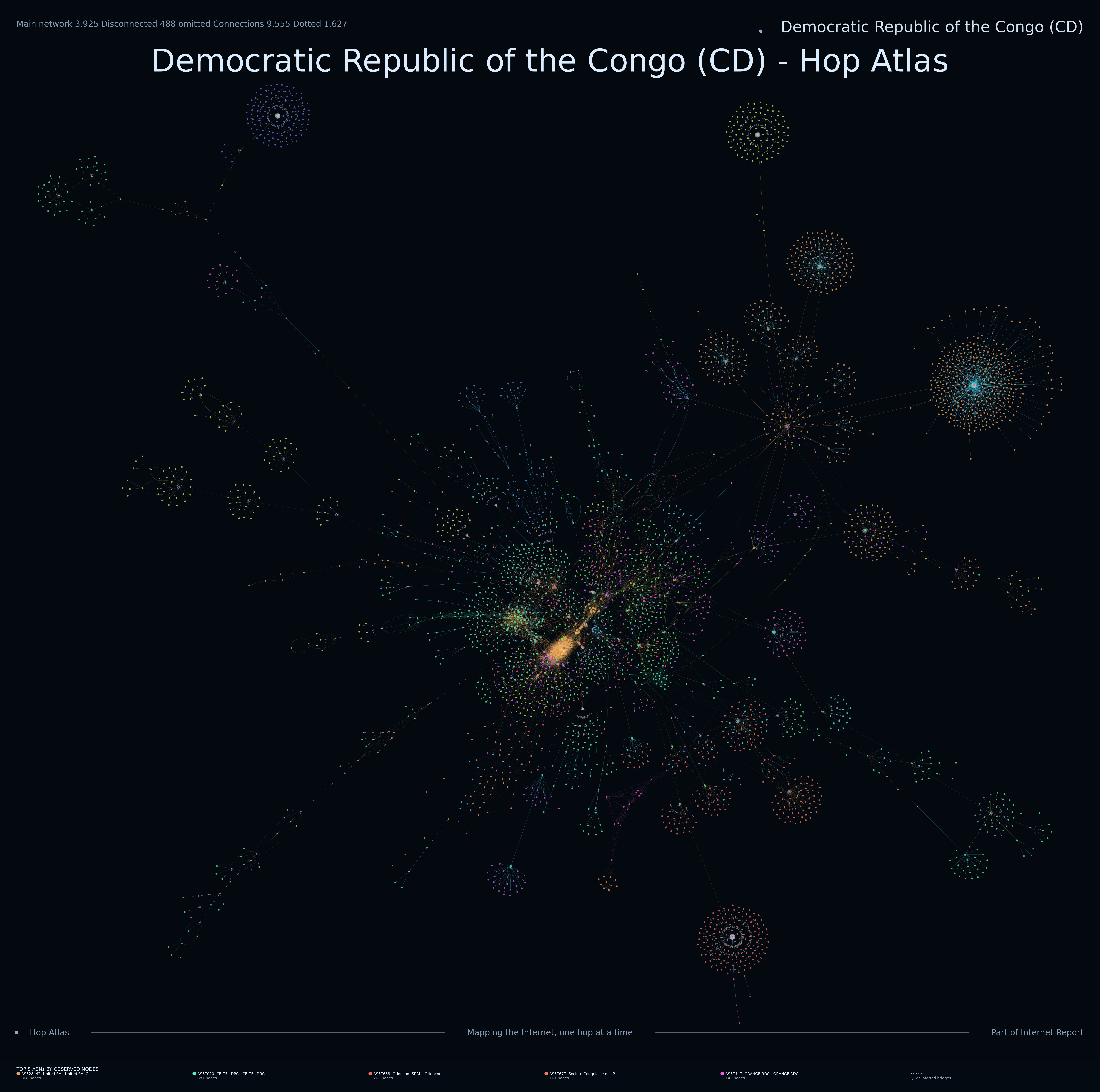
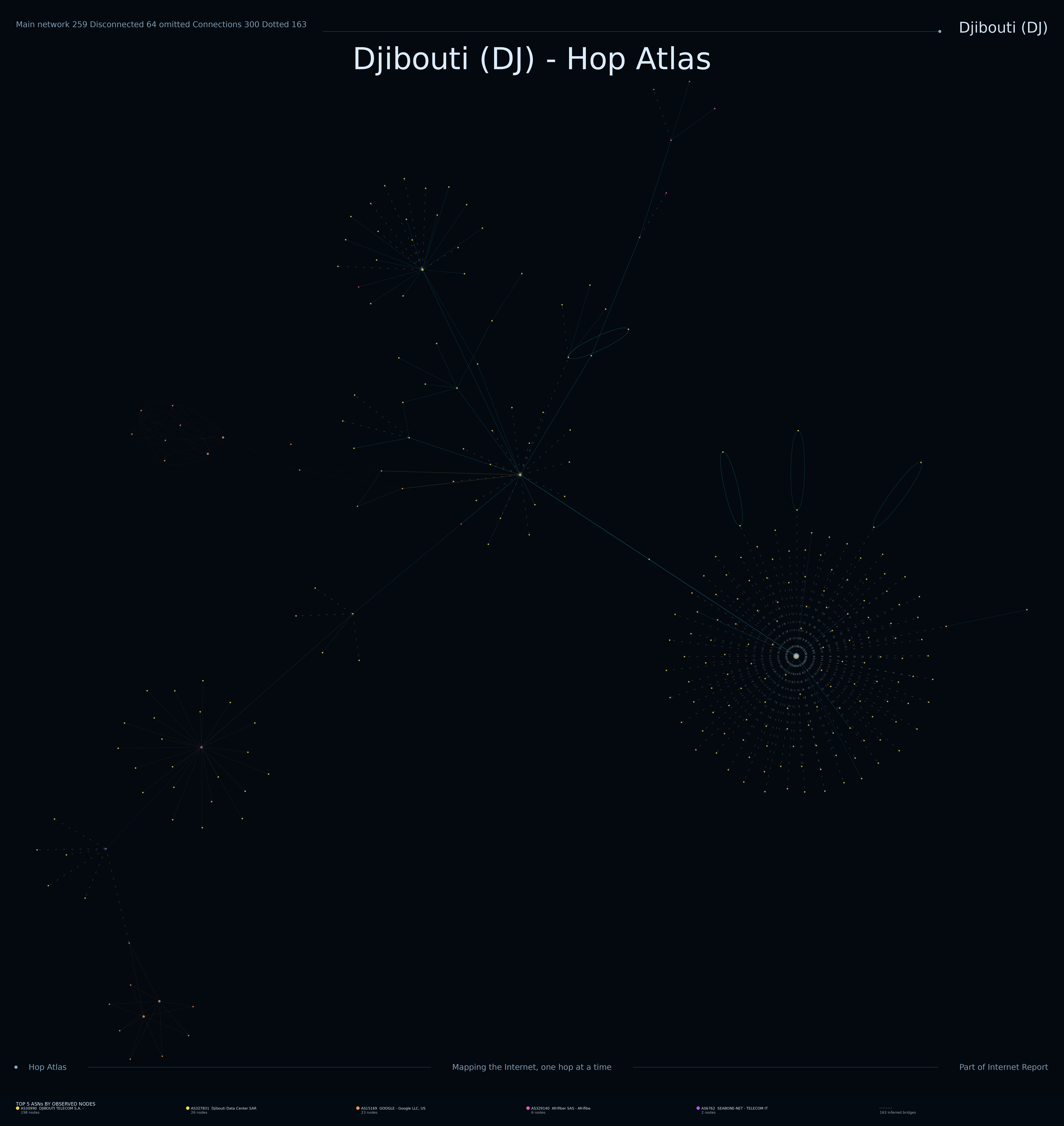
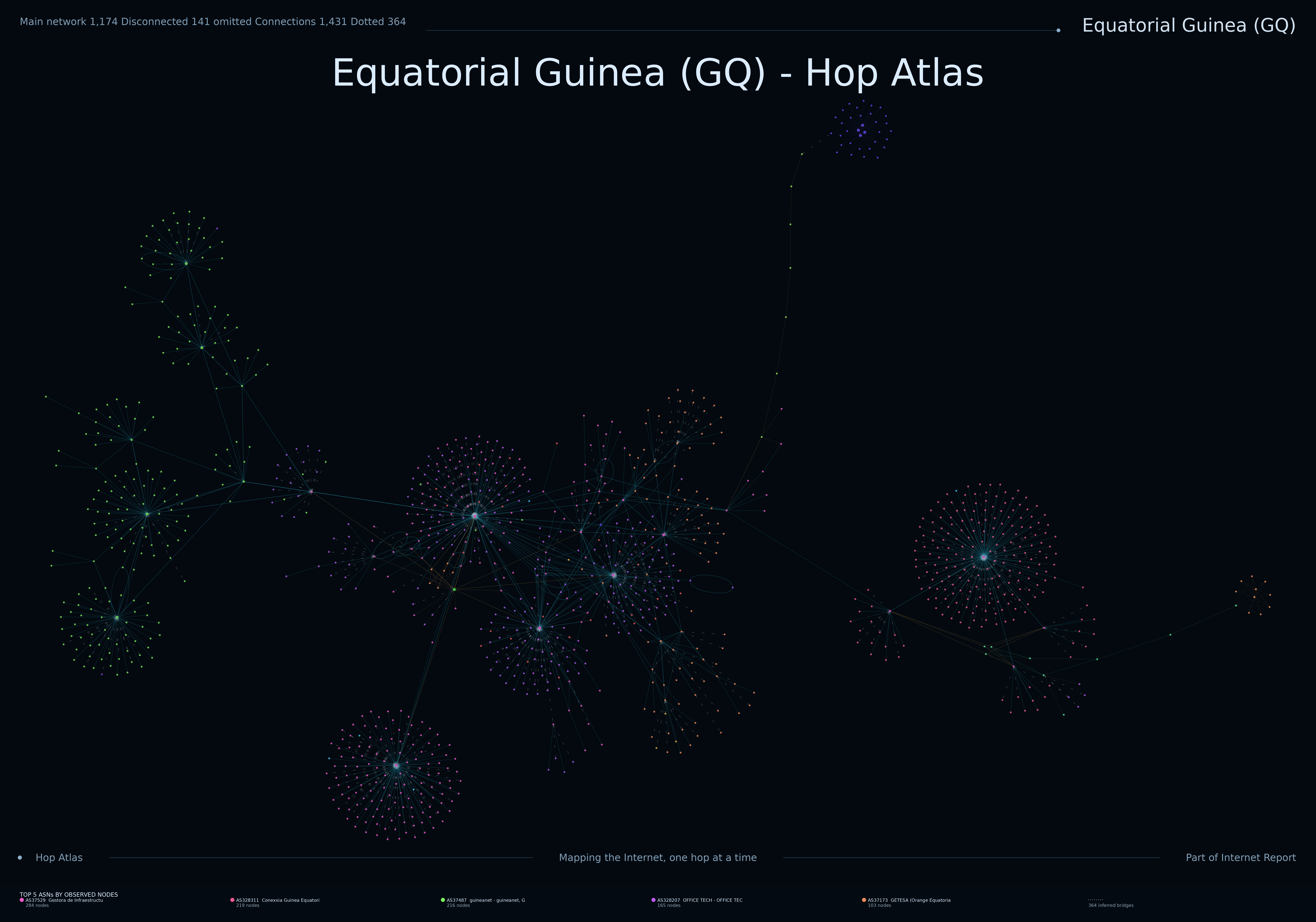
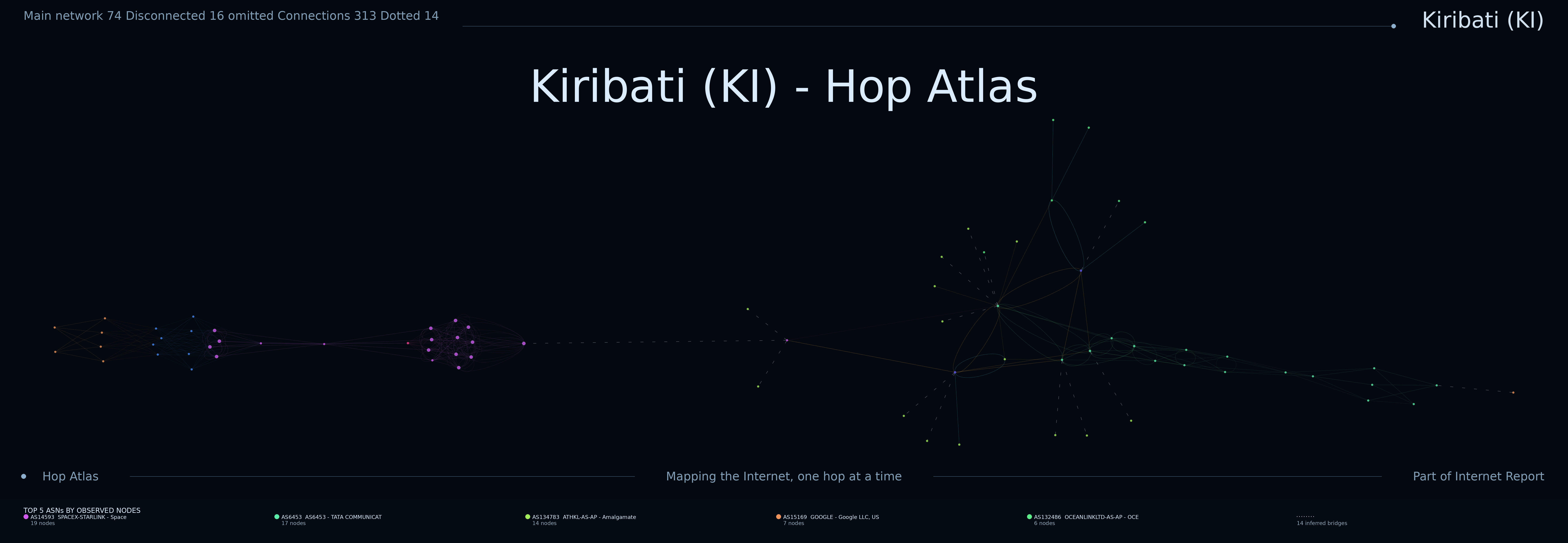
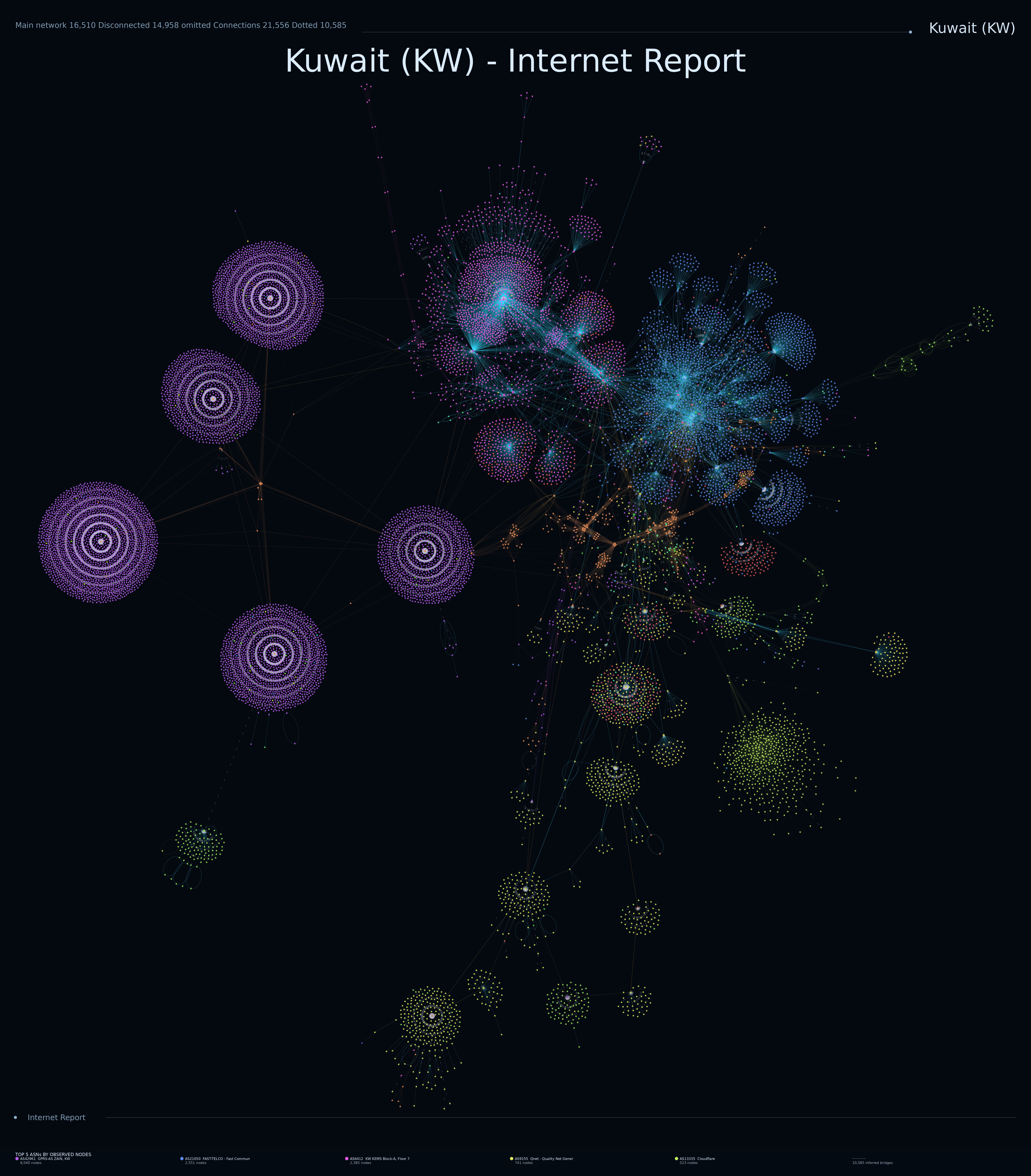
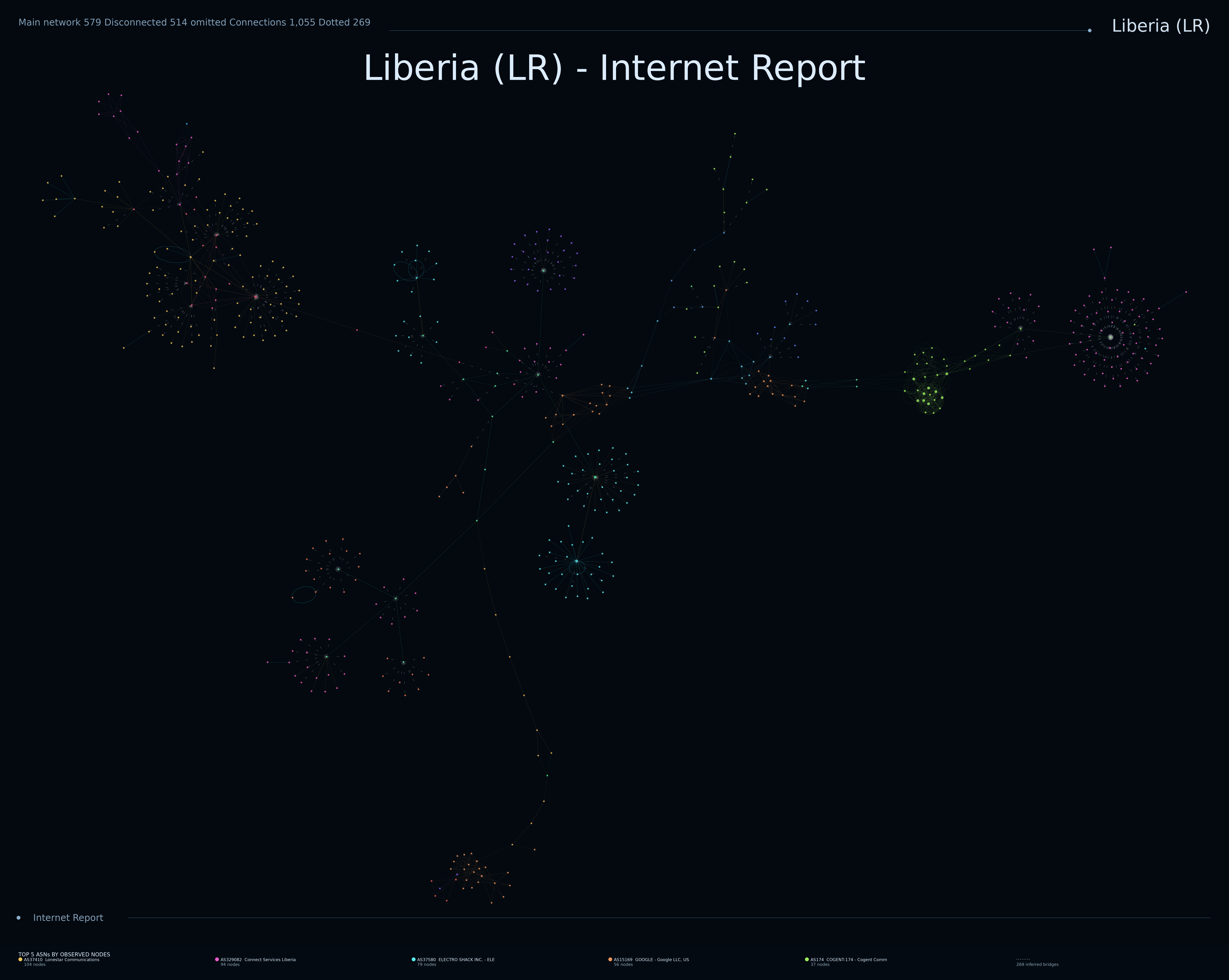
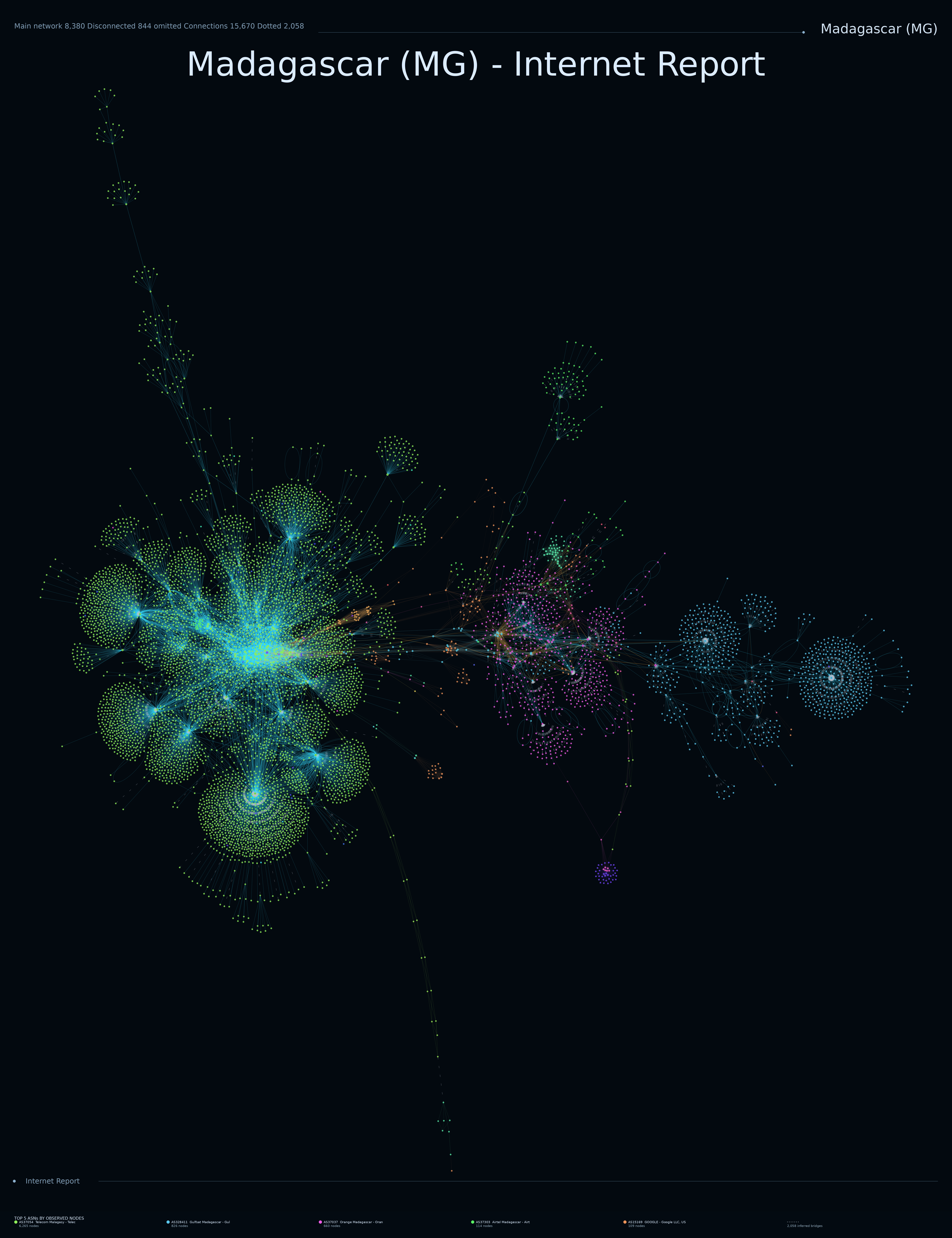
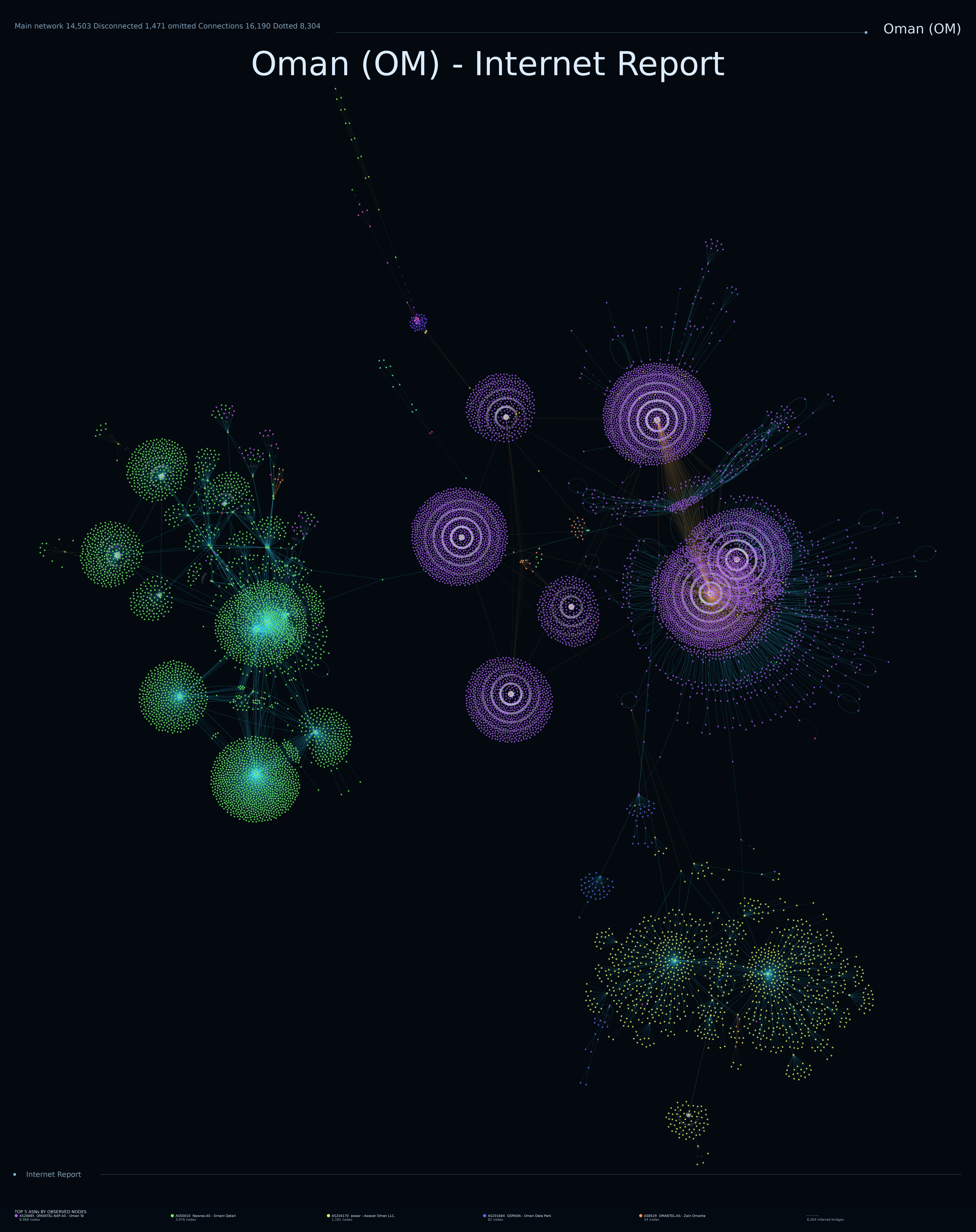

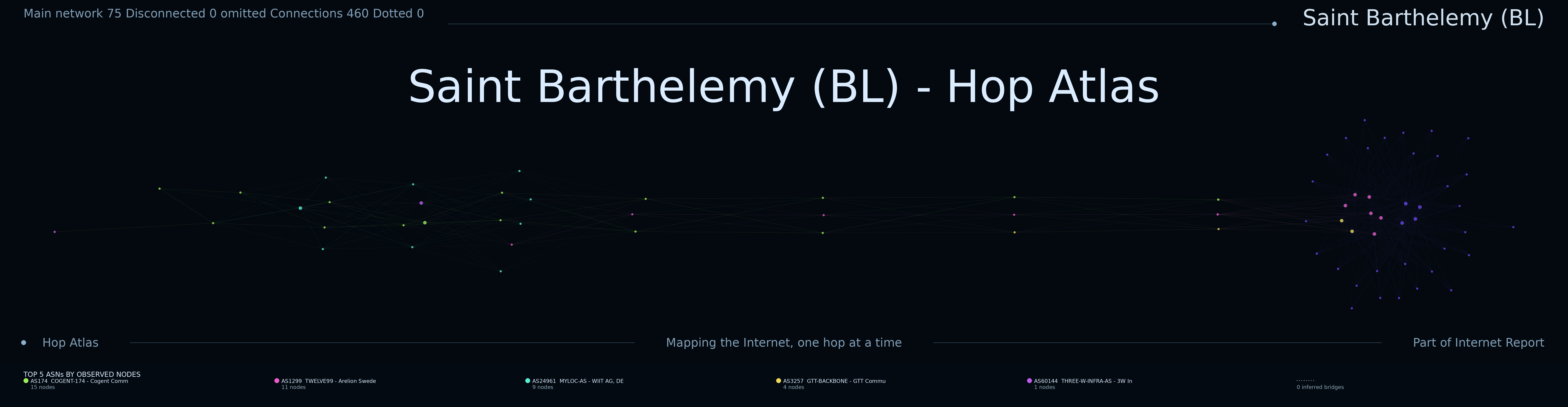
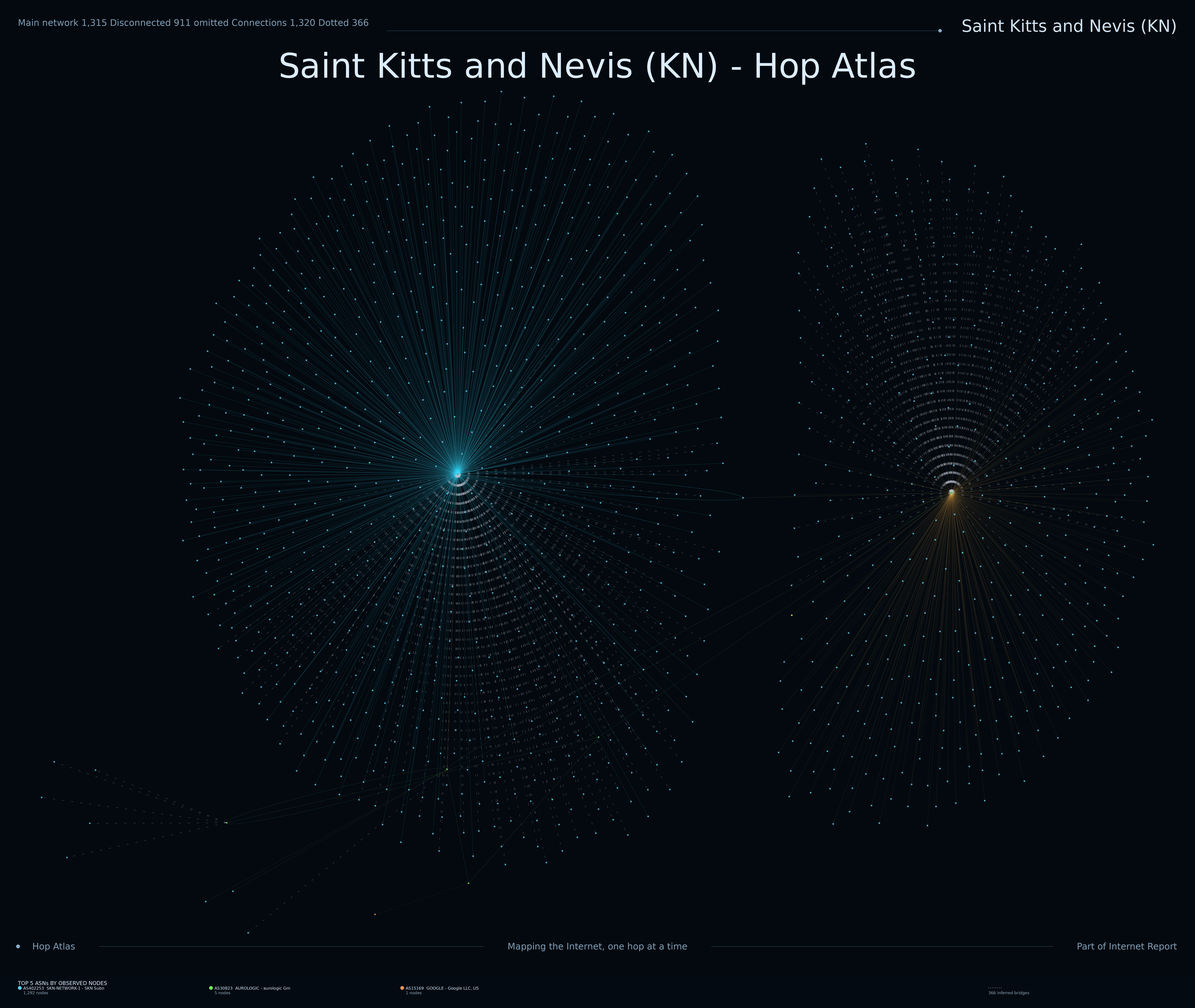
Internet Report is an experimental measurement and visualisation project exploring how networks appear from the outside. Distributed probes perform traceroutes toward allocated address space, recording the routers and paths encountered along the way. Those observations are then assembled into country-level topology maps.

The result is part measurement project, part historical archive, and part generative network artwork: a collection of snapshots showing how dramatically the visible shape of the Internet differs from one country or territory to another.

Countries mapped
90
Completed campaigns
86
Active campaigns
4
Completed IPs
12,266,125
Traceroutes
12,267,359
Campaign targets
12,792,155
The atlas

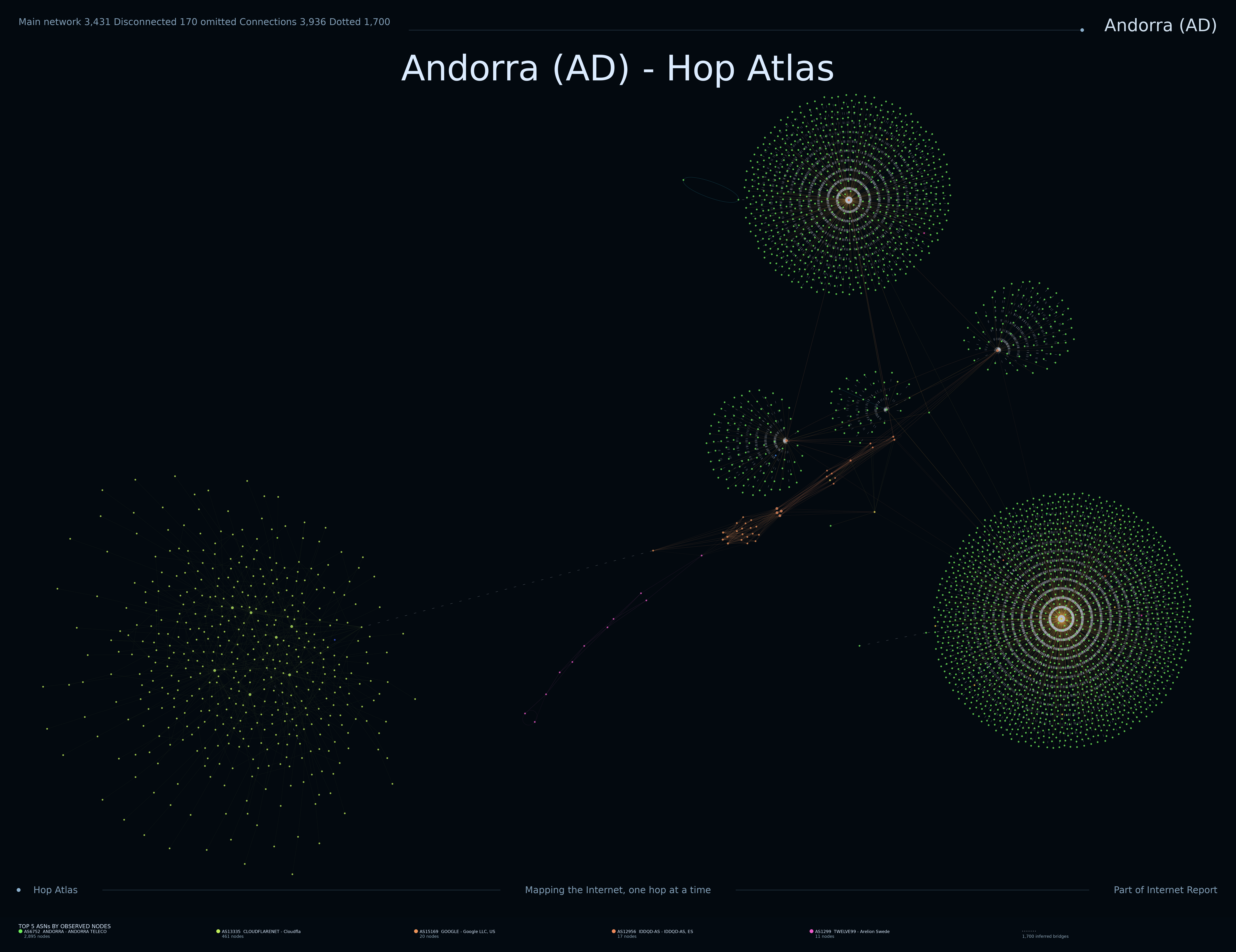
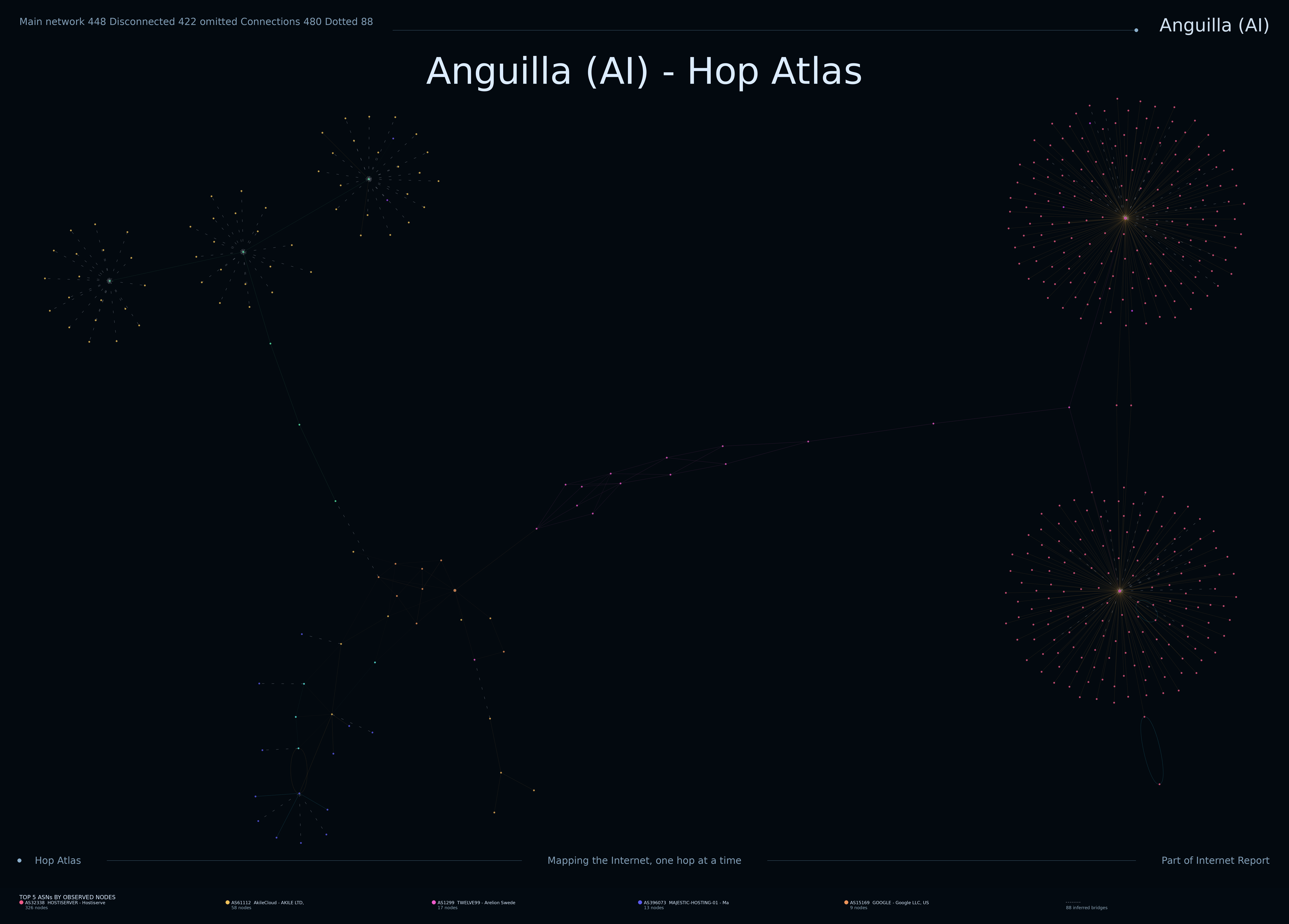
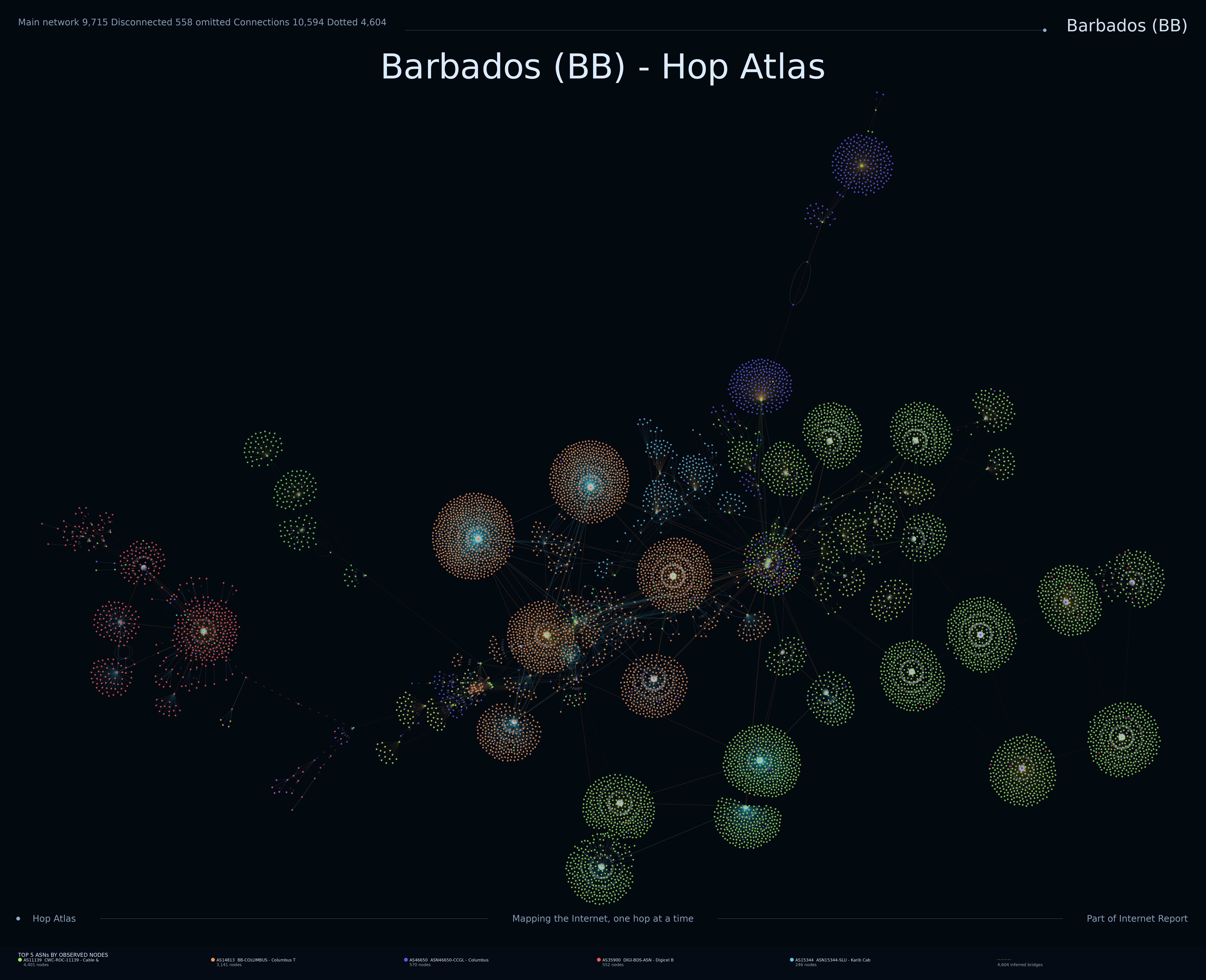
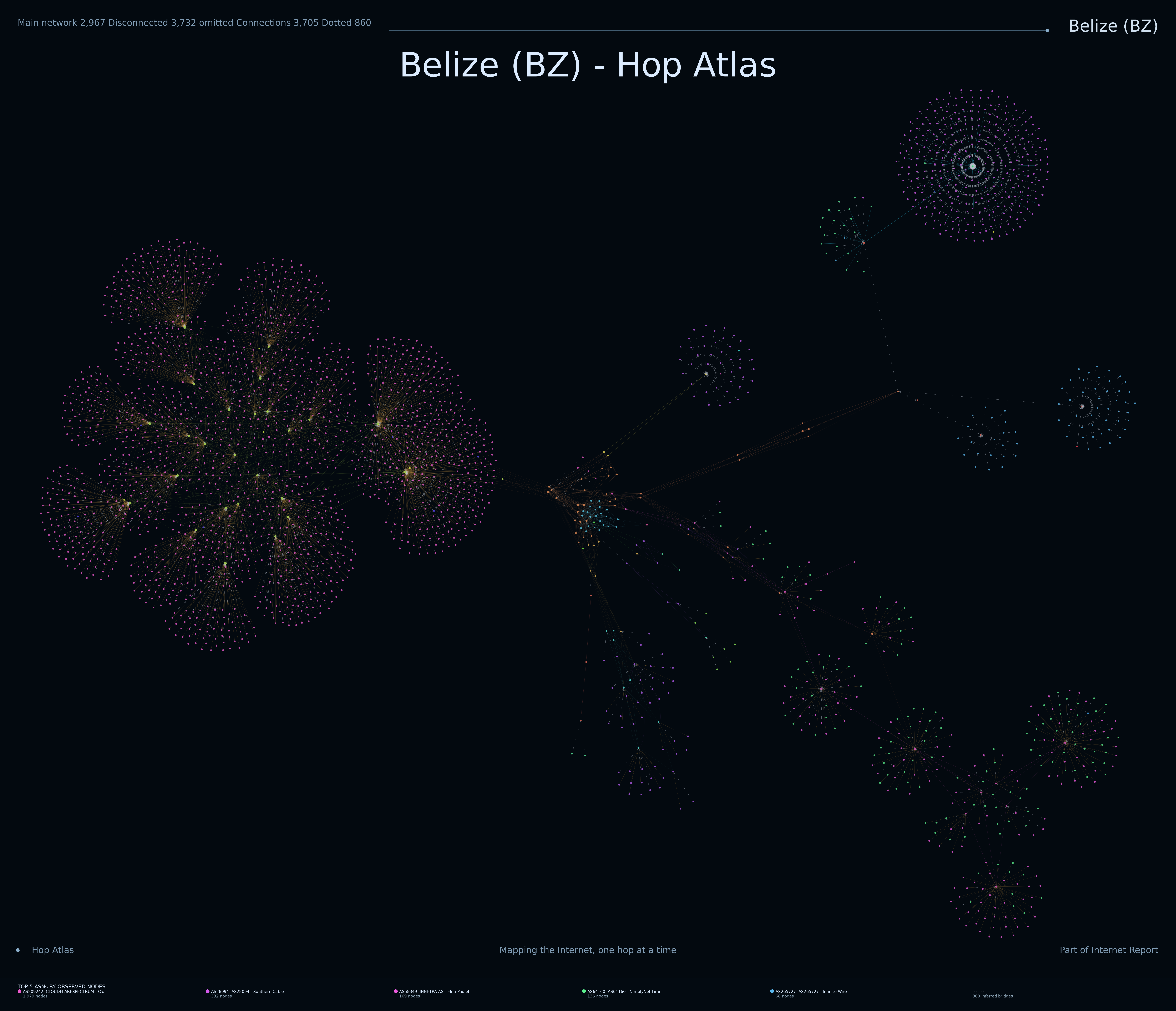
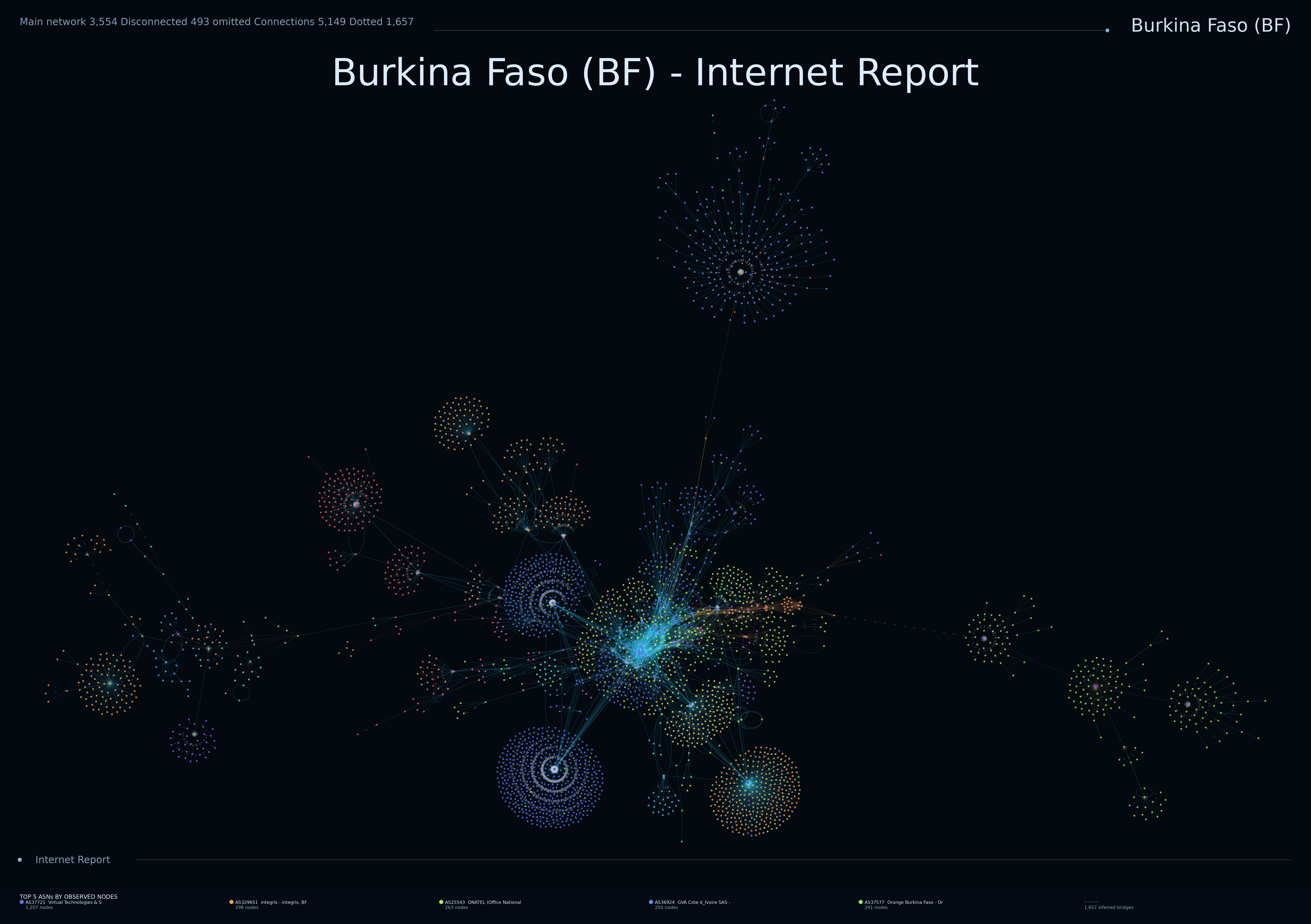
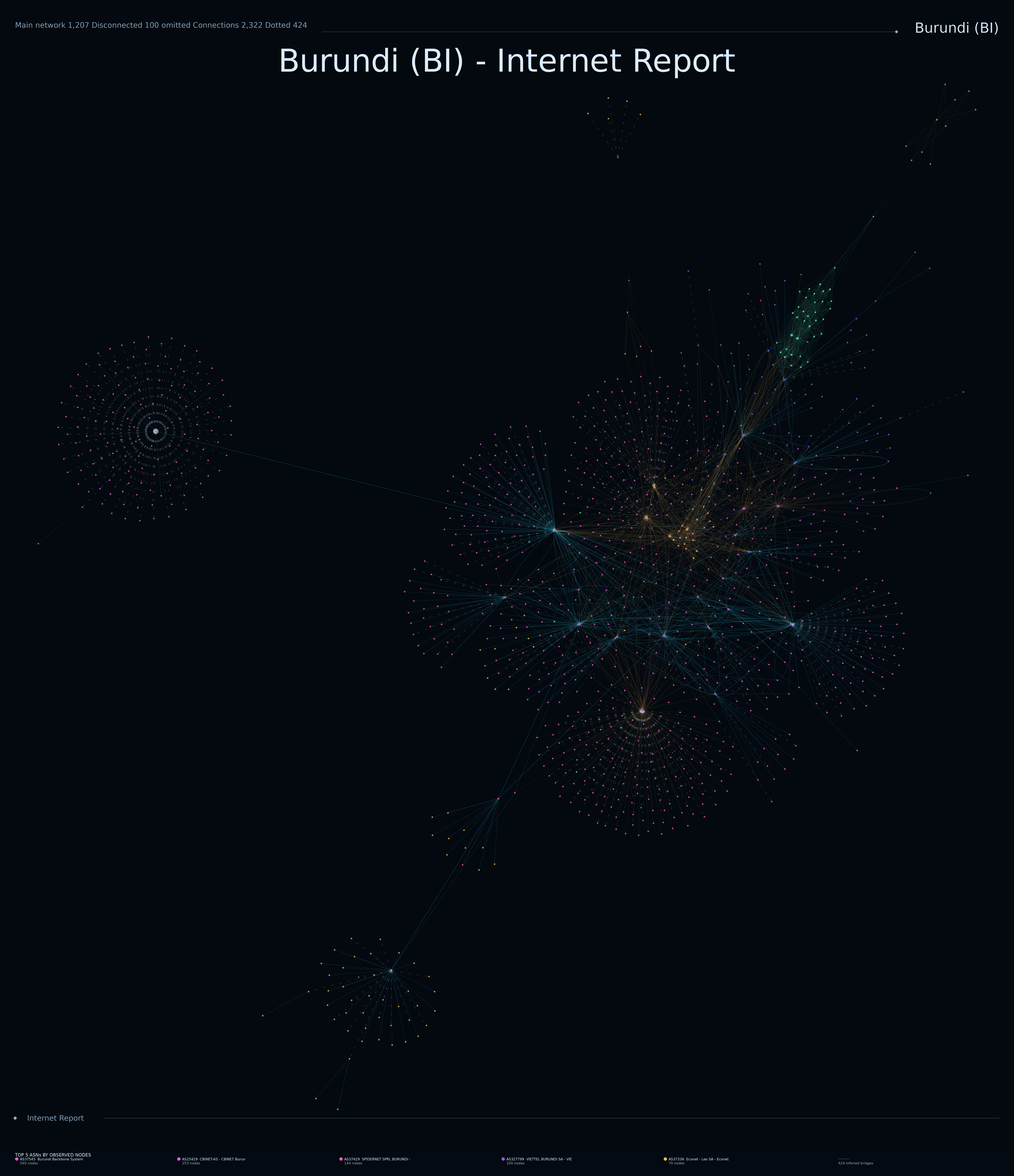
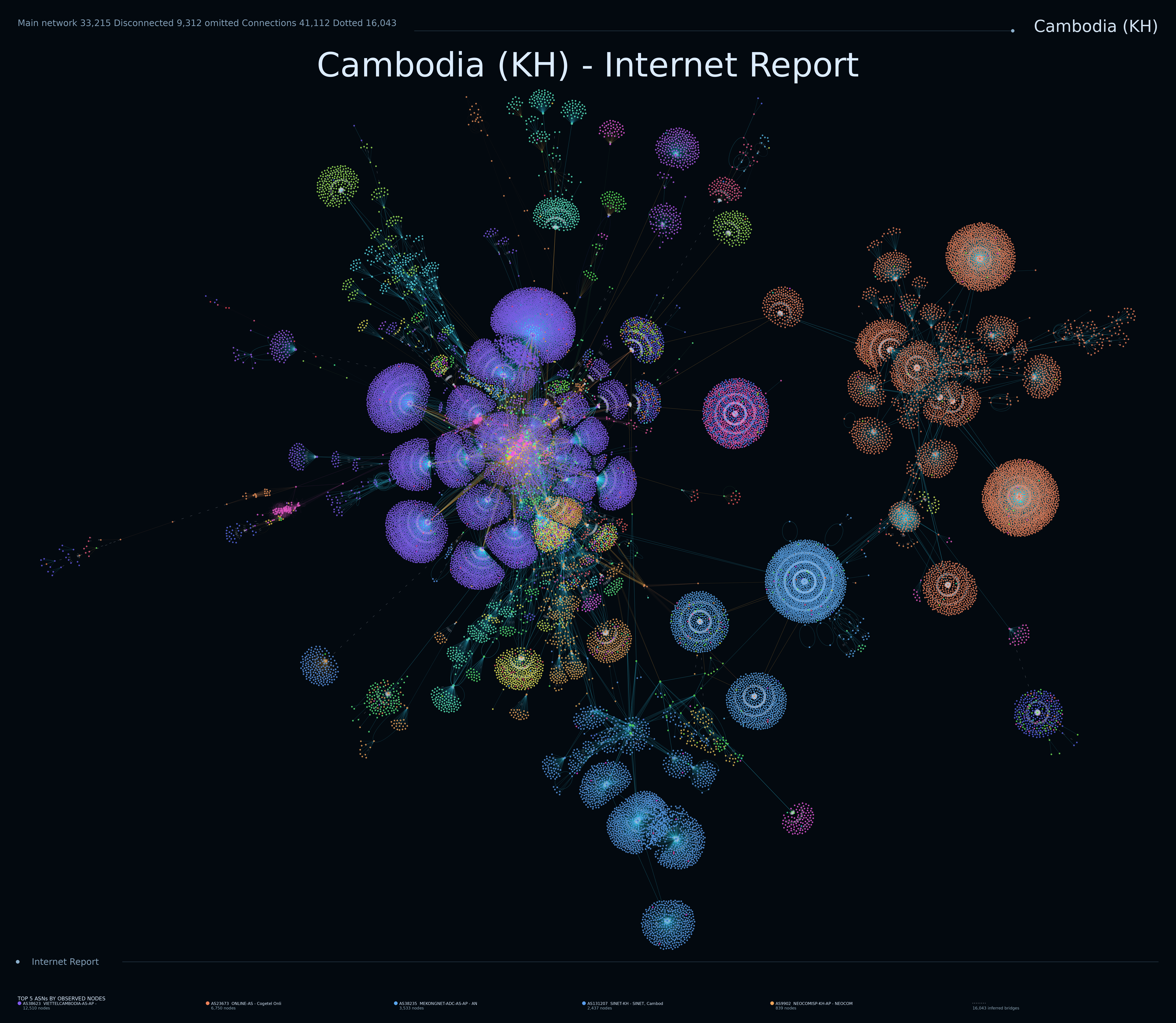
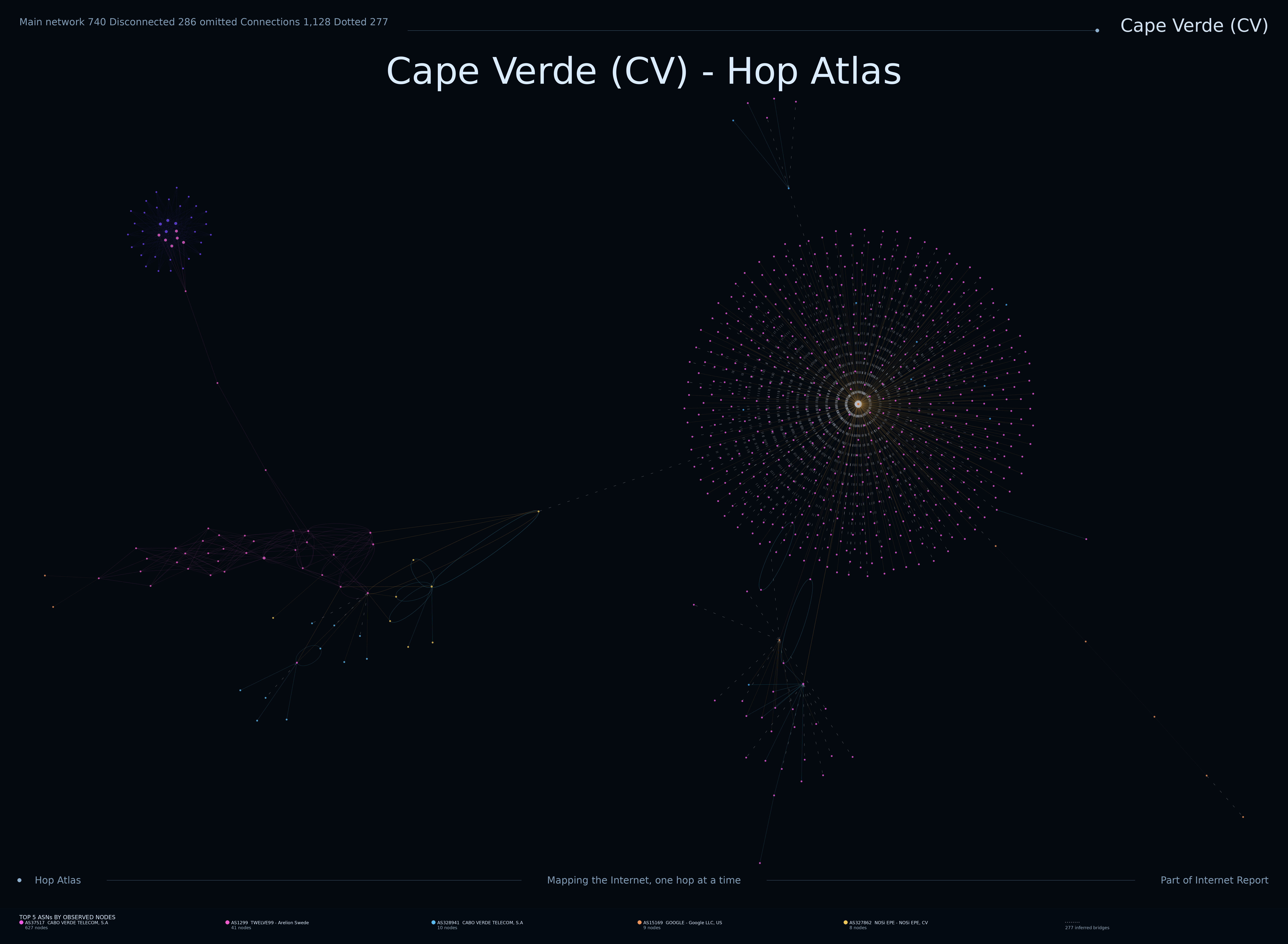
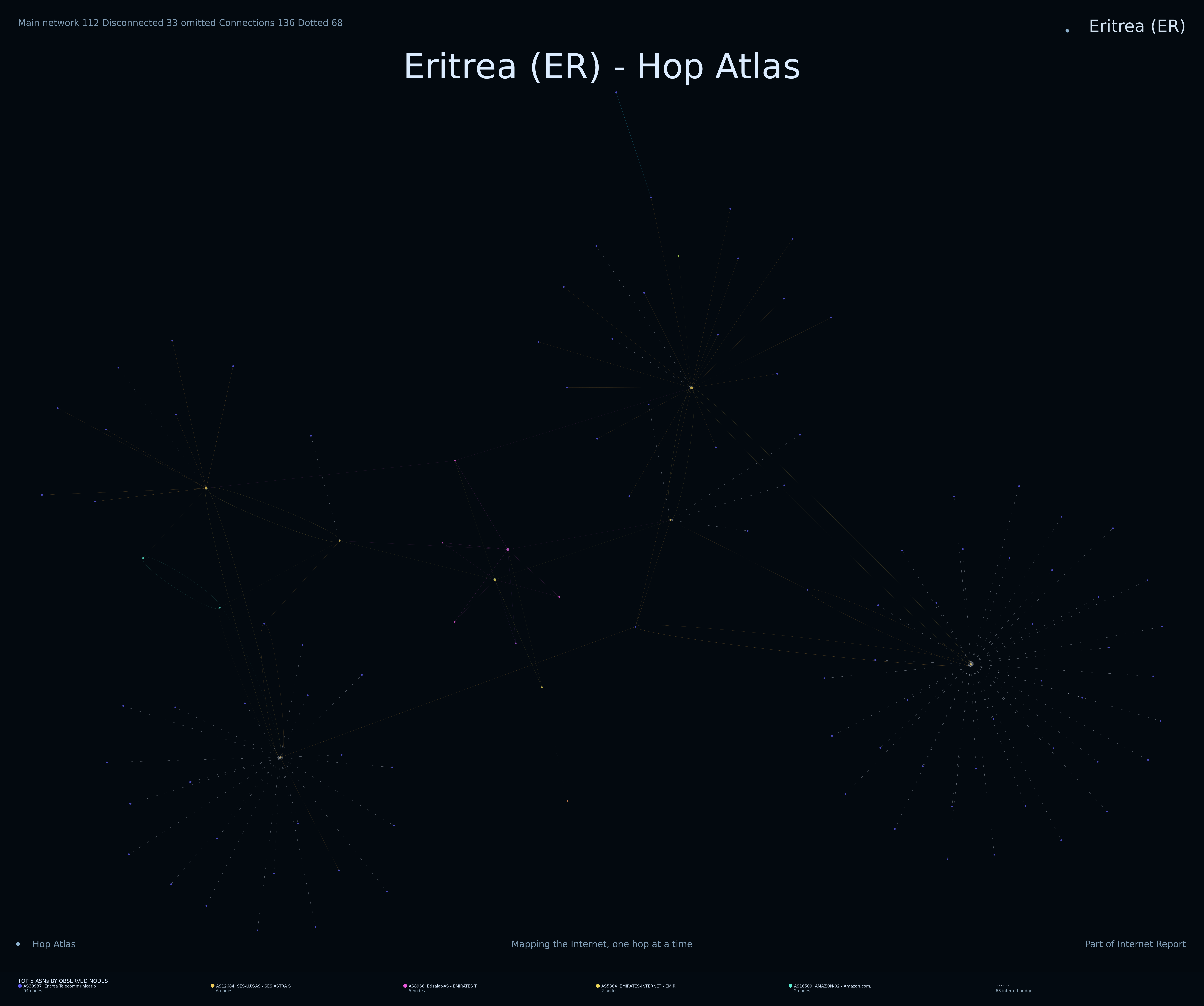
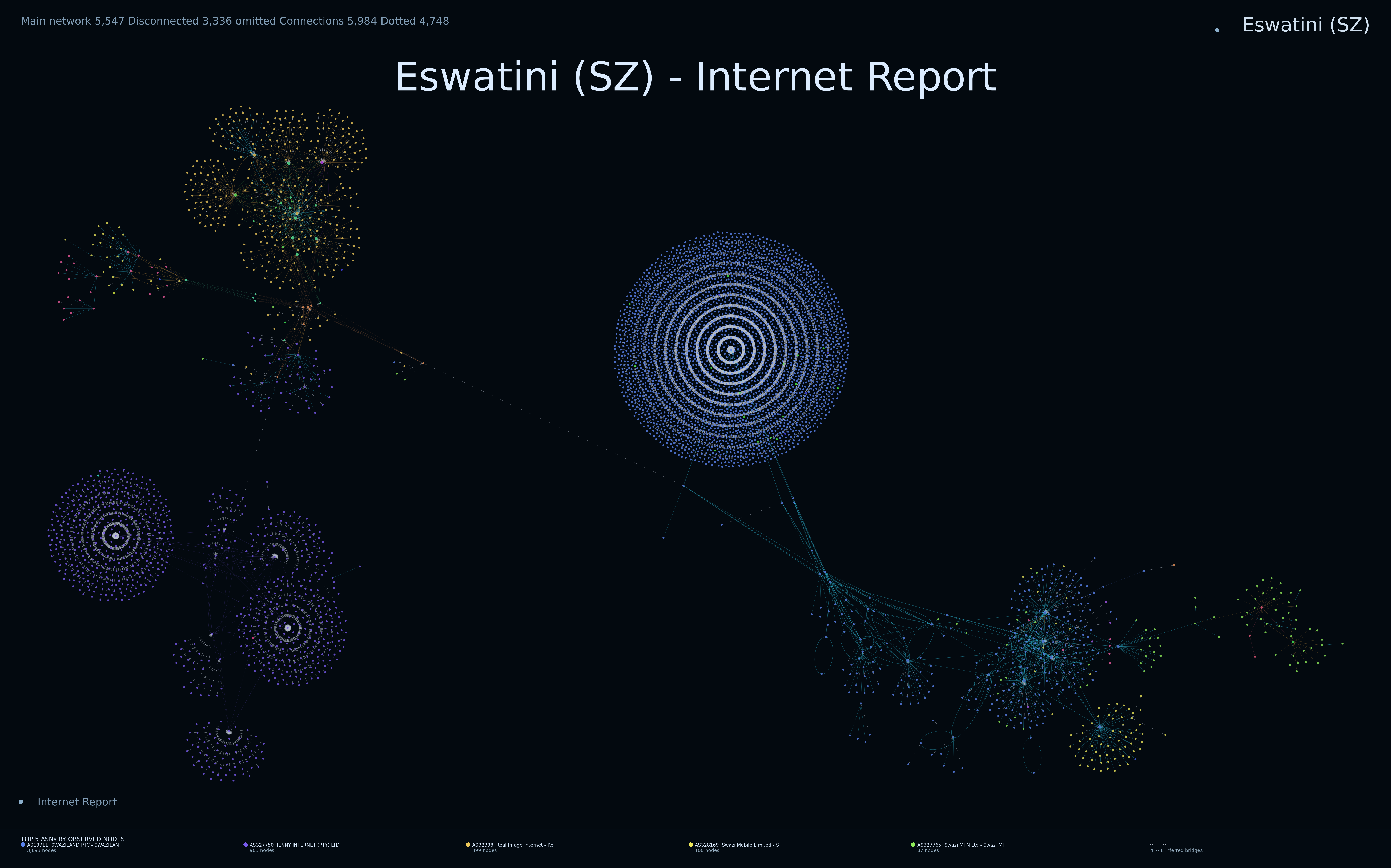
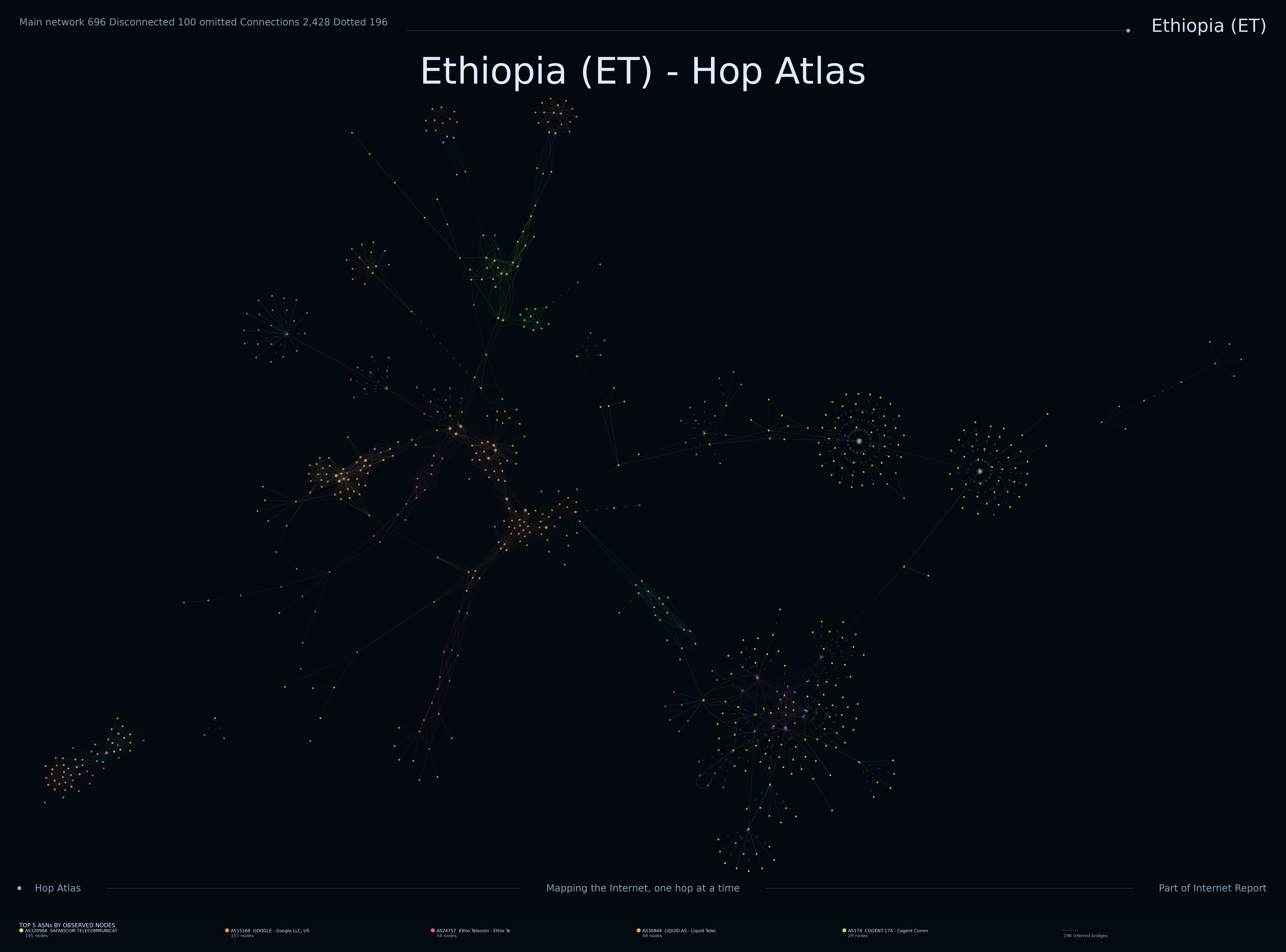
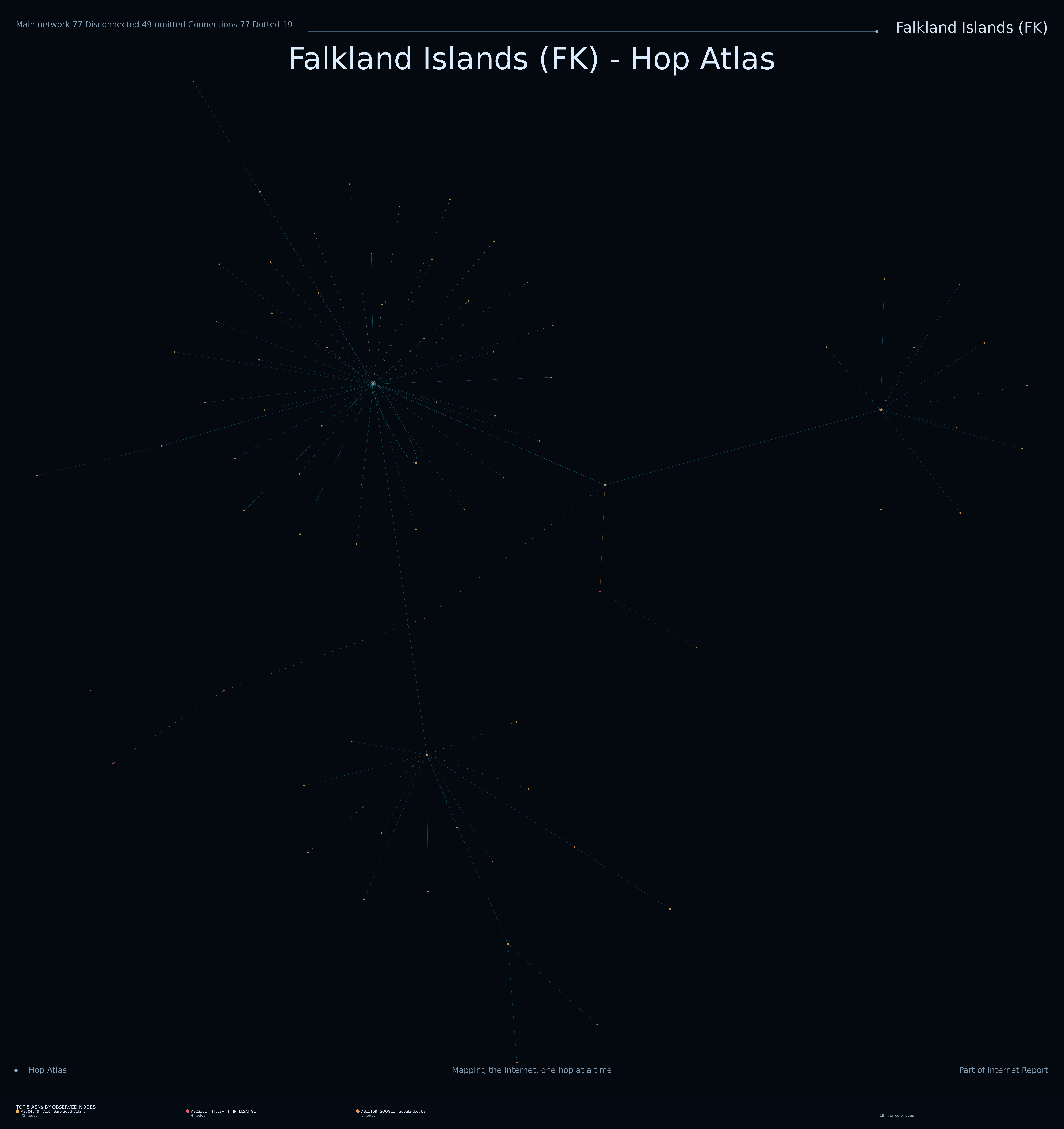
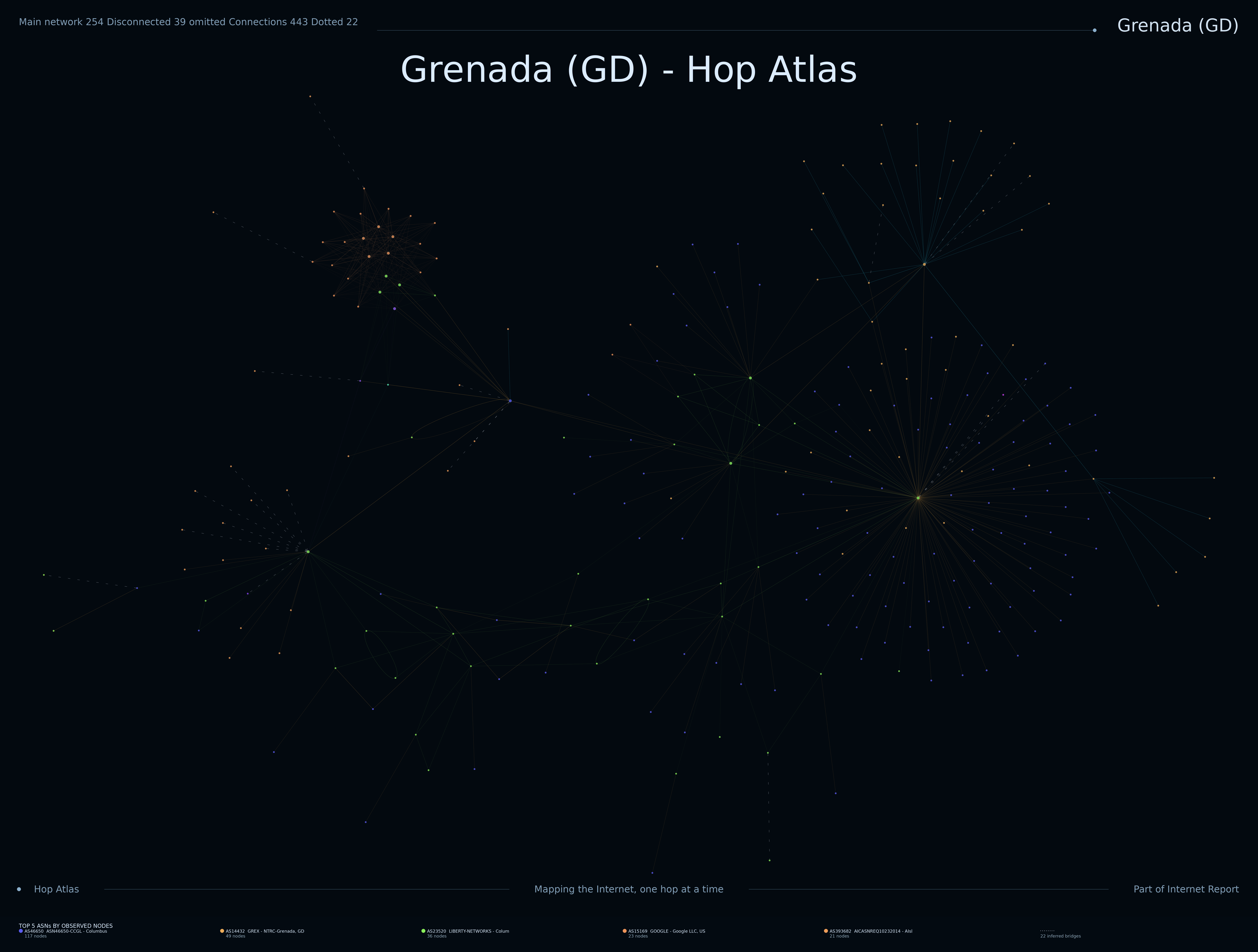
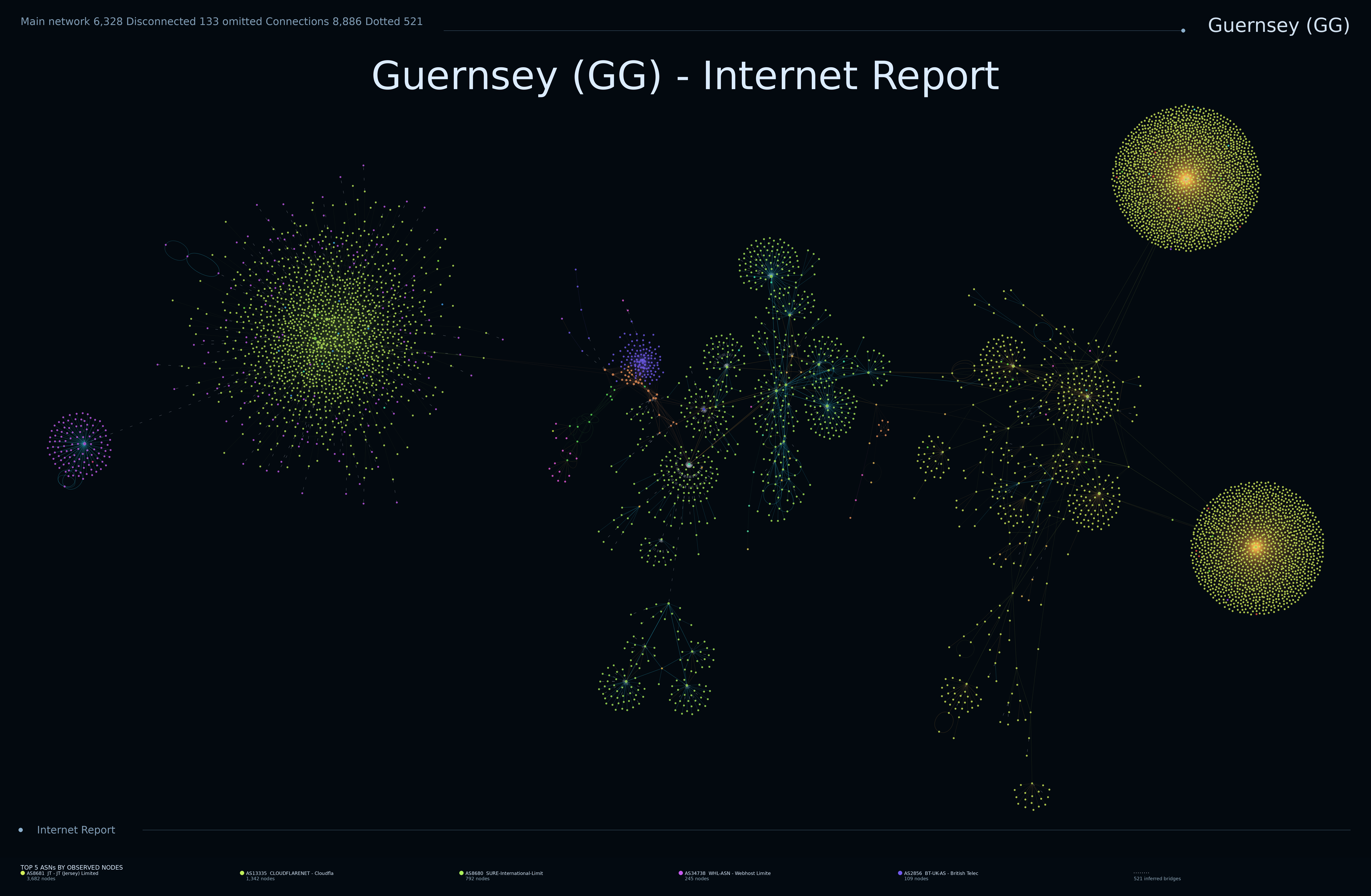
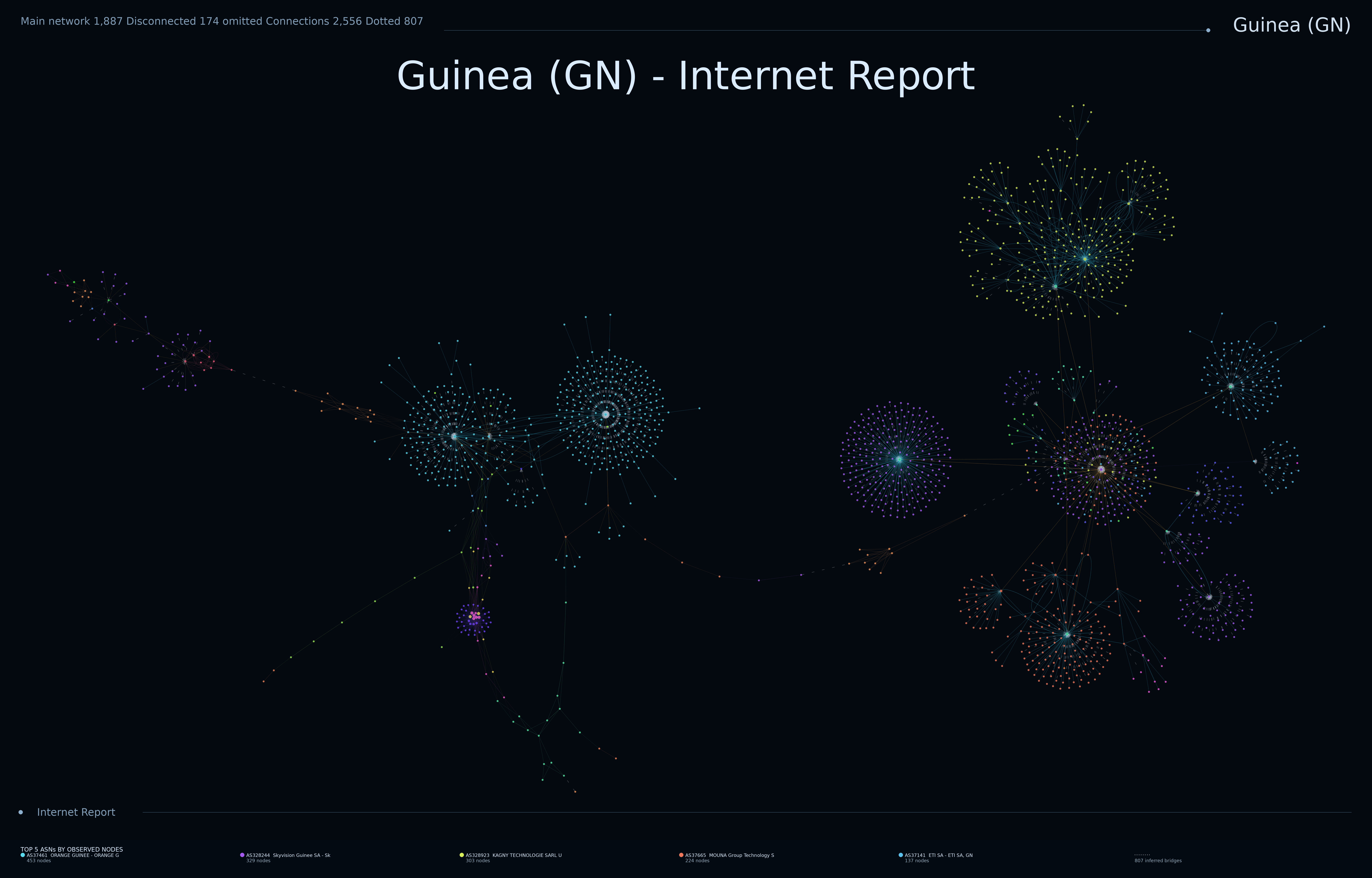
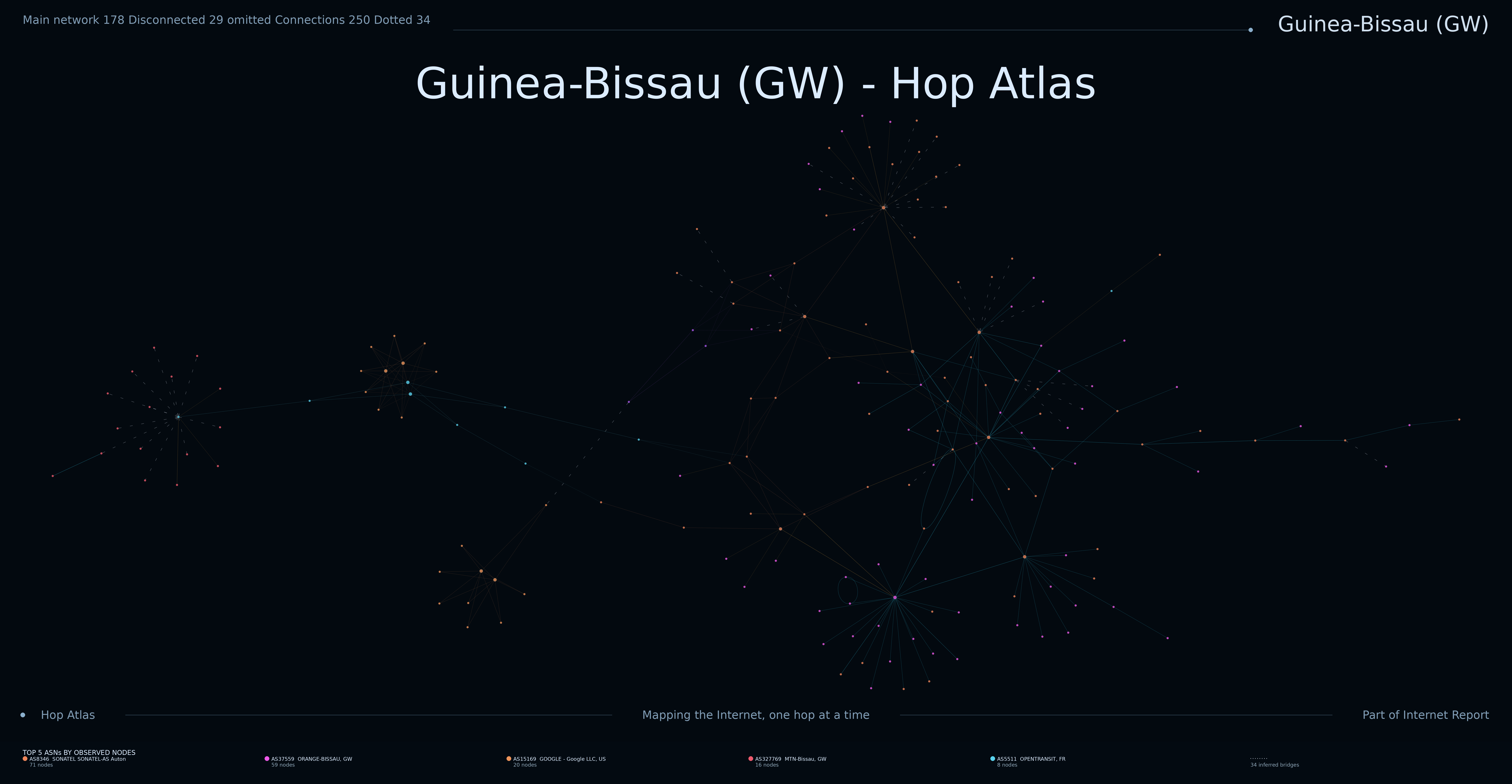
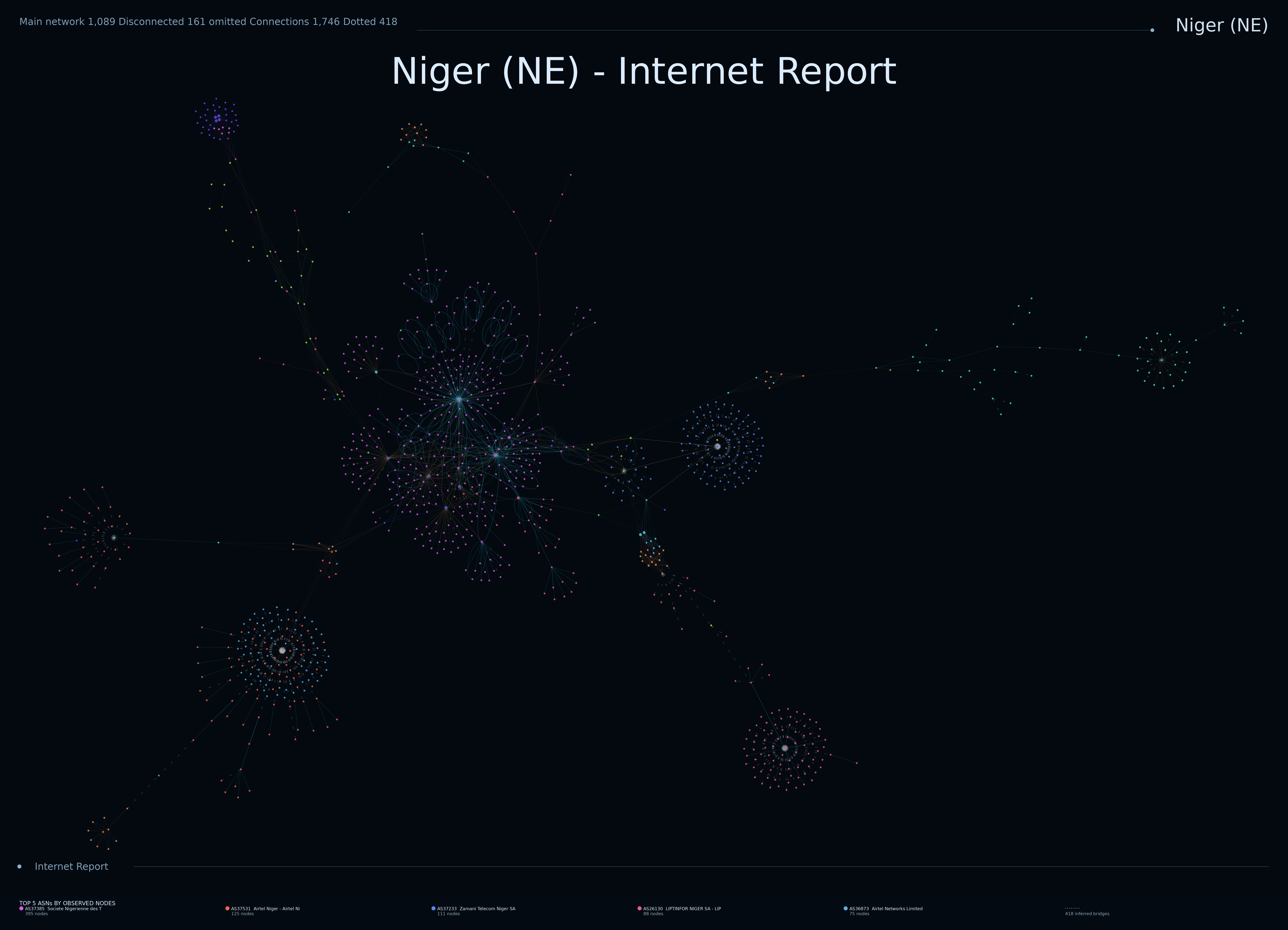
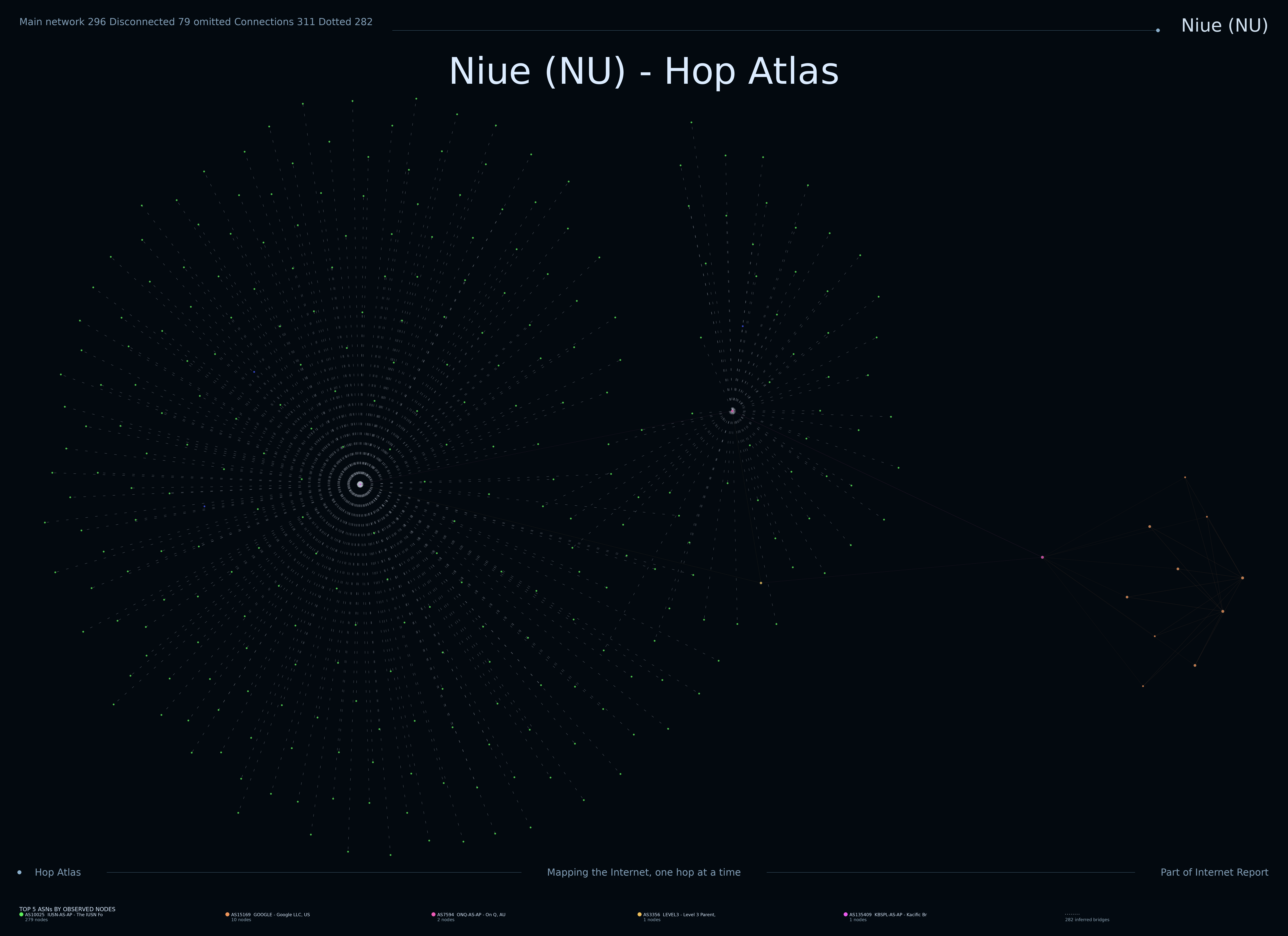
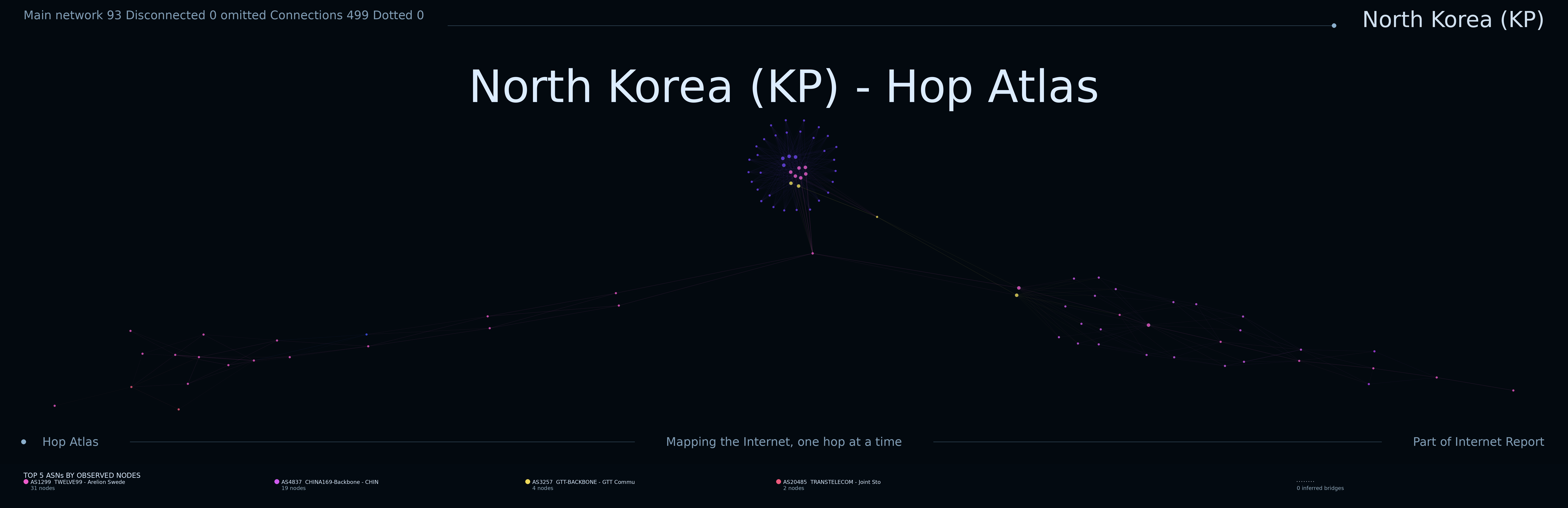
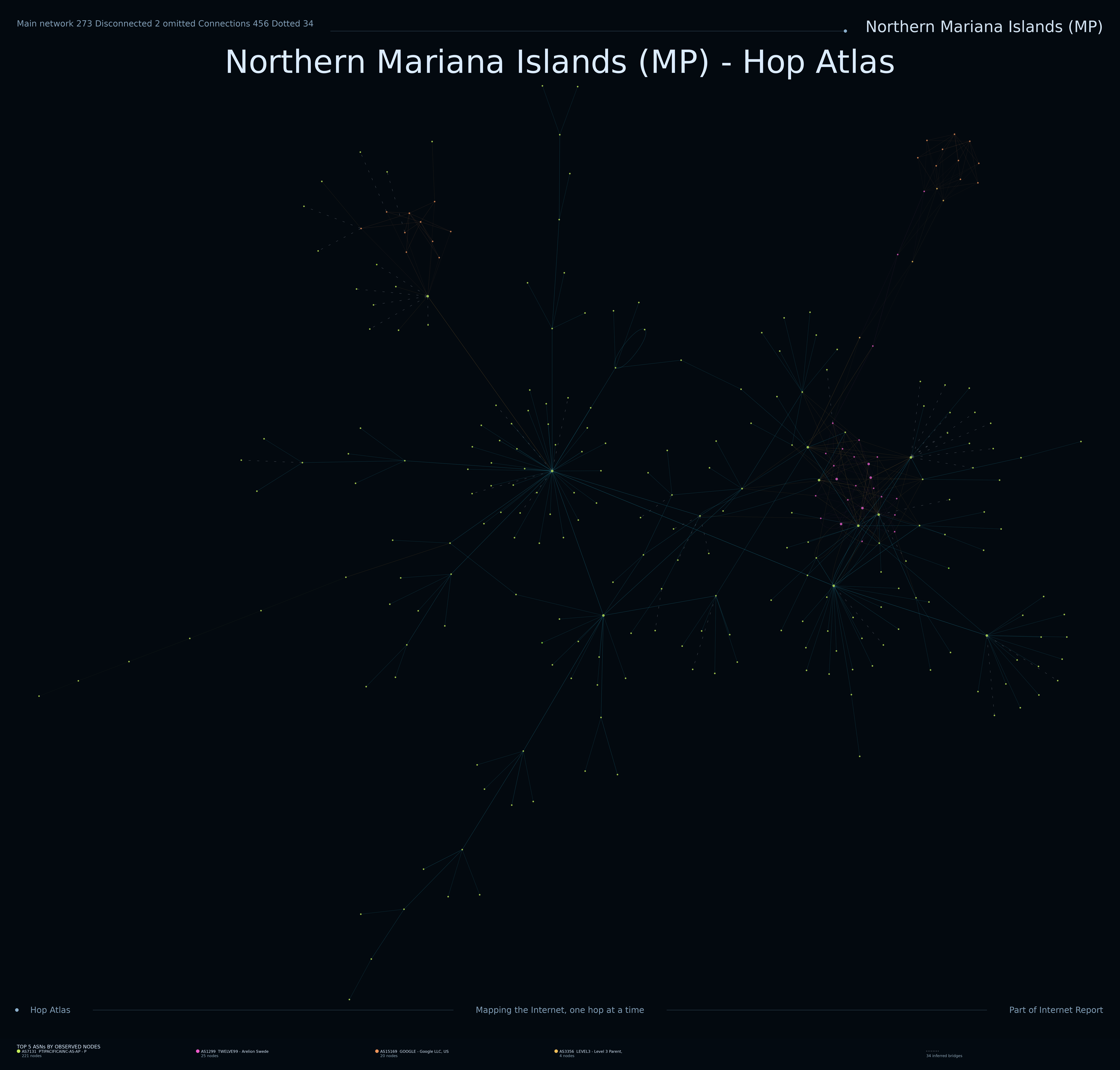
Country maps

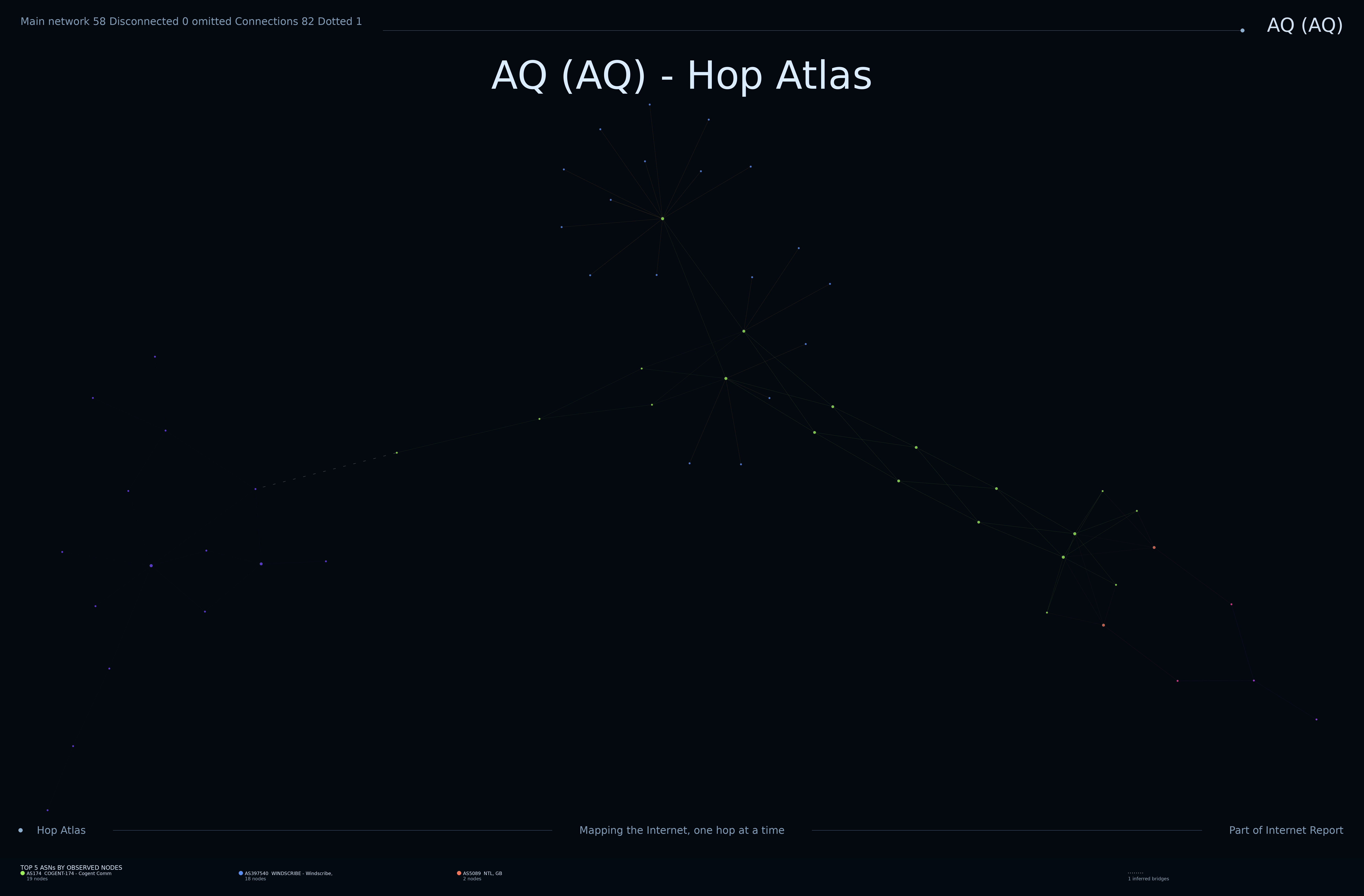
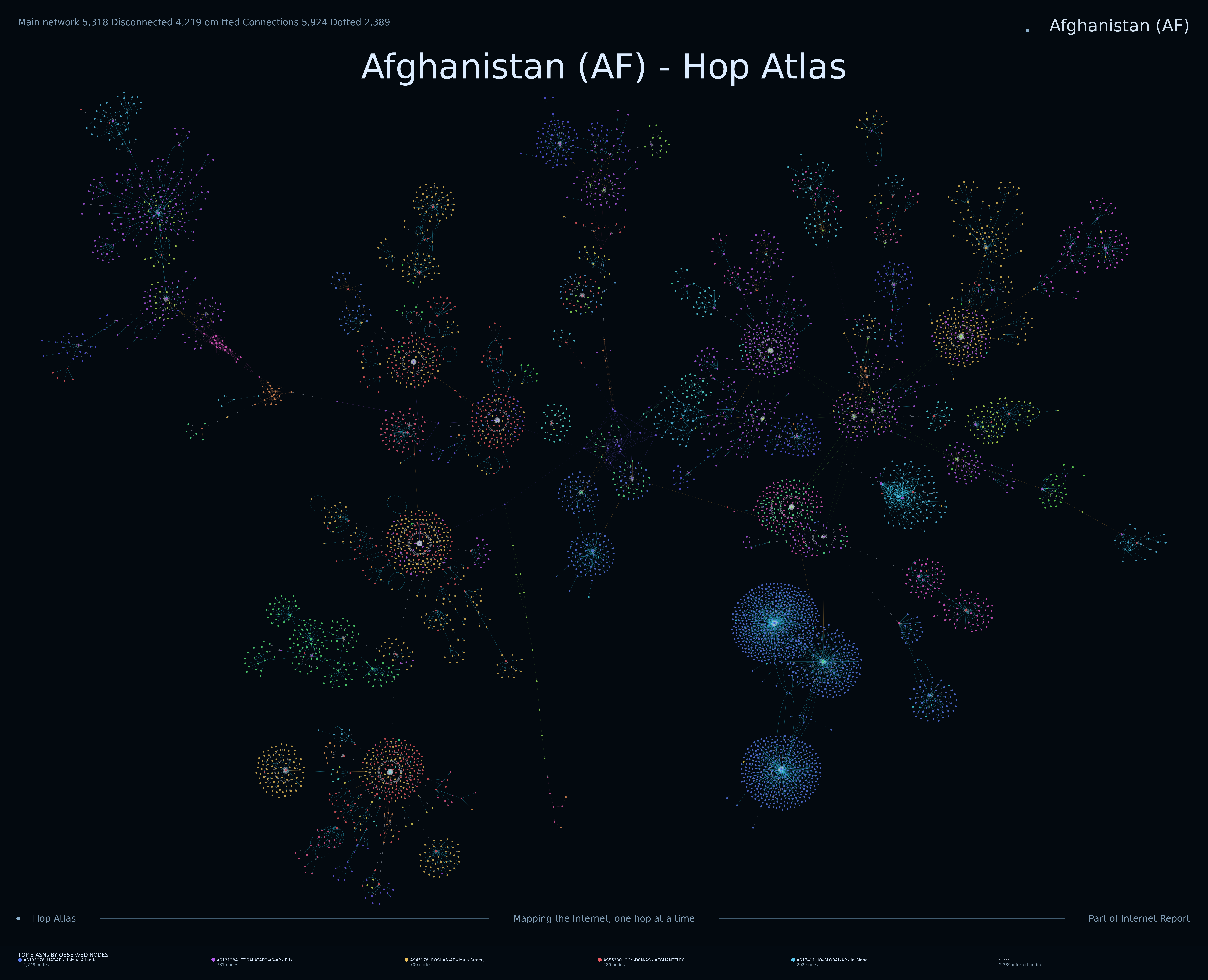
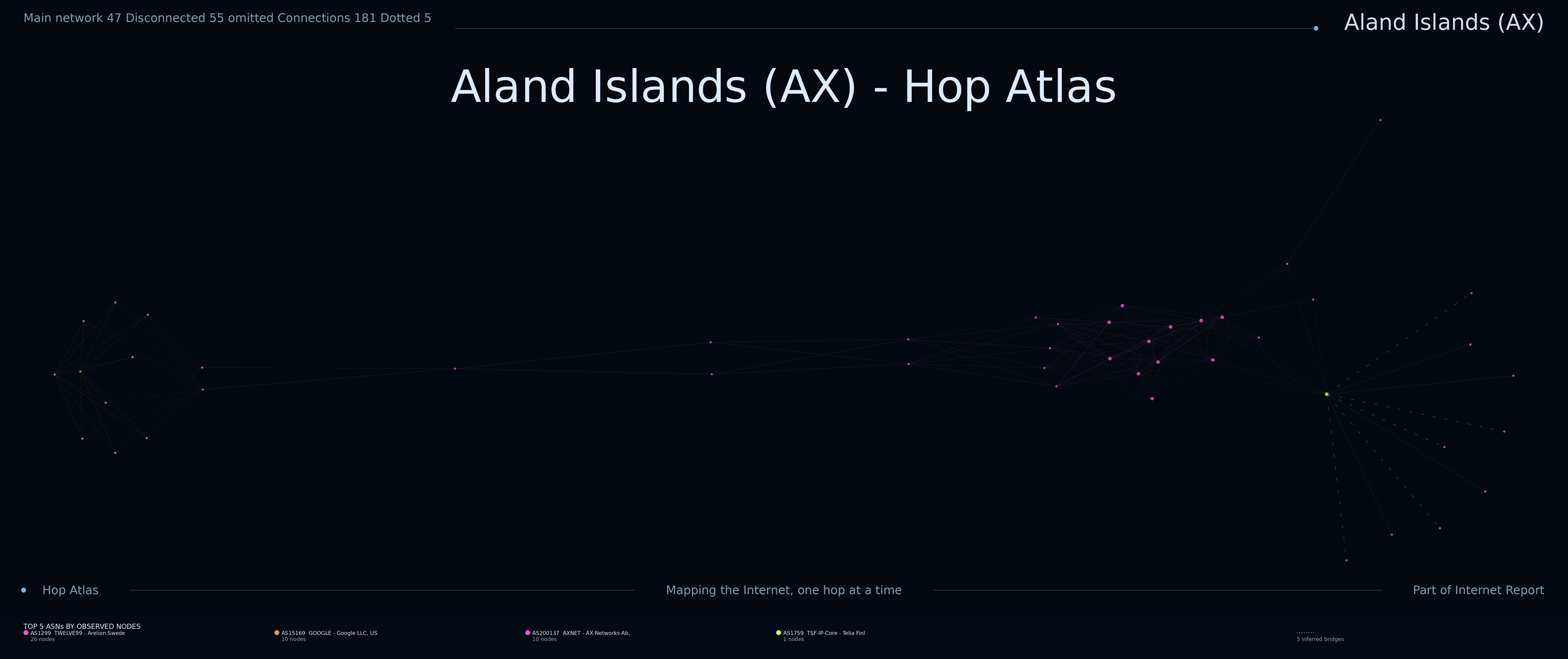
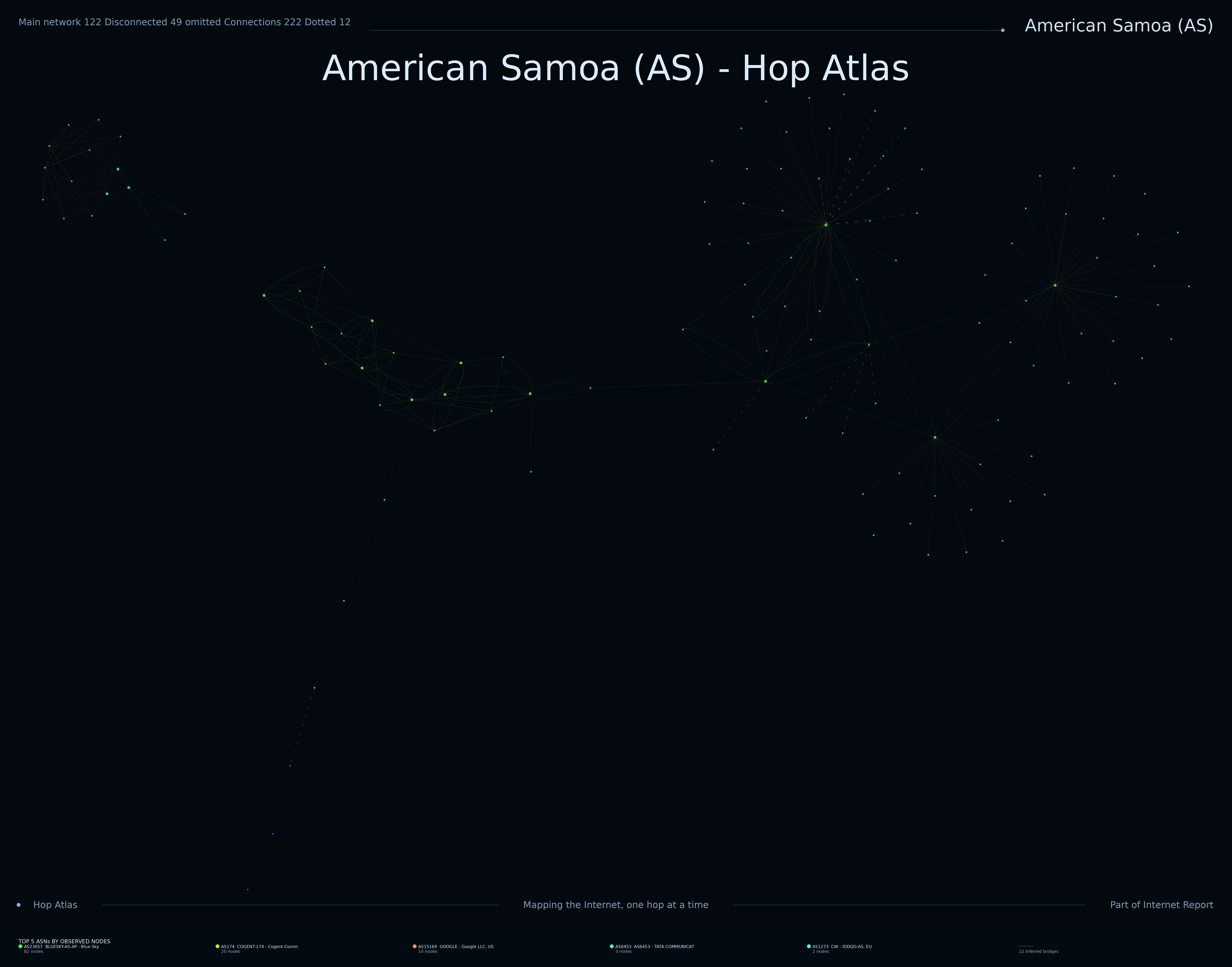
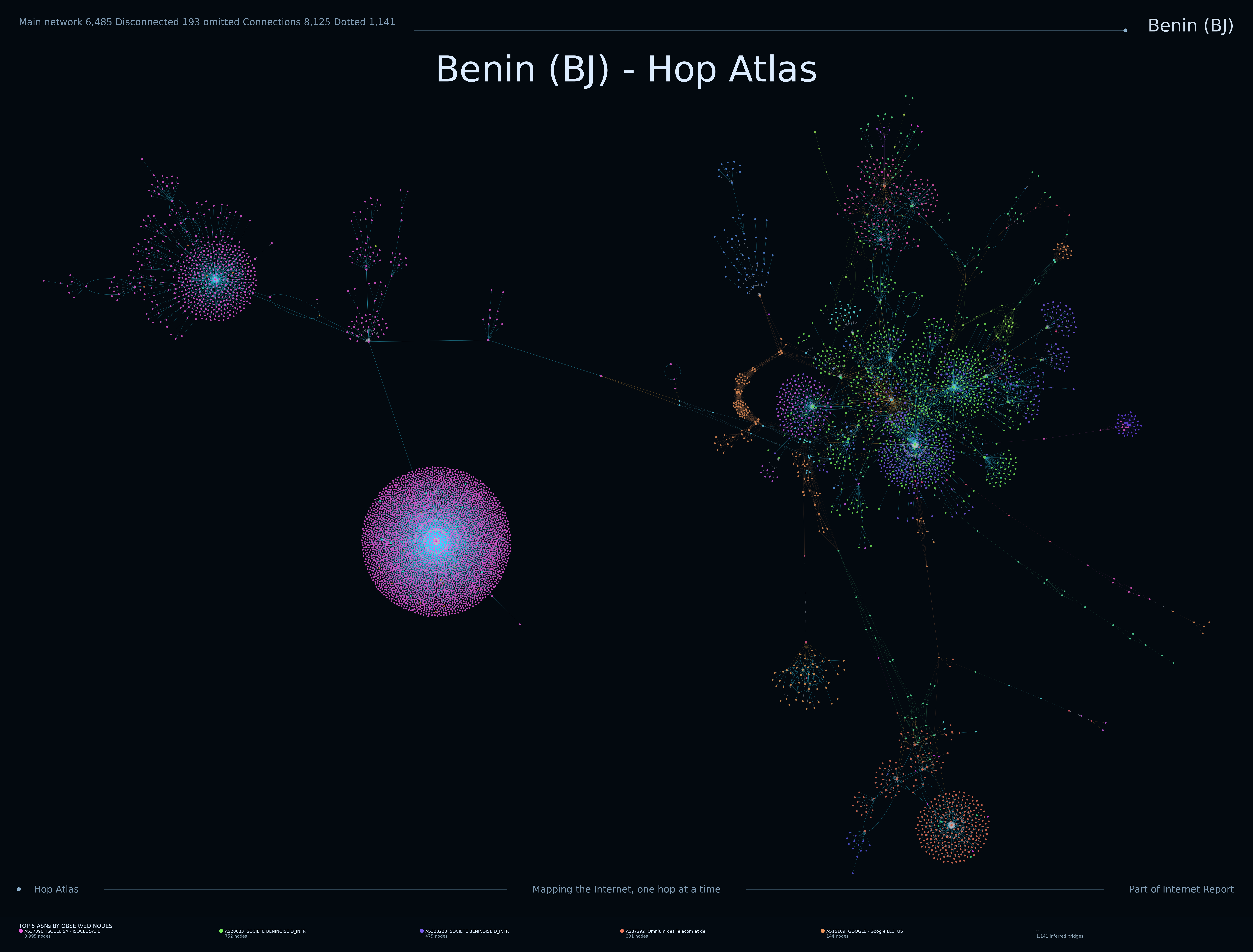
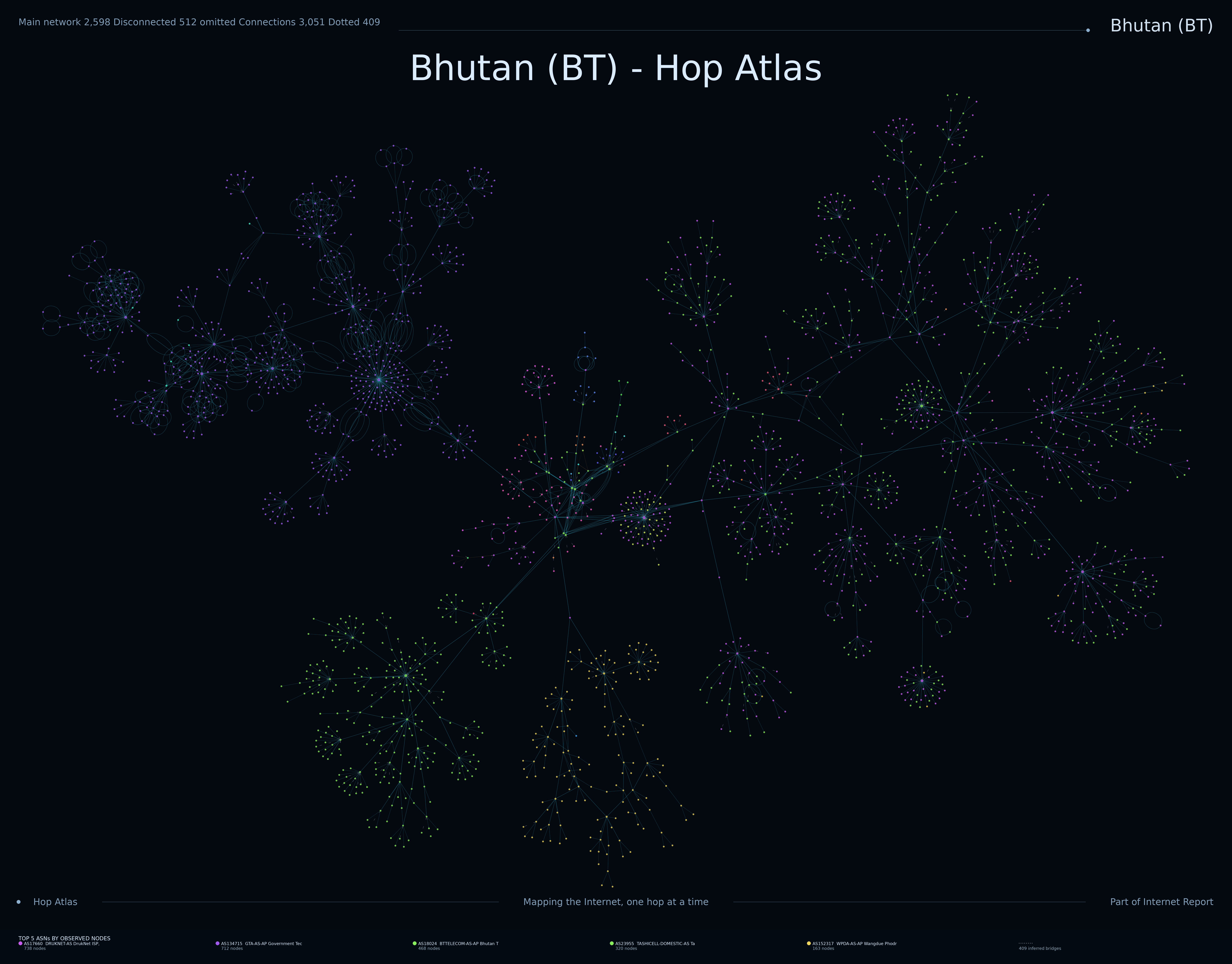
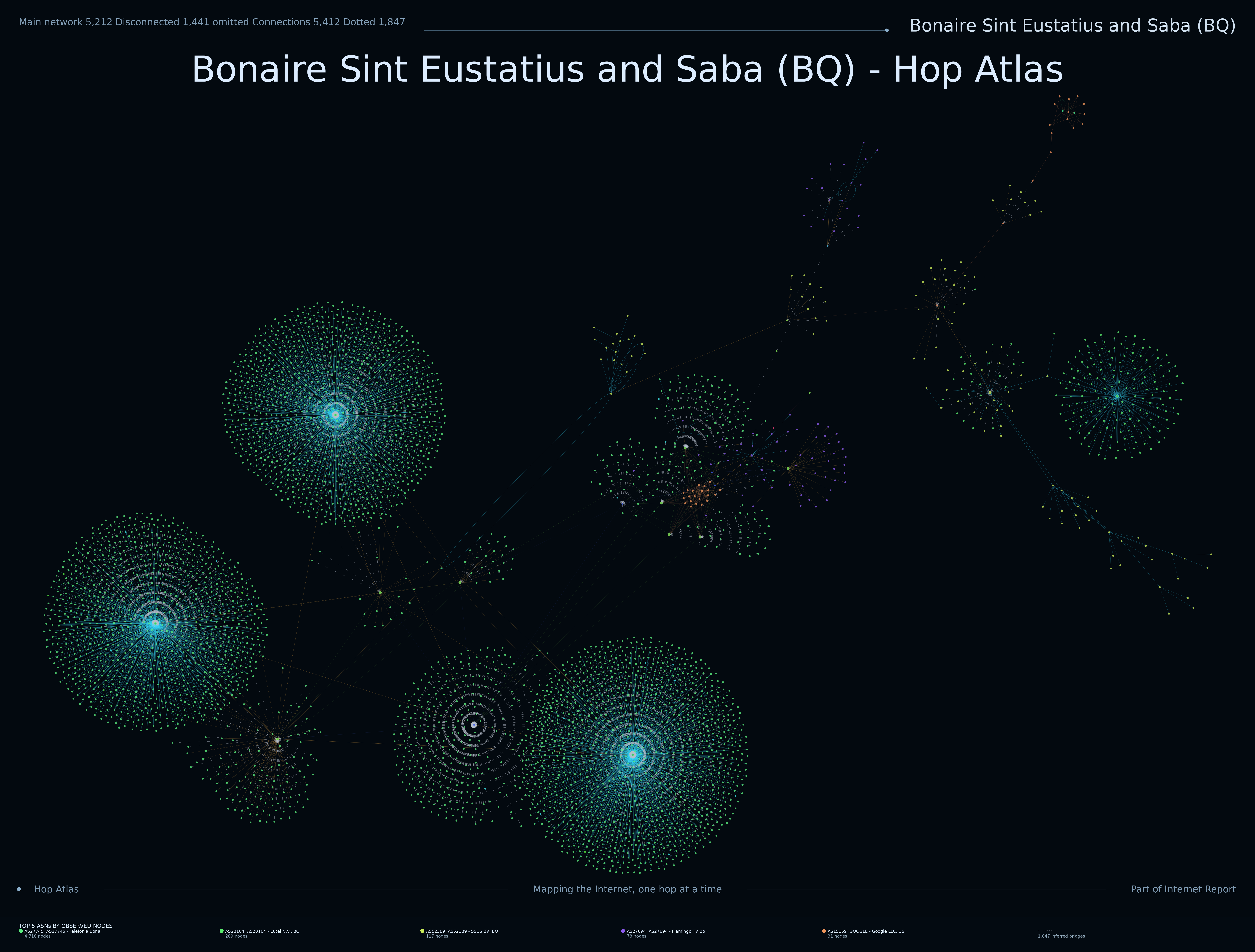
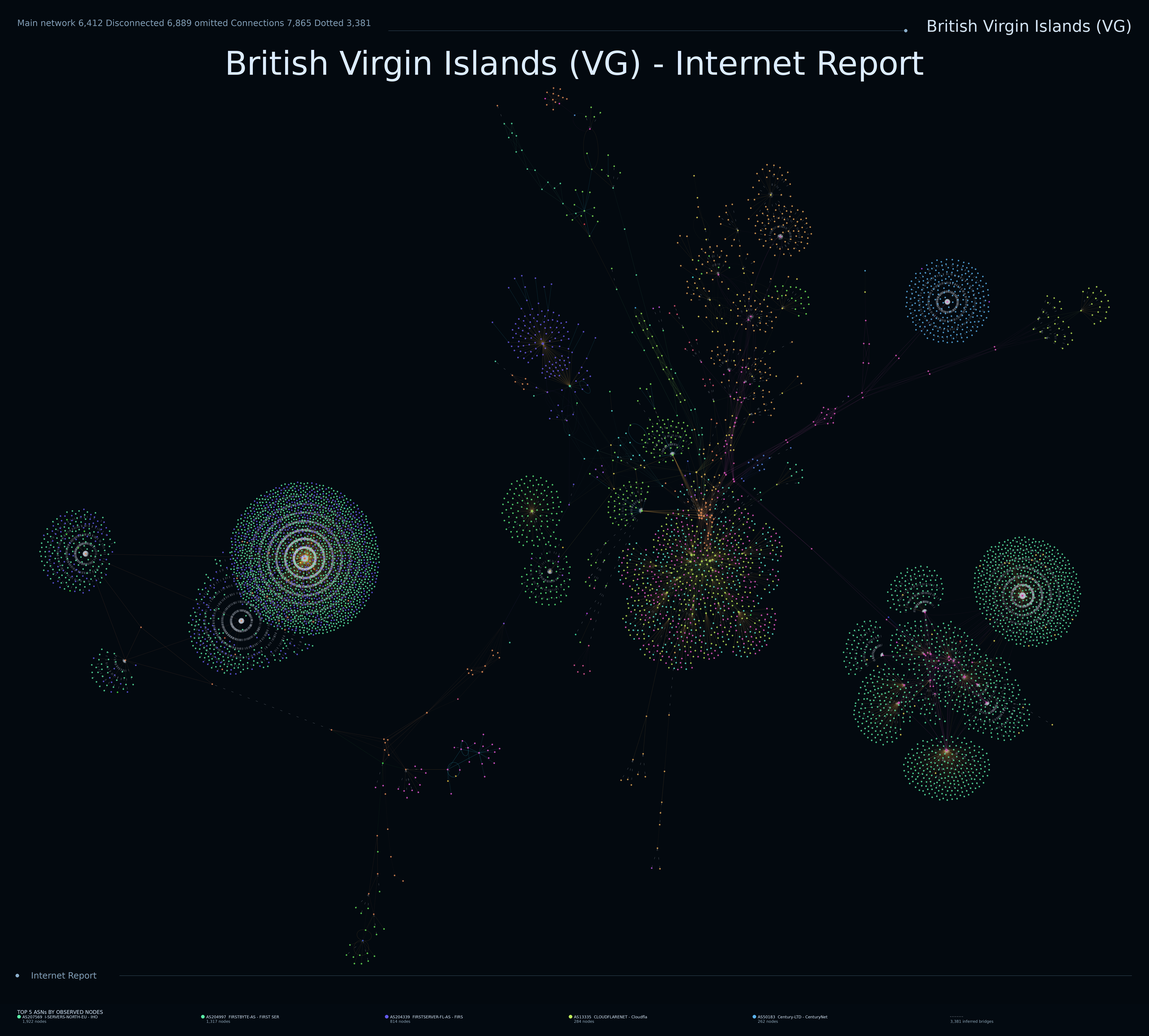
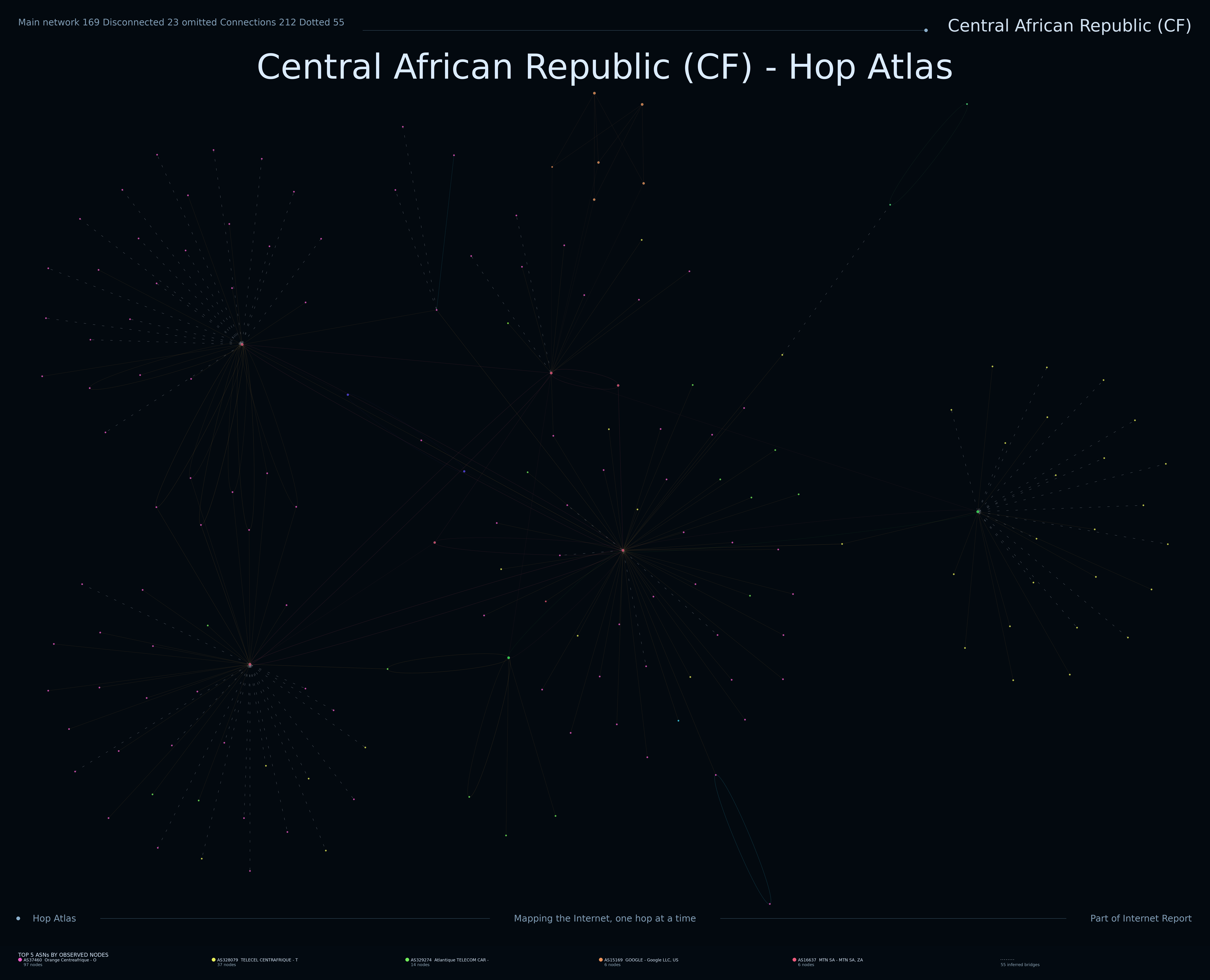
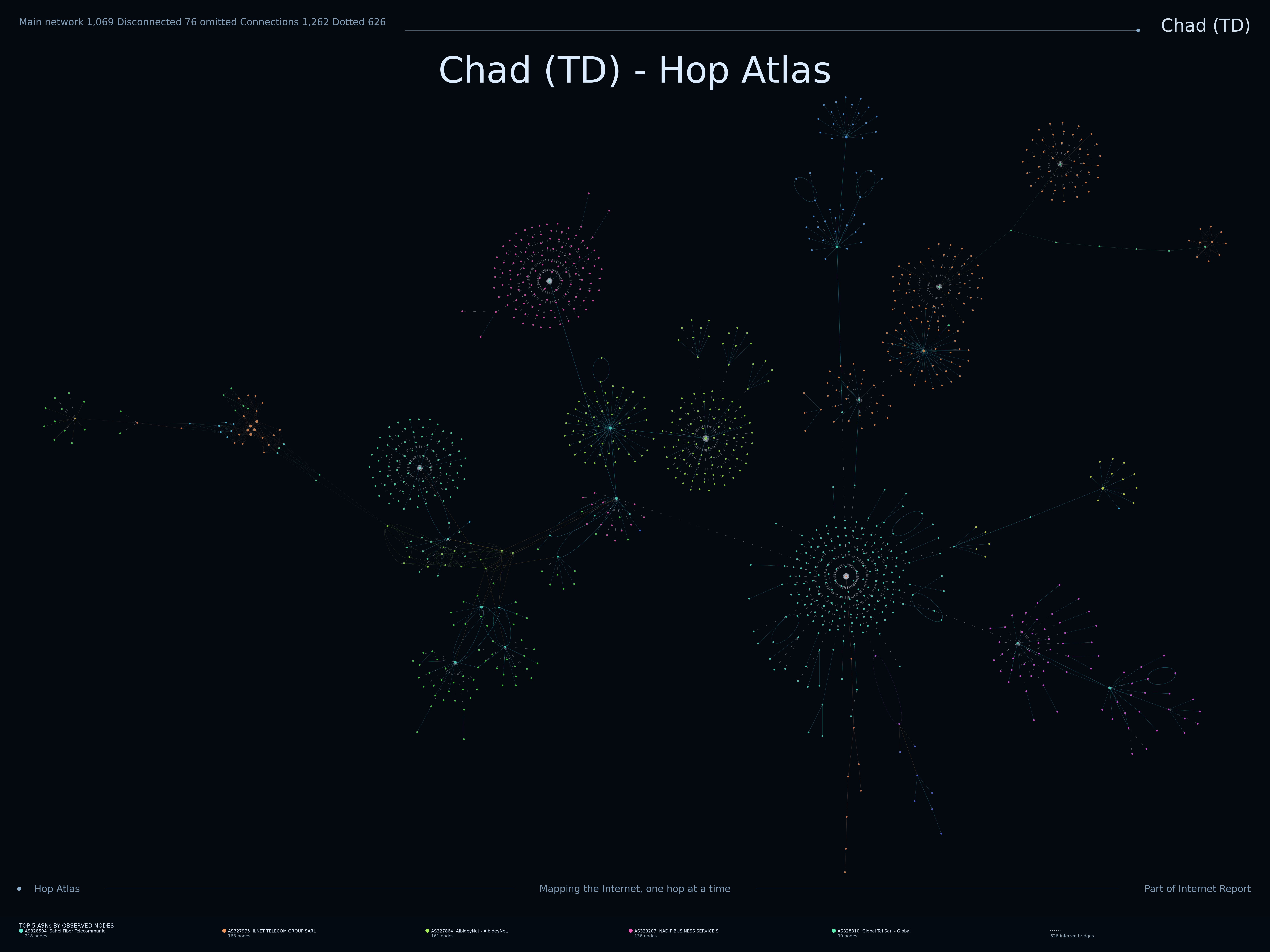
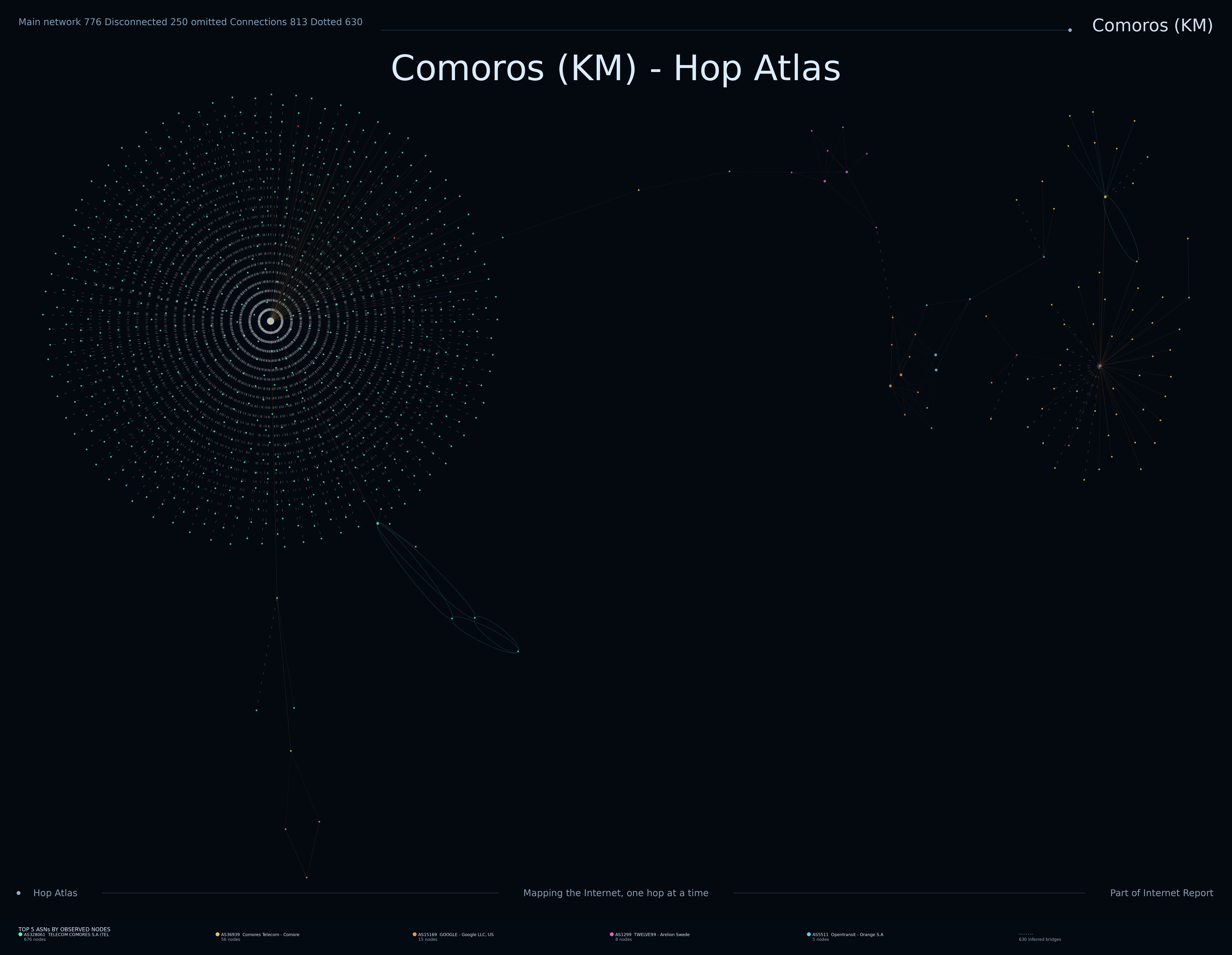
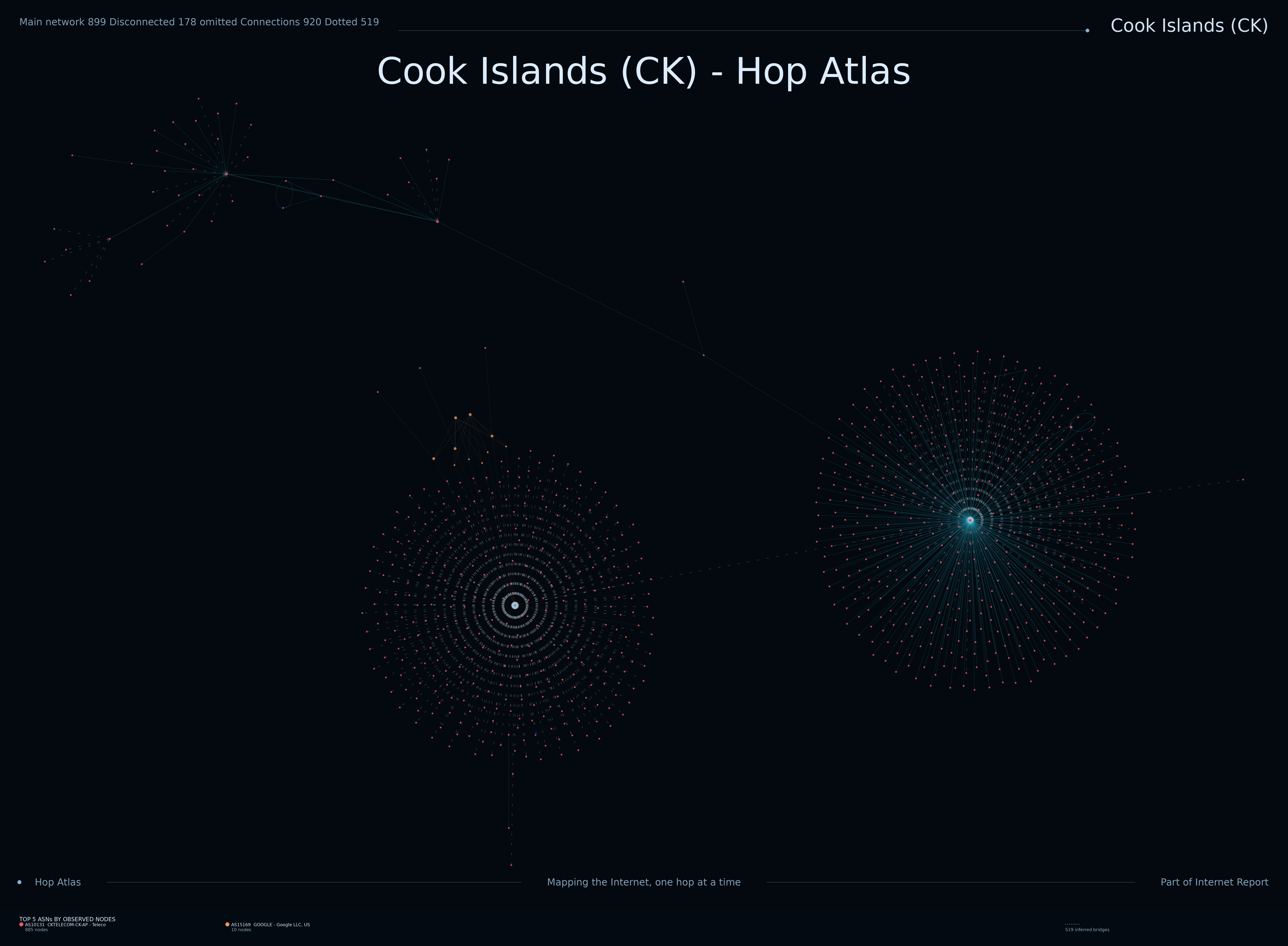
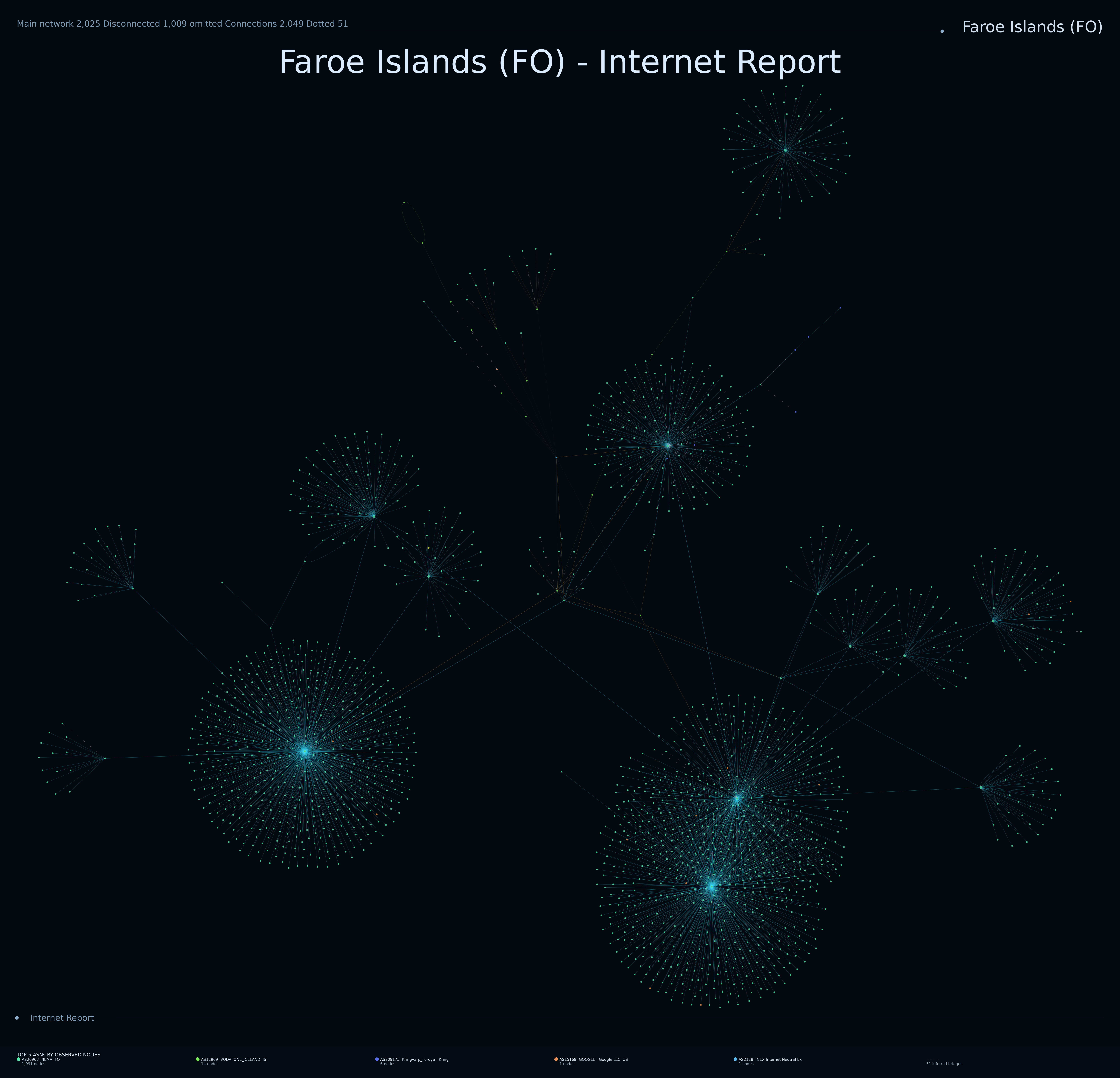
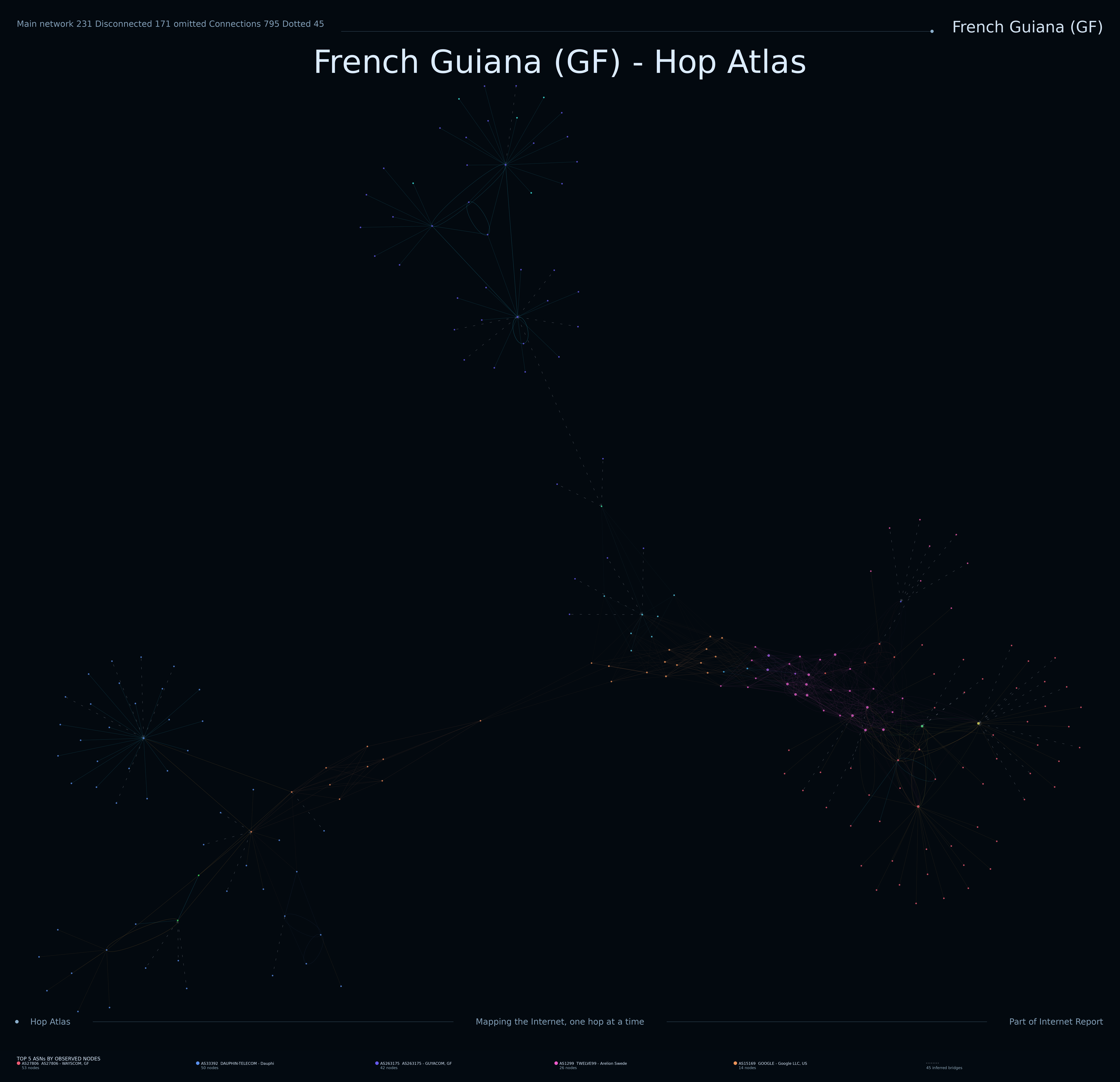
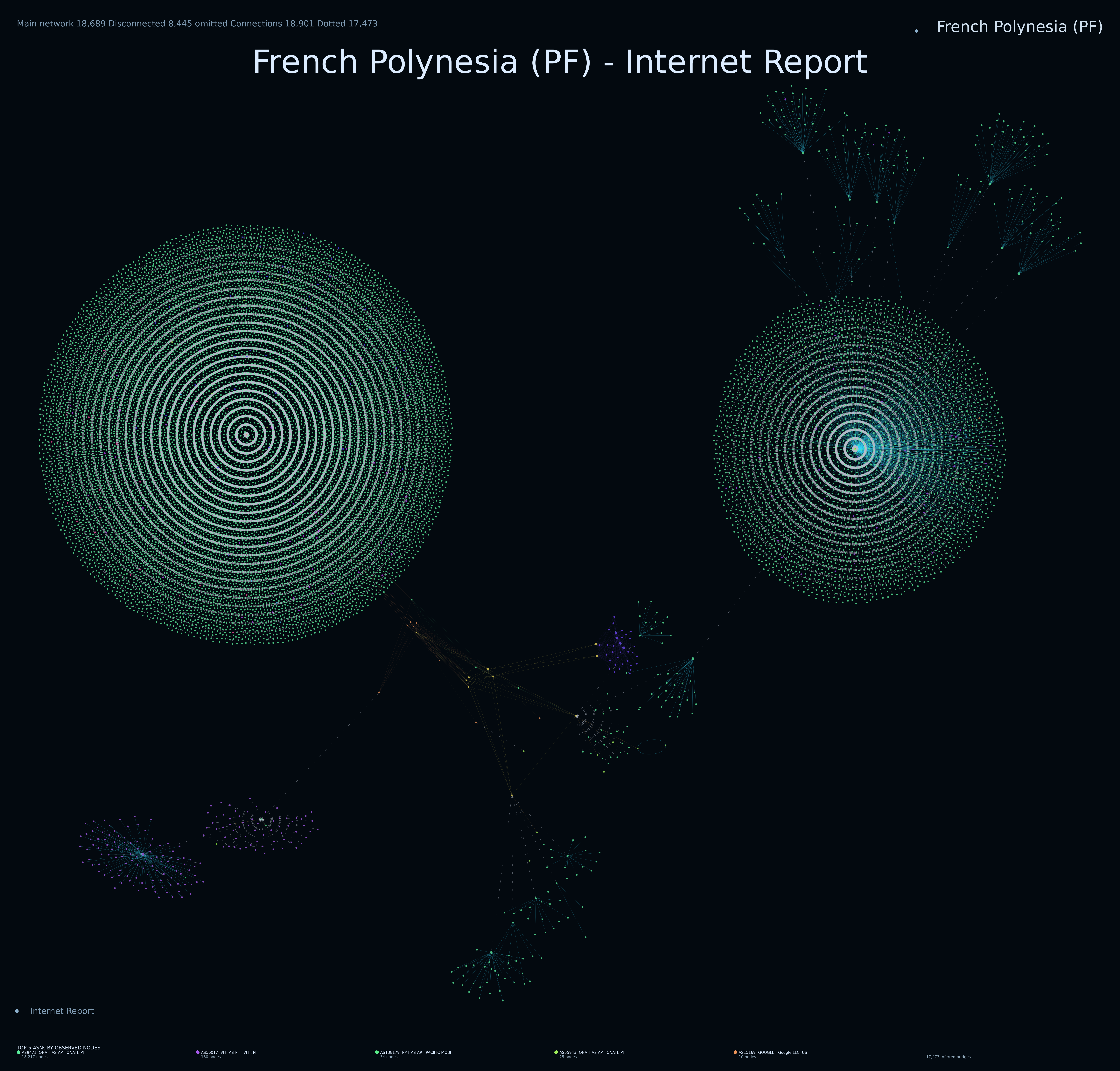
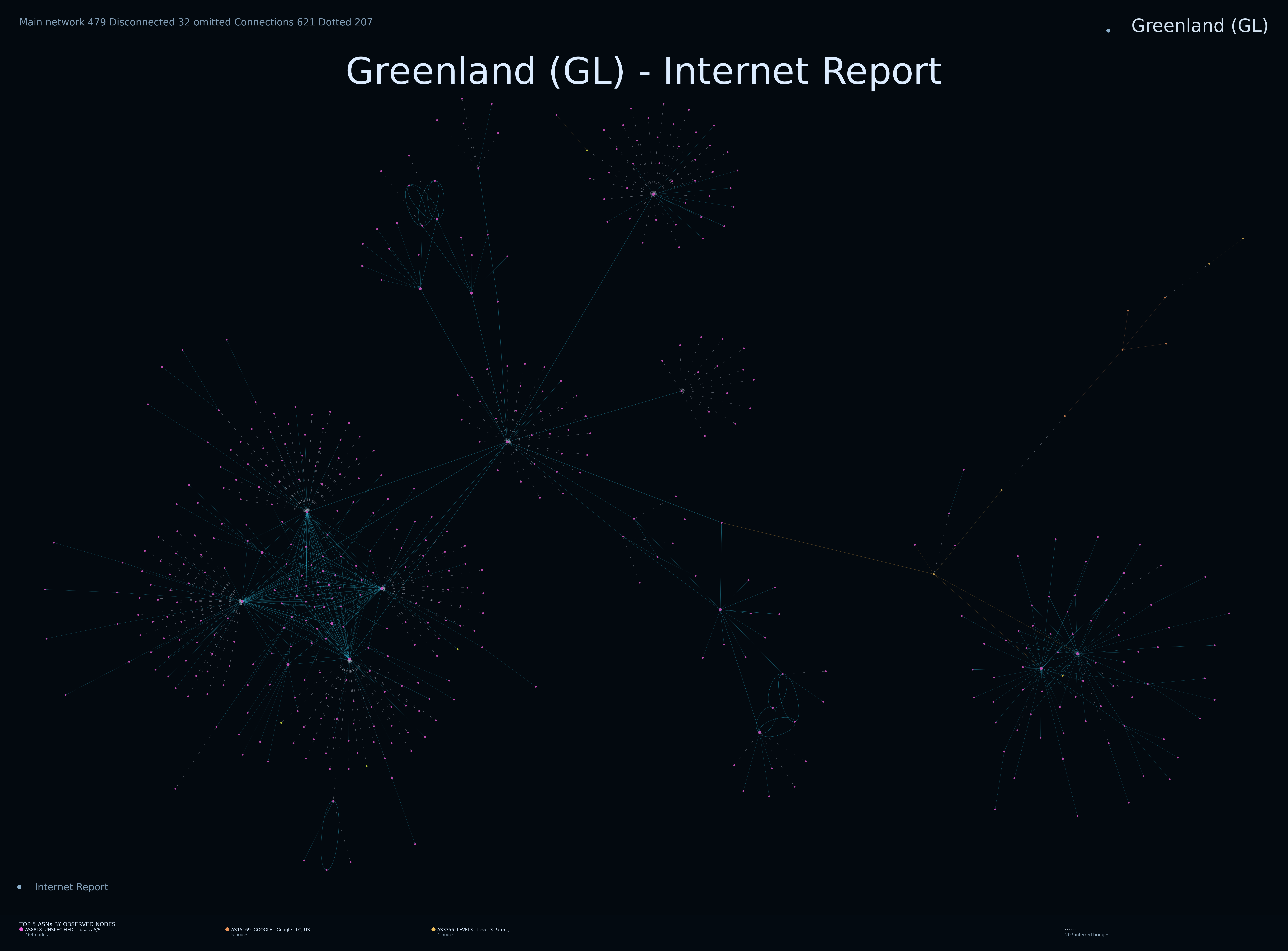
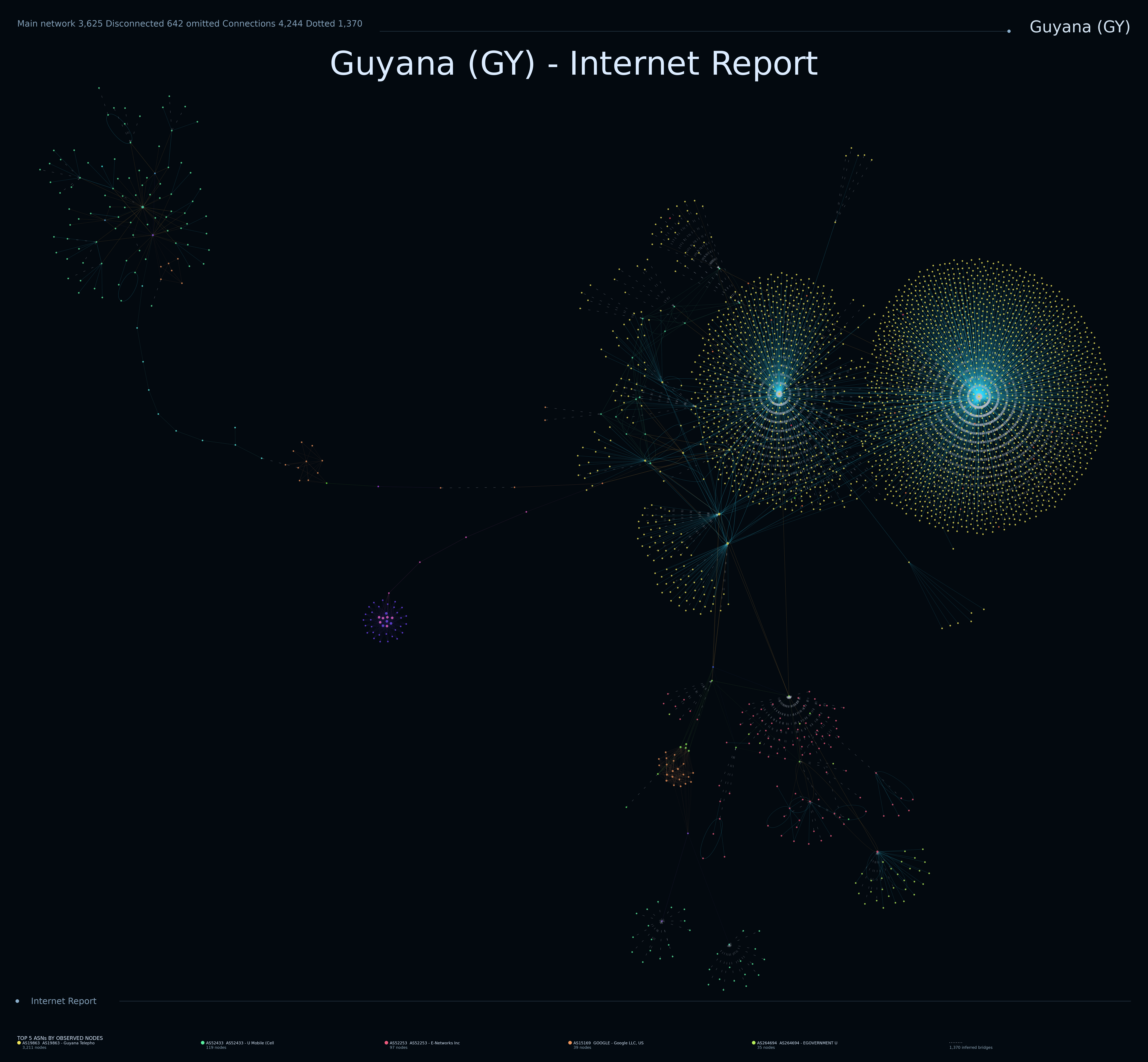
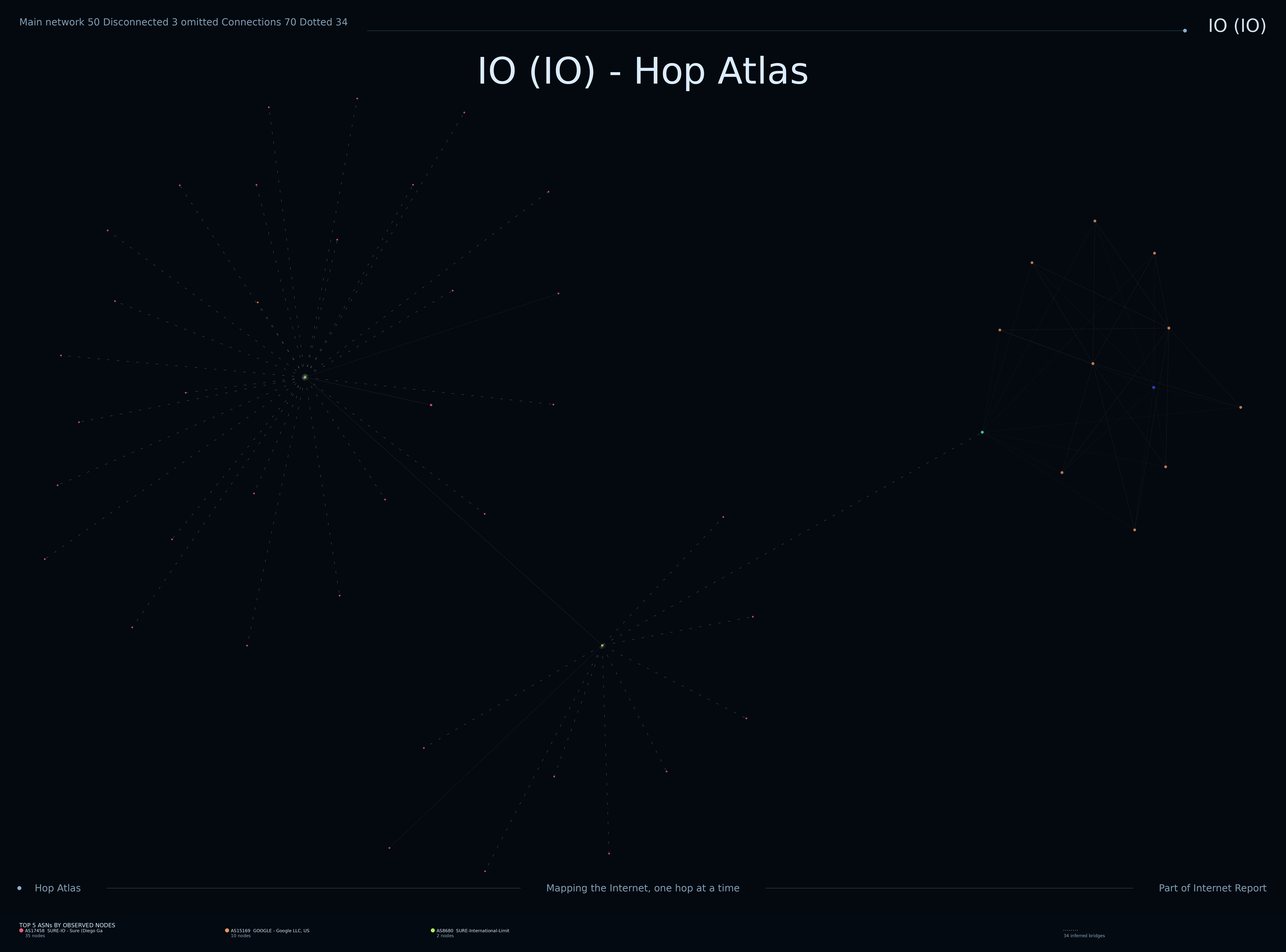
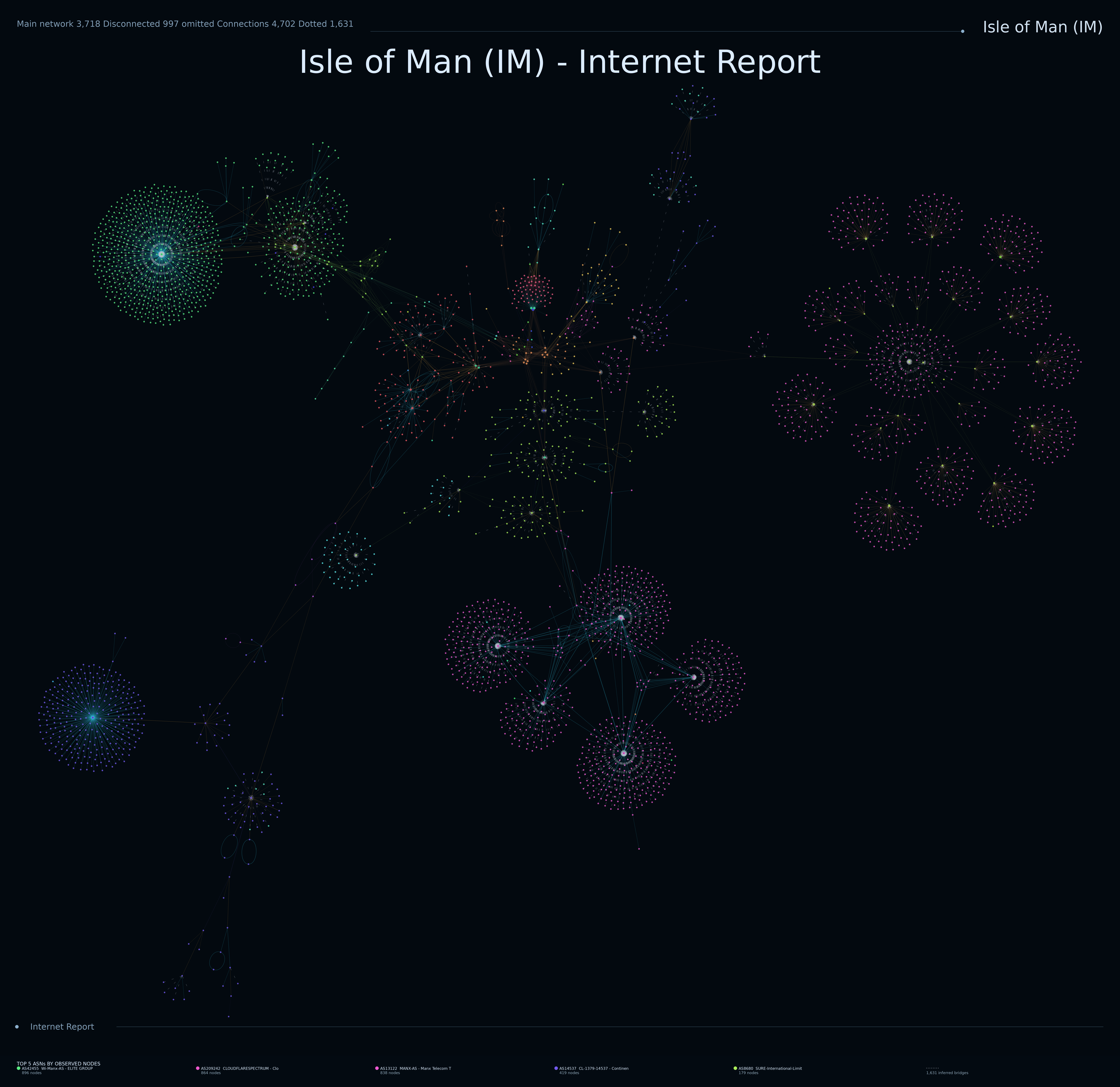
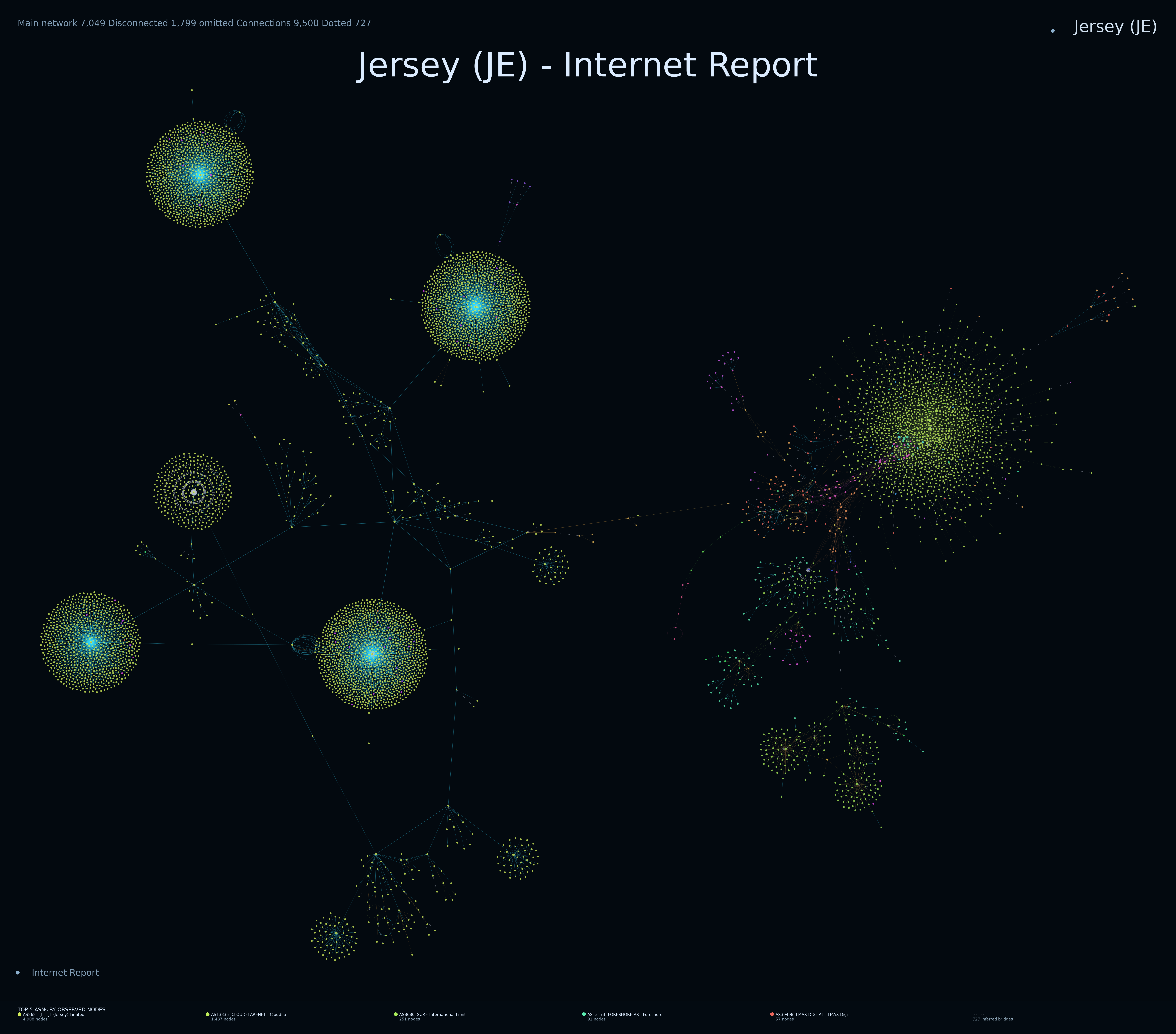
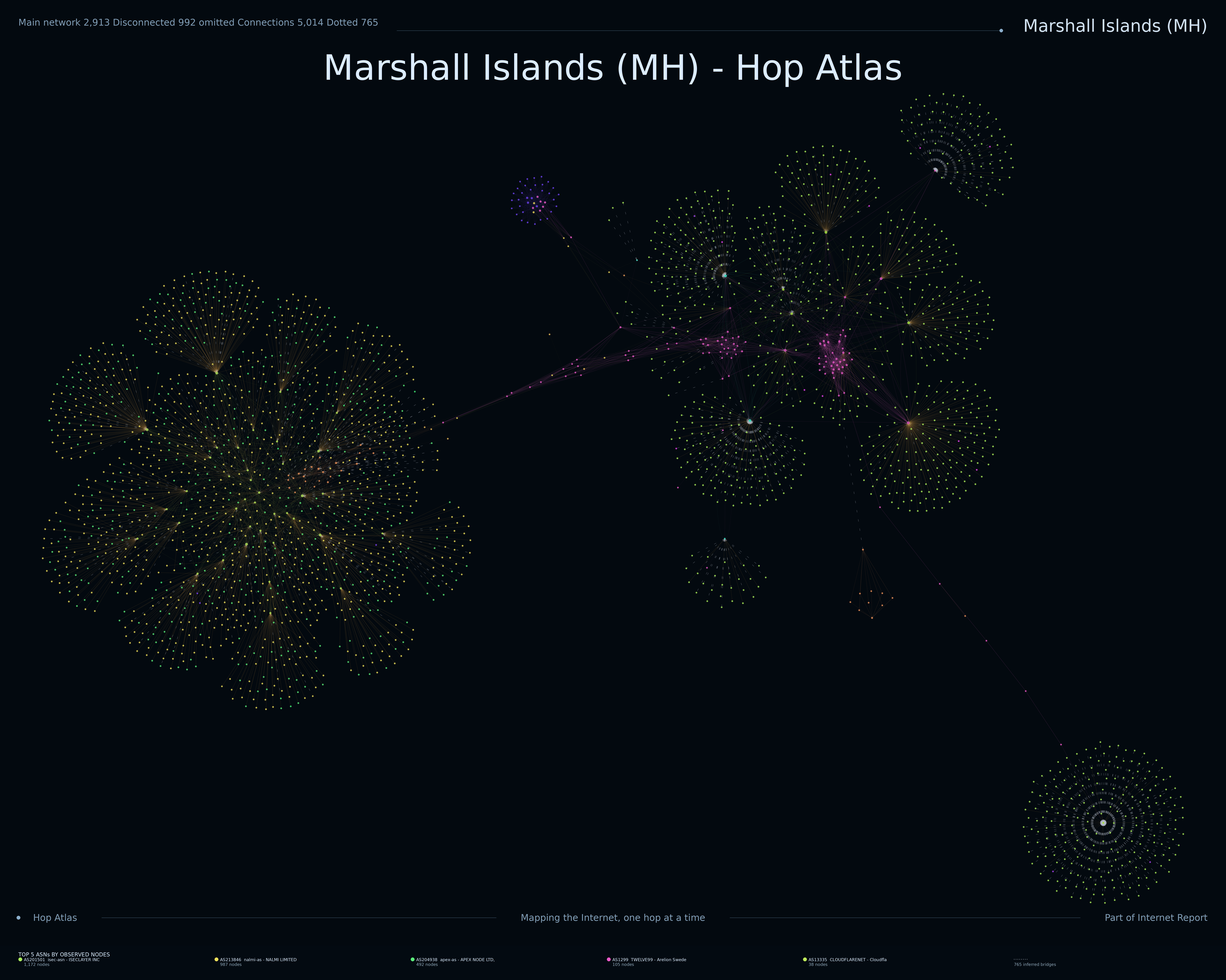
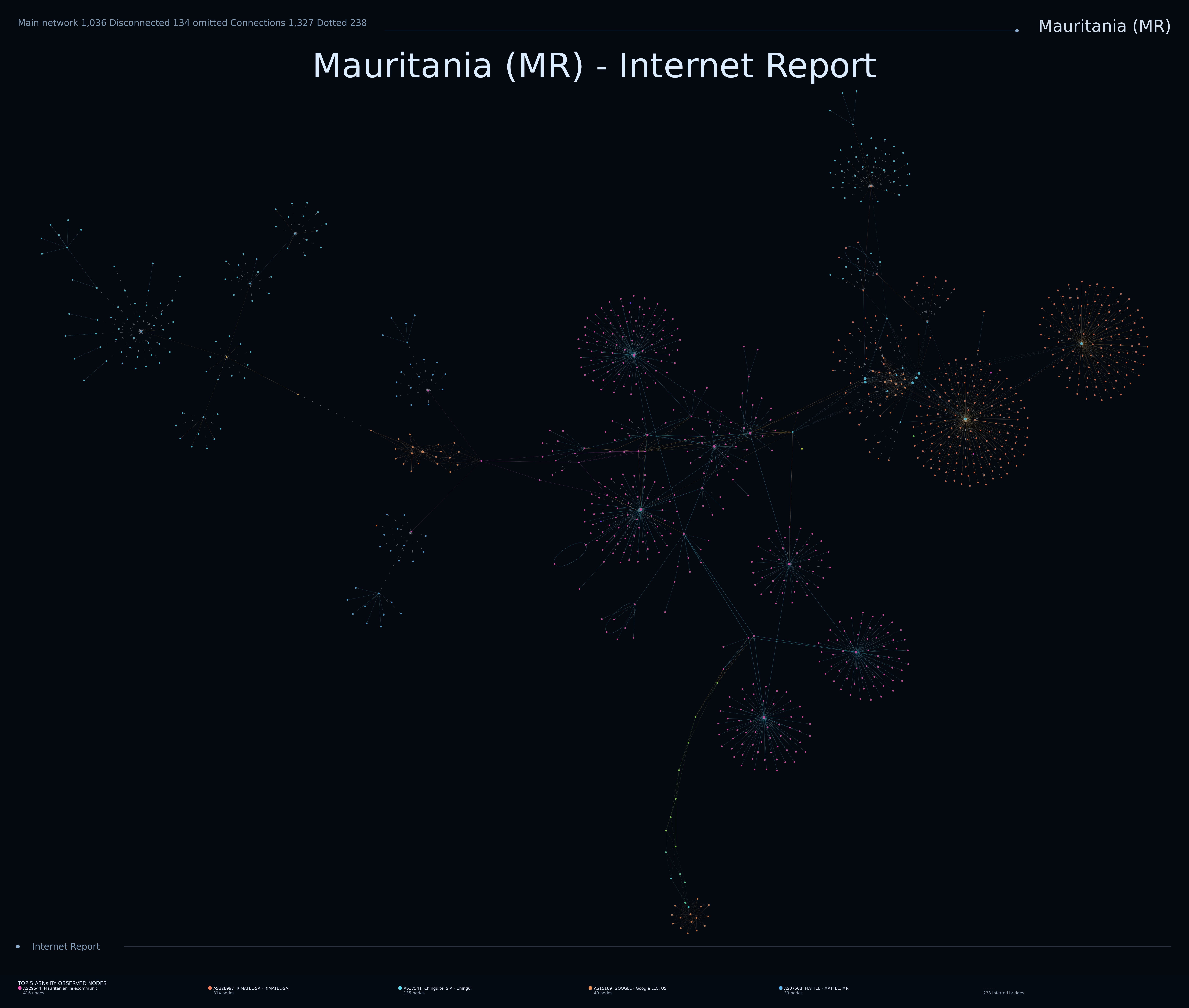
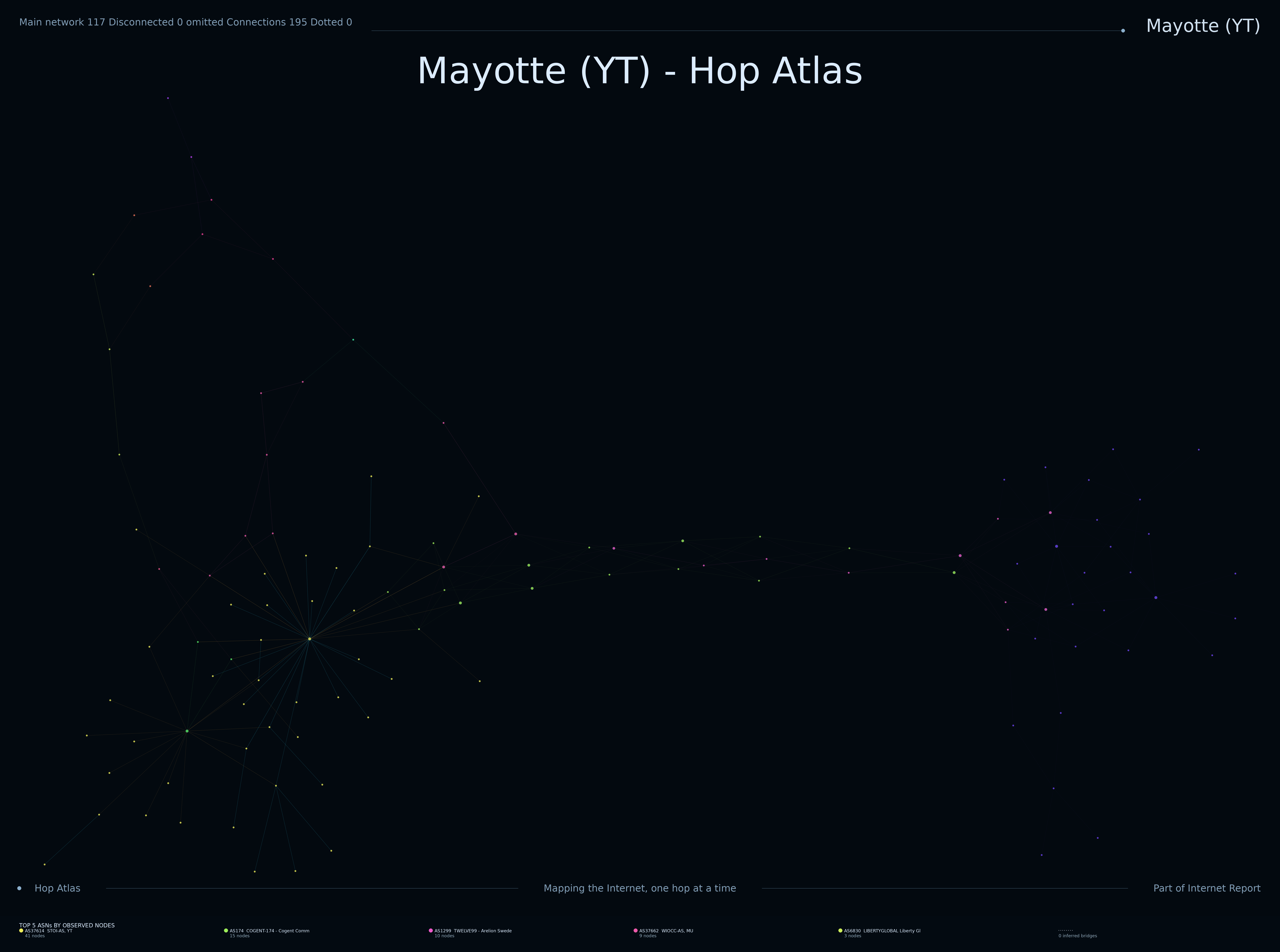
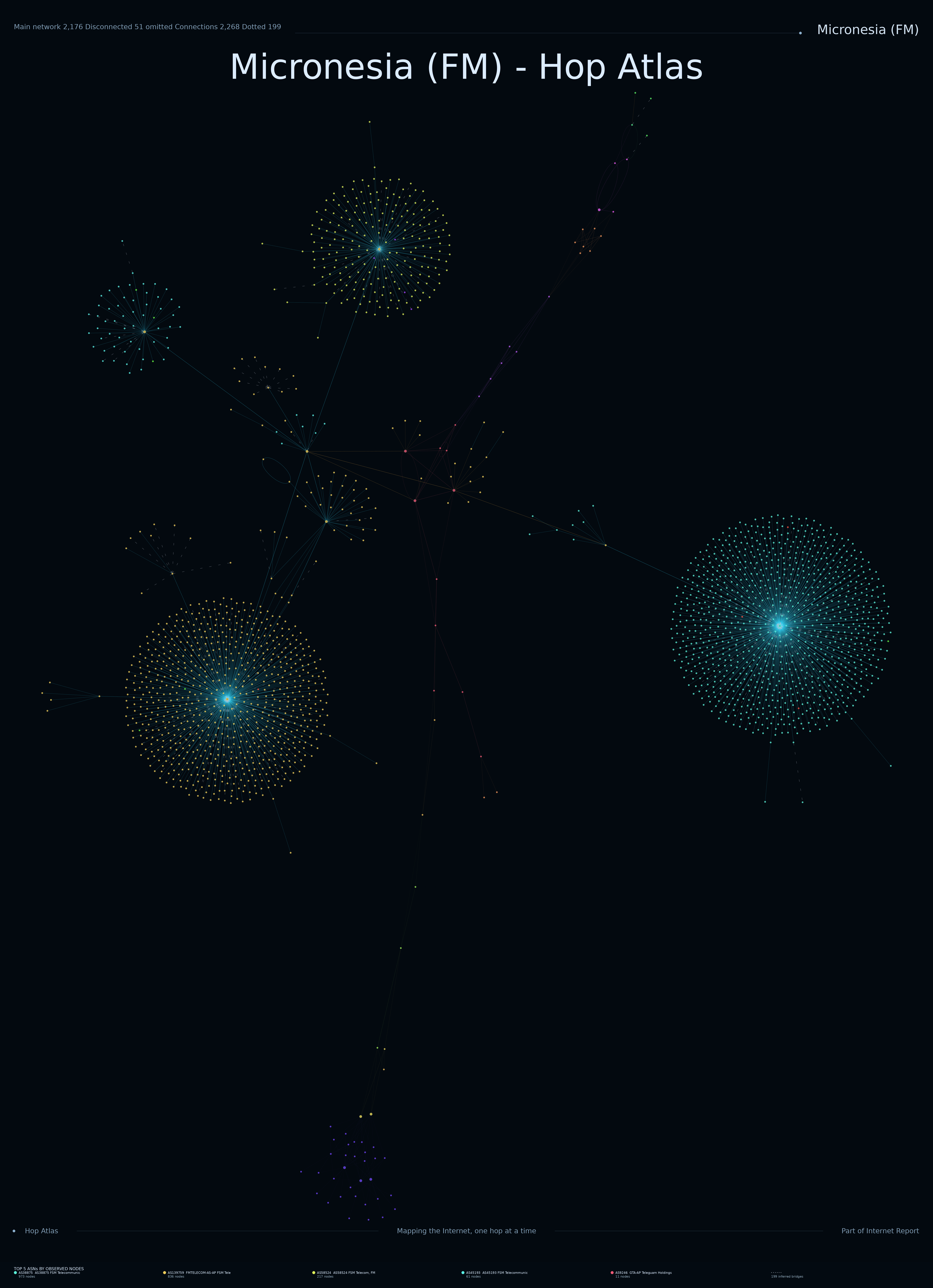
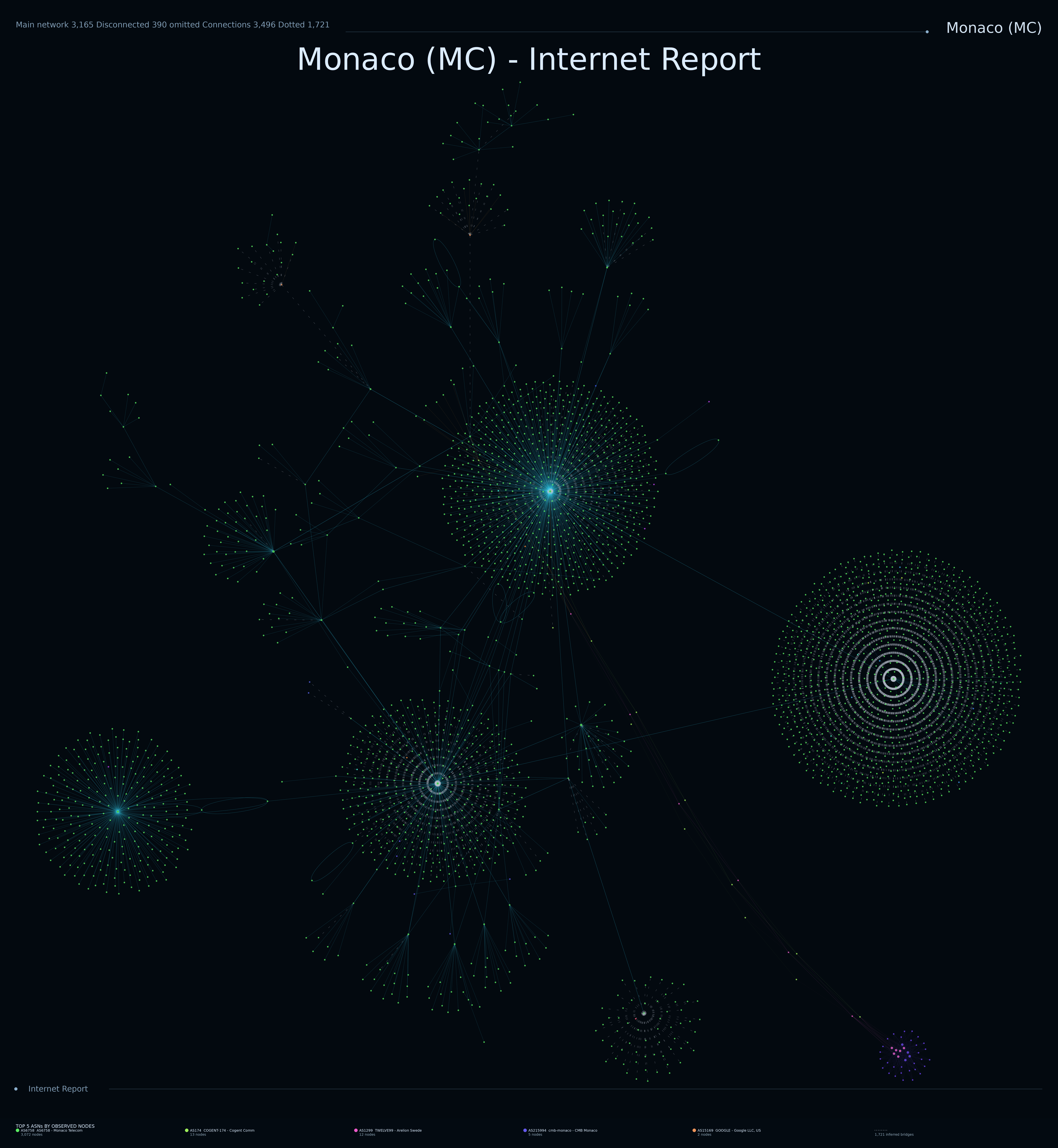
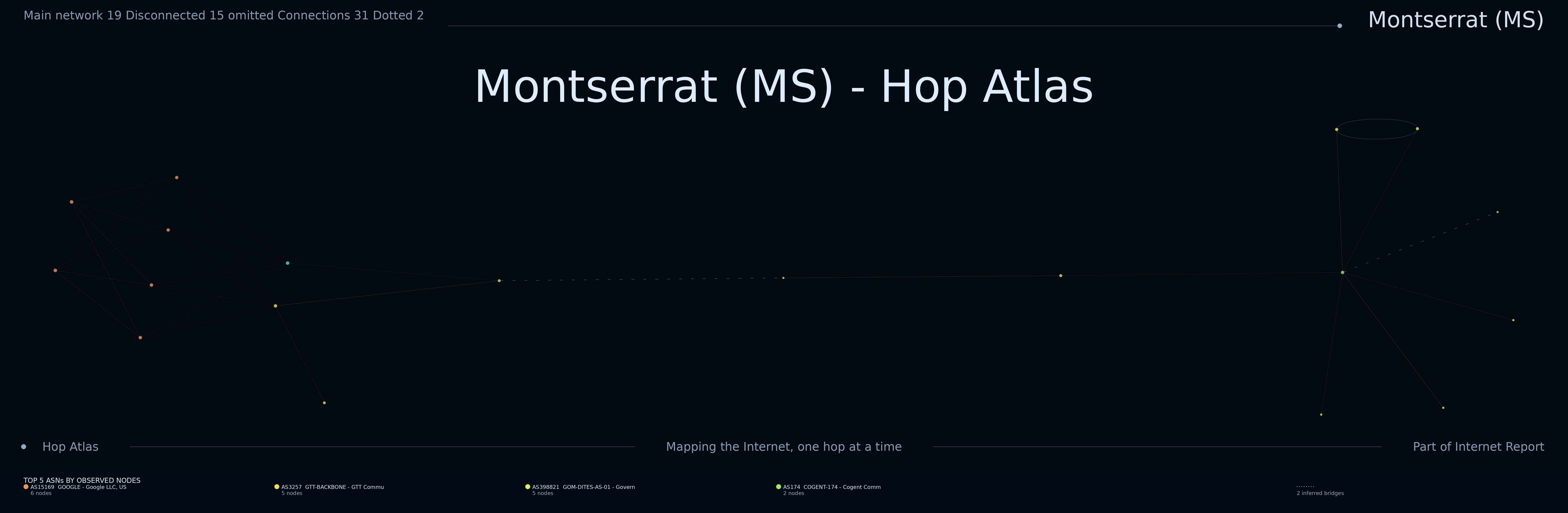
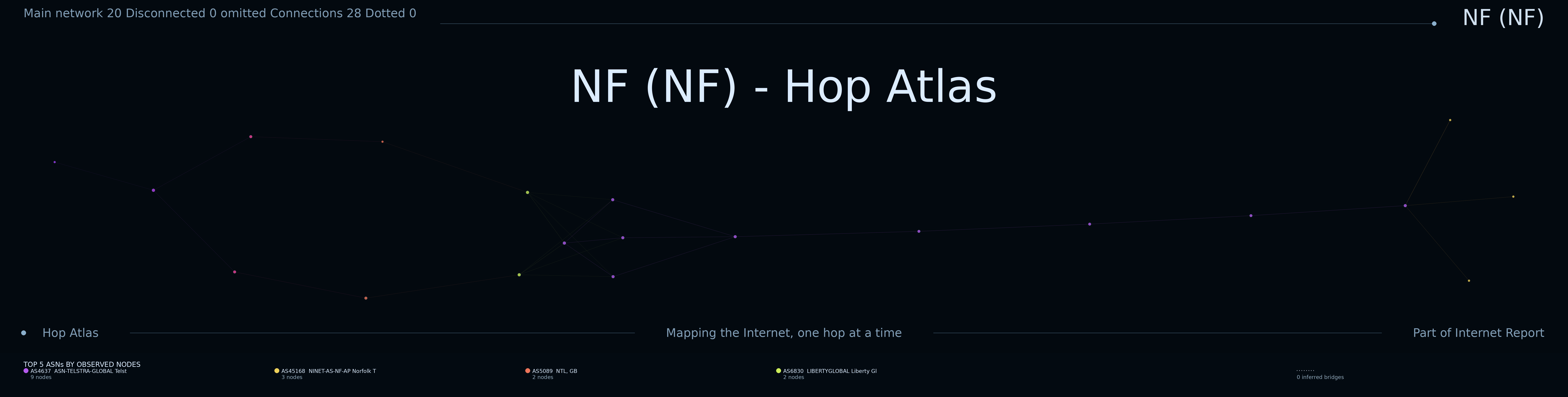
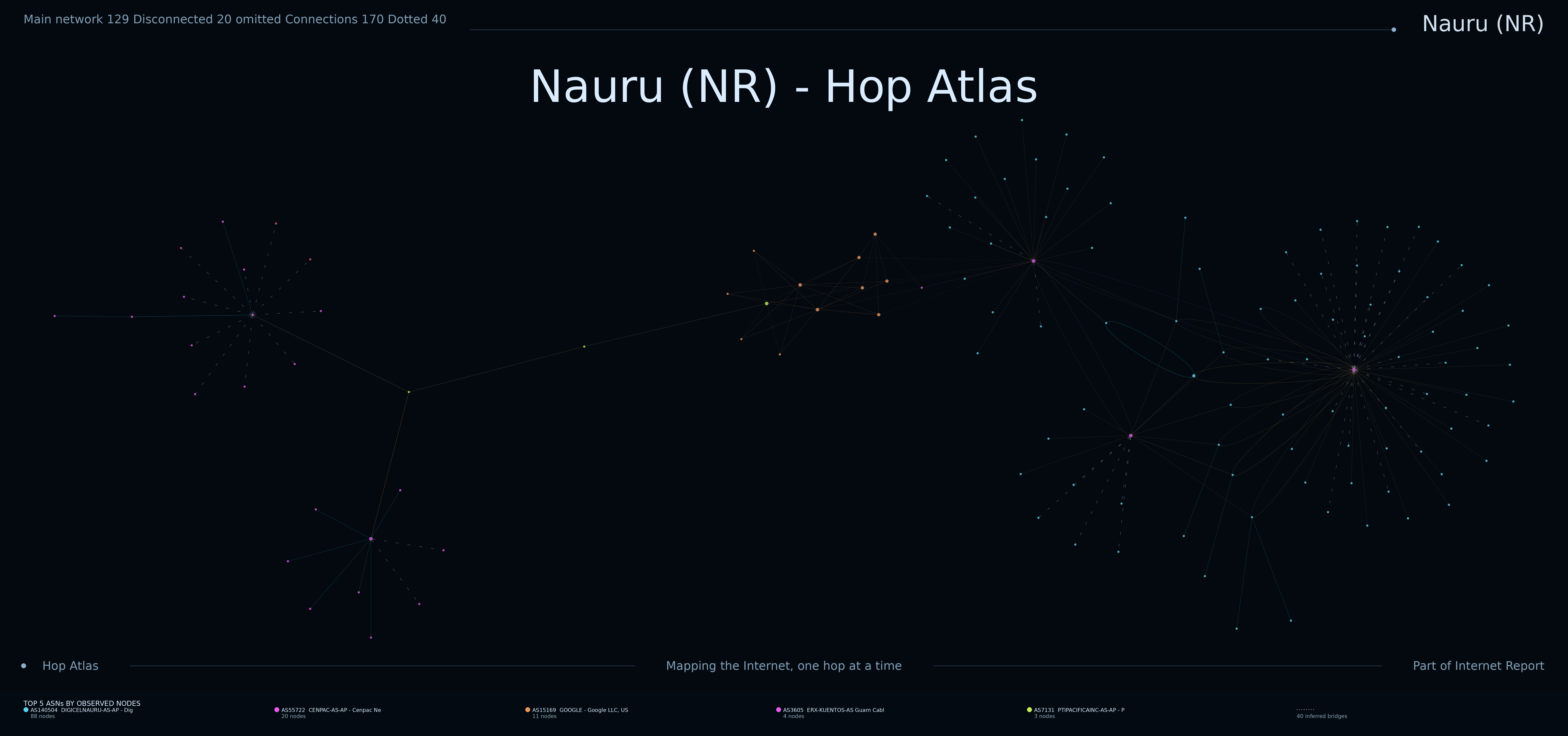
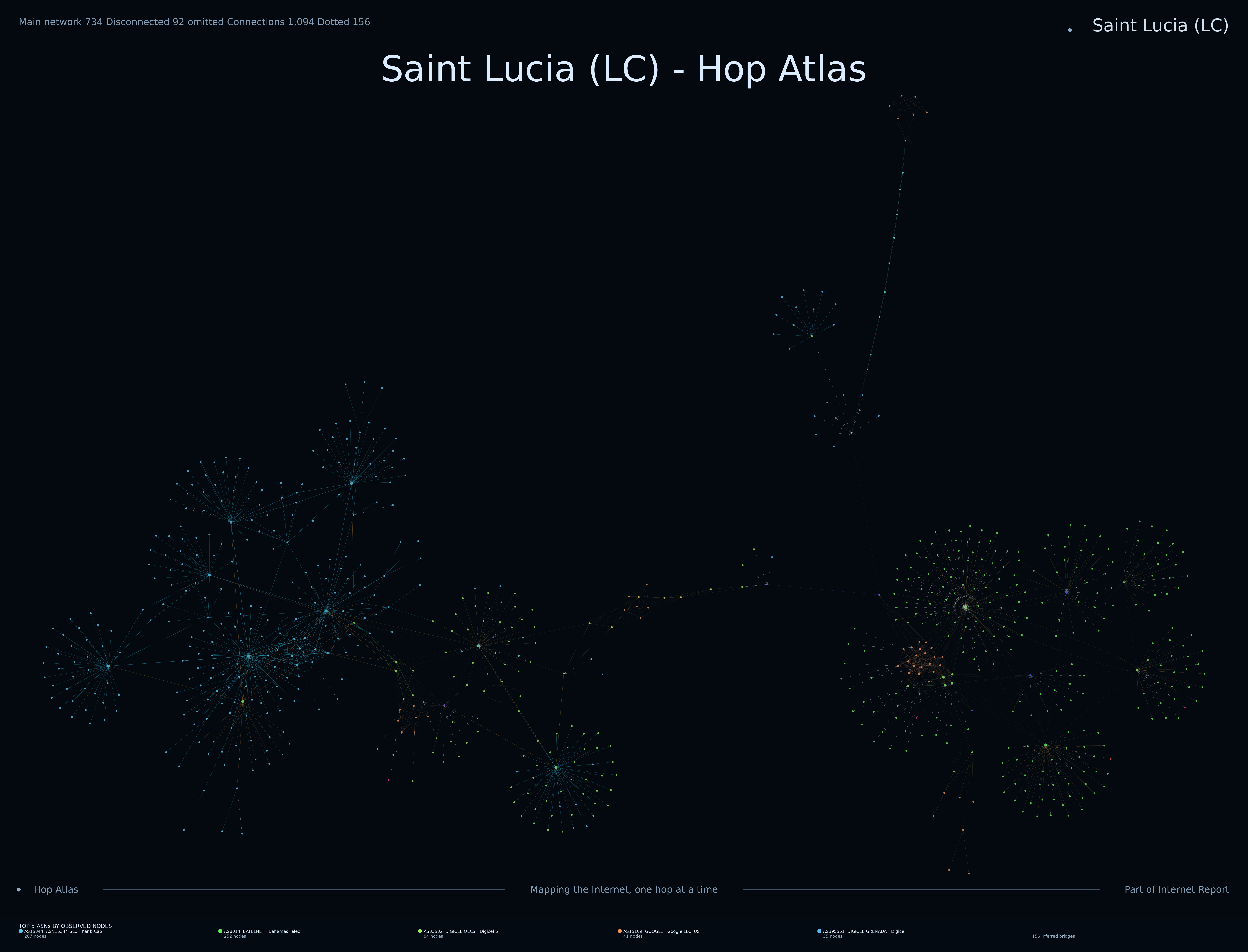
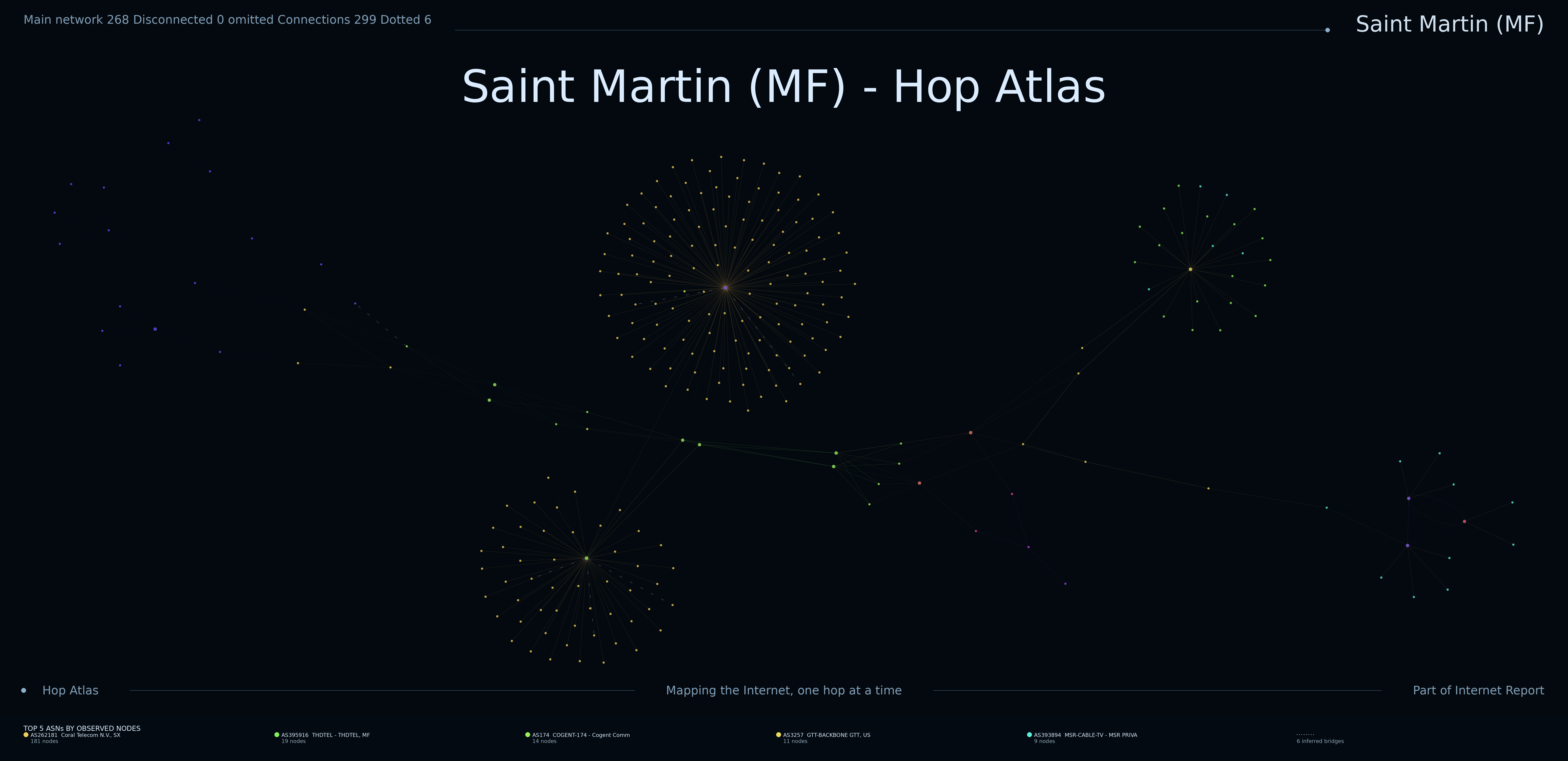
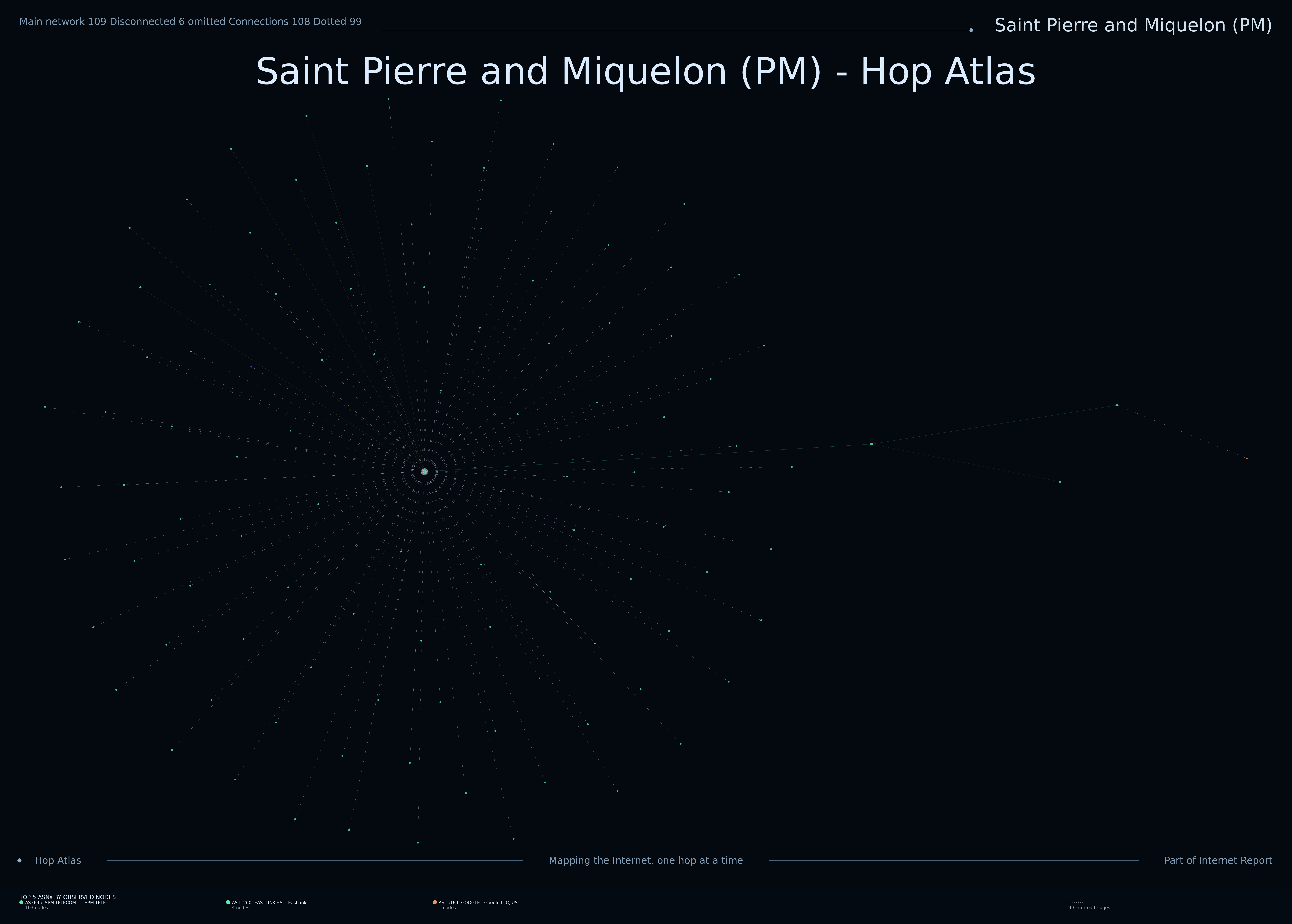
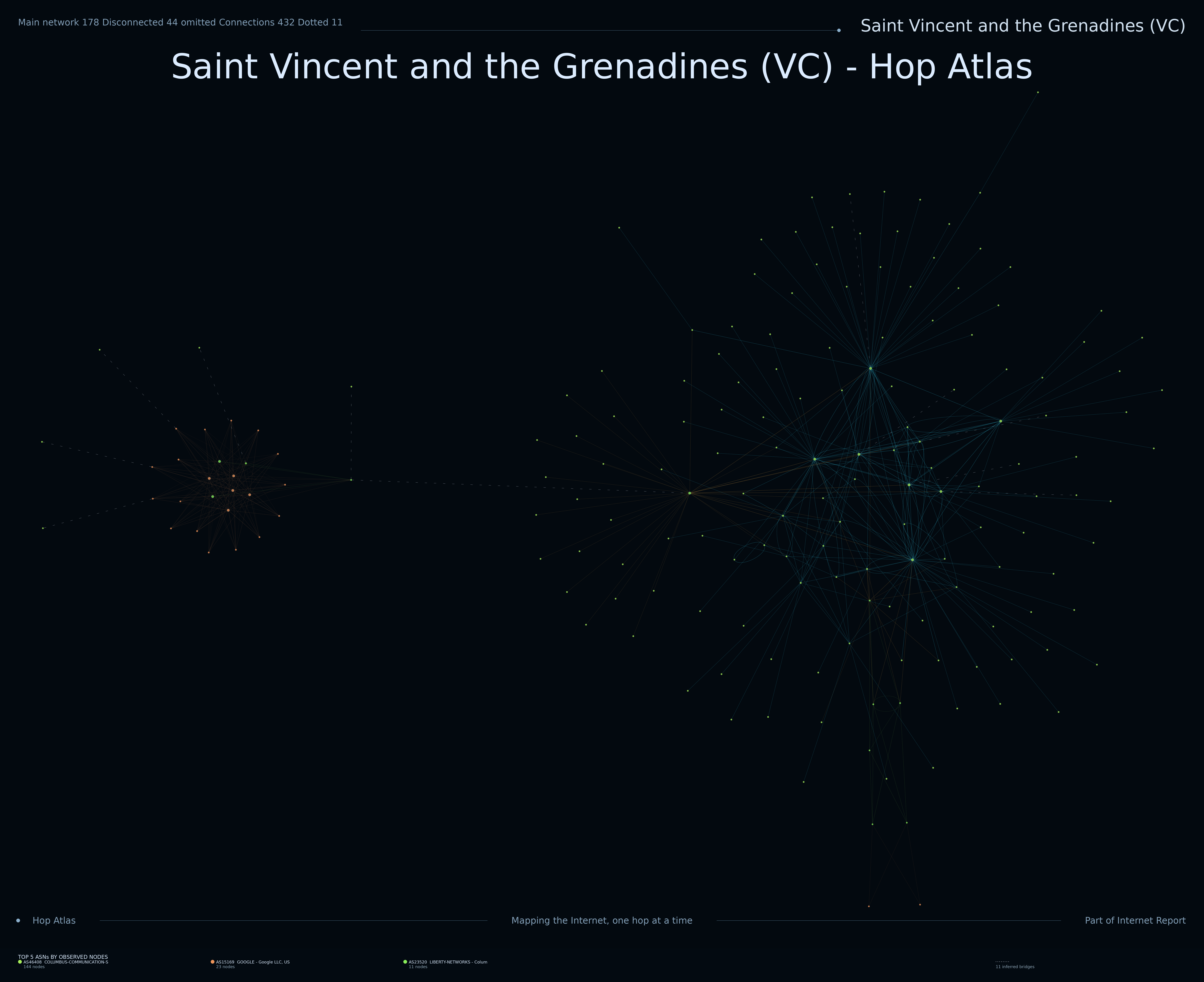

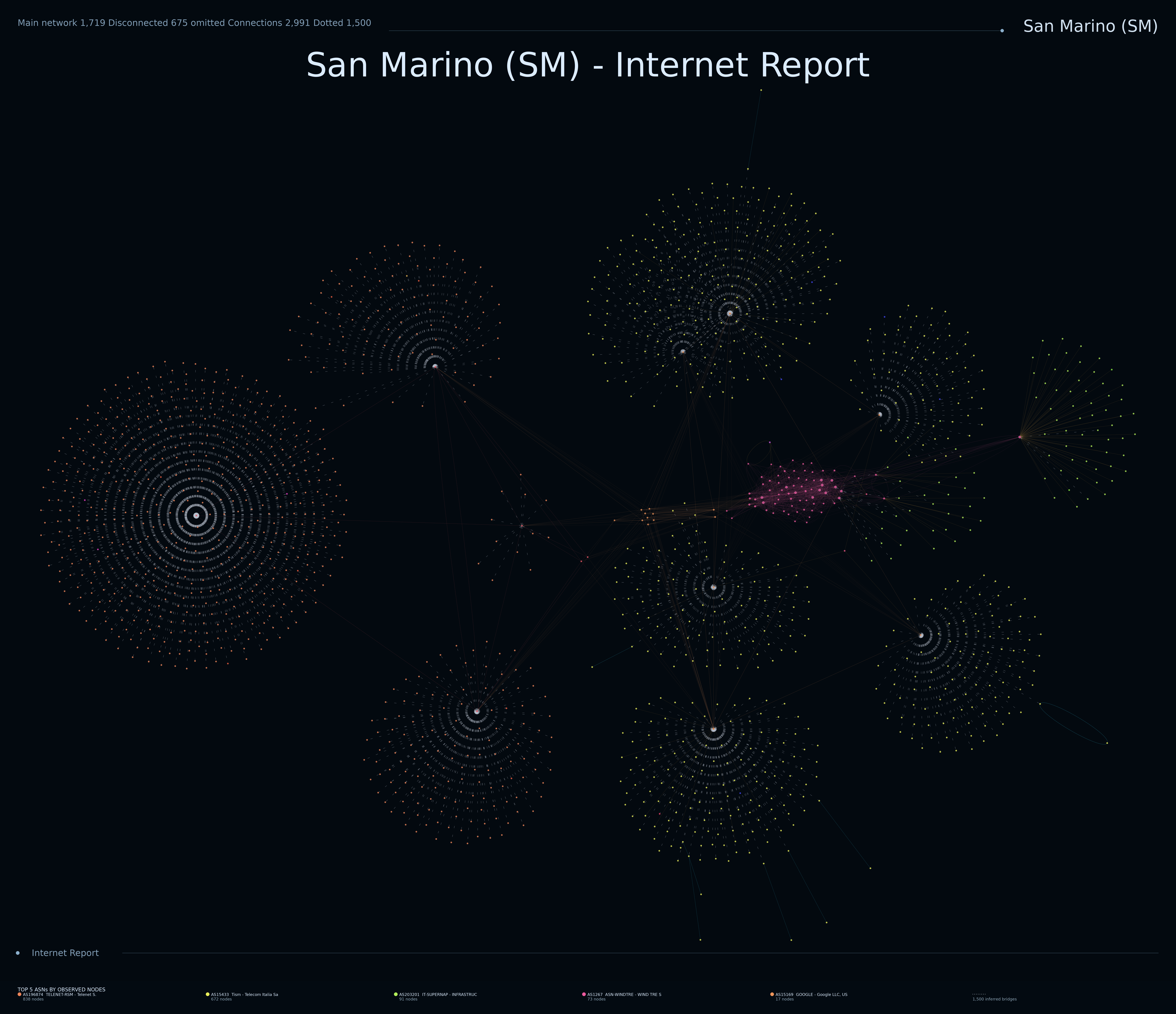
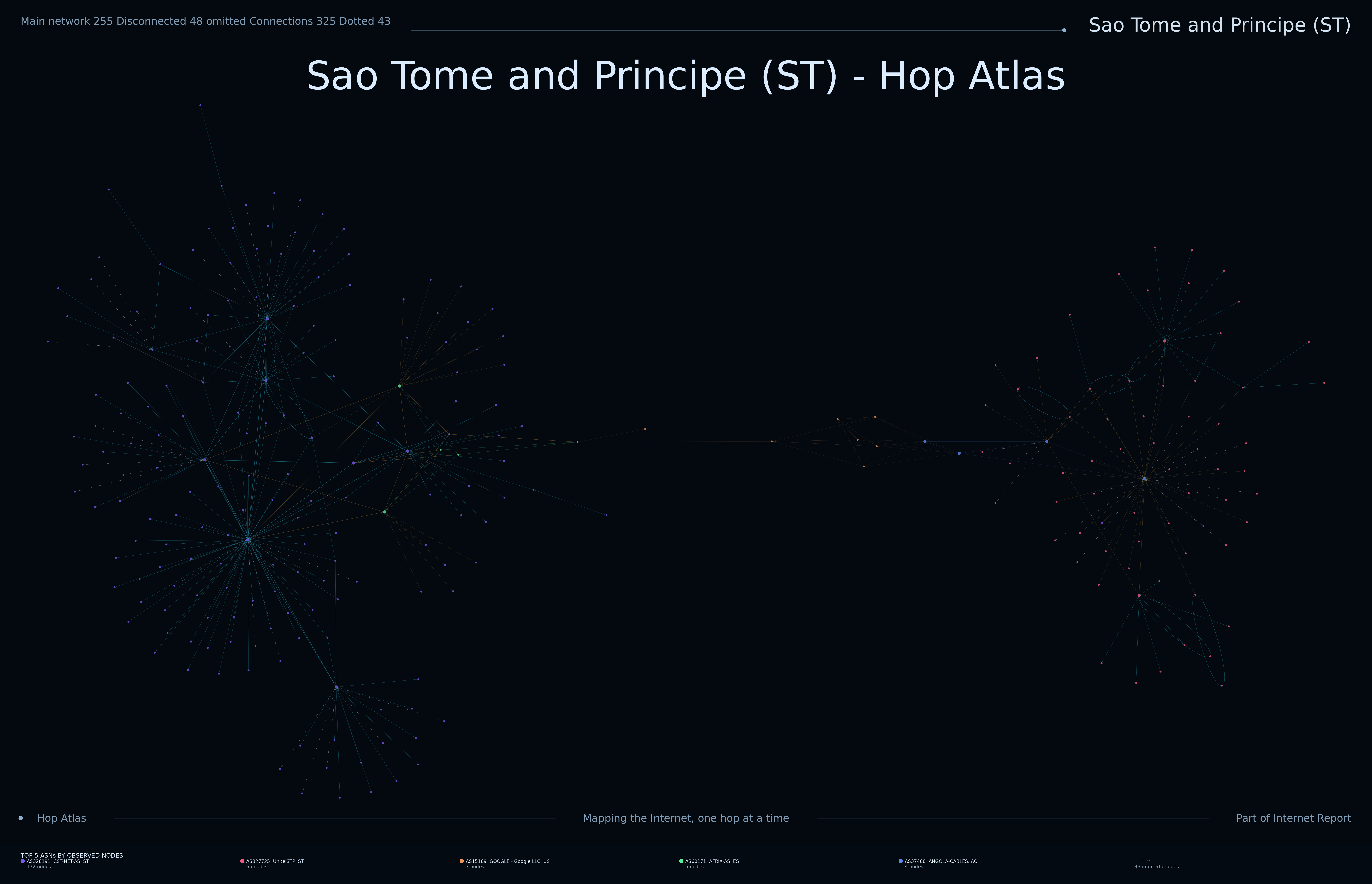
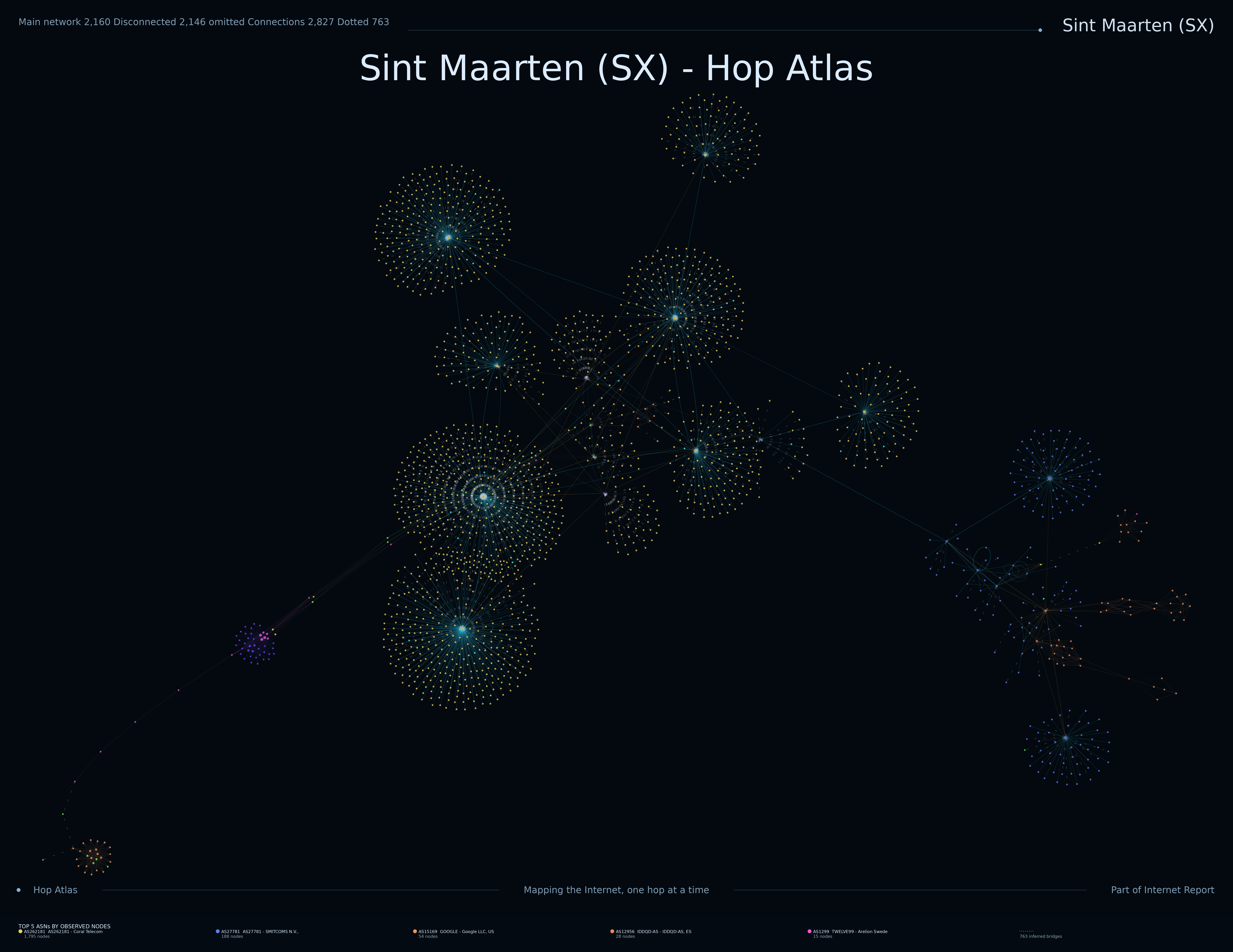
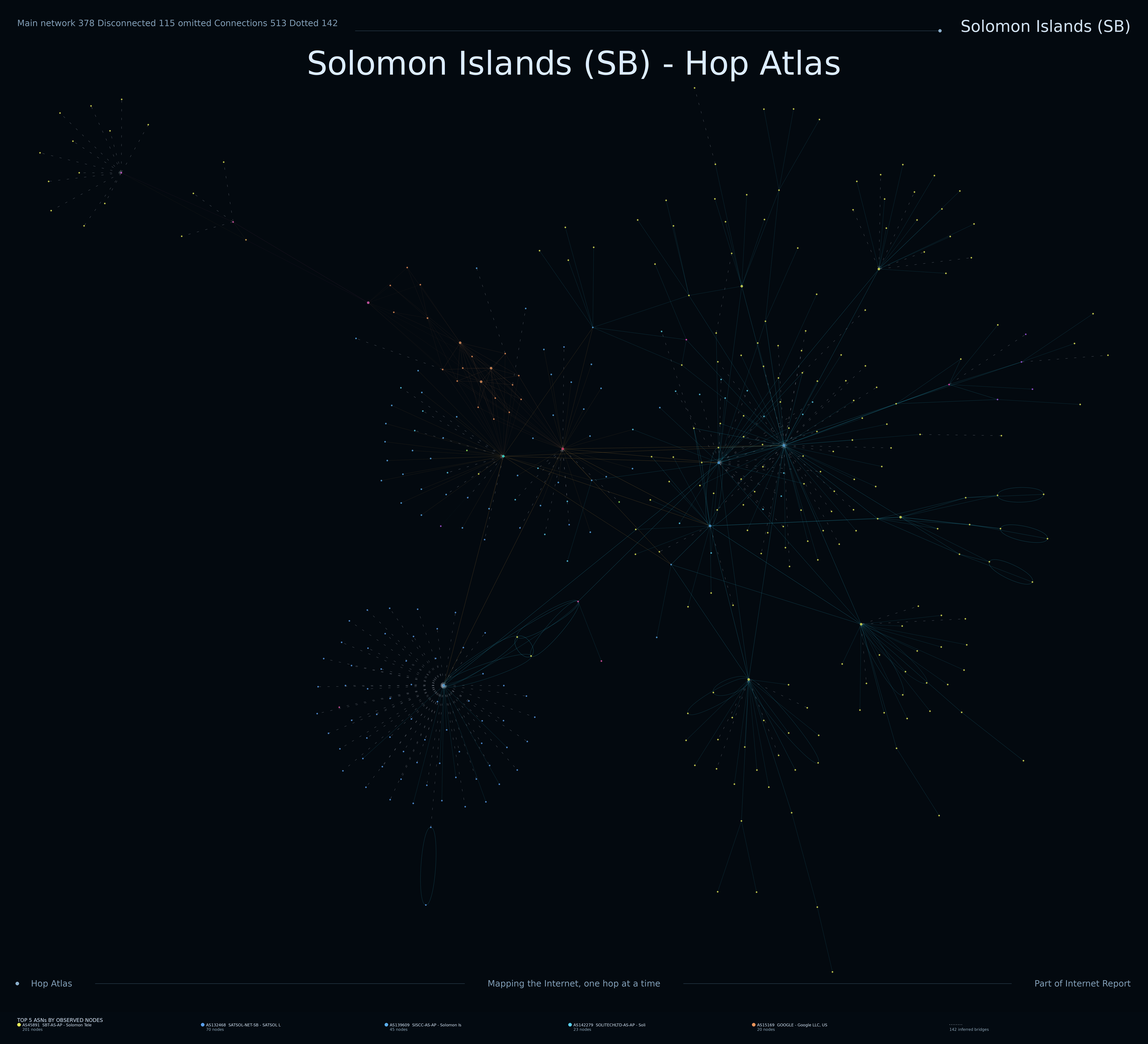
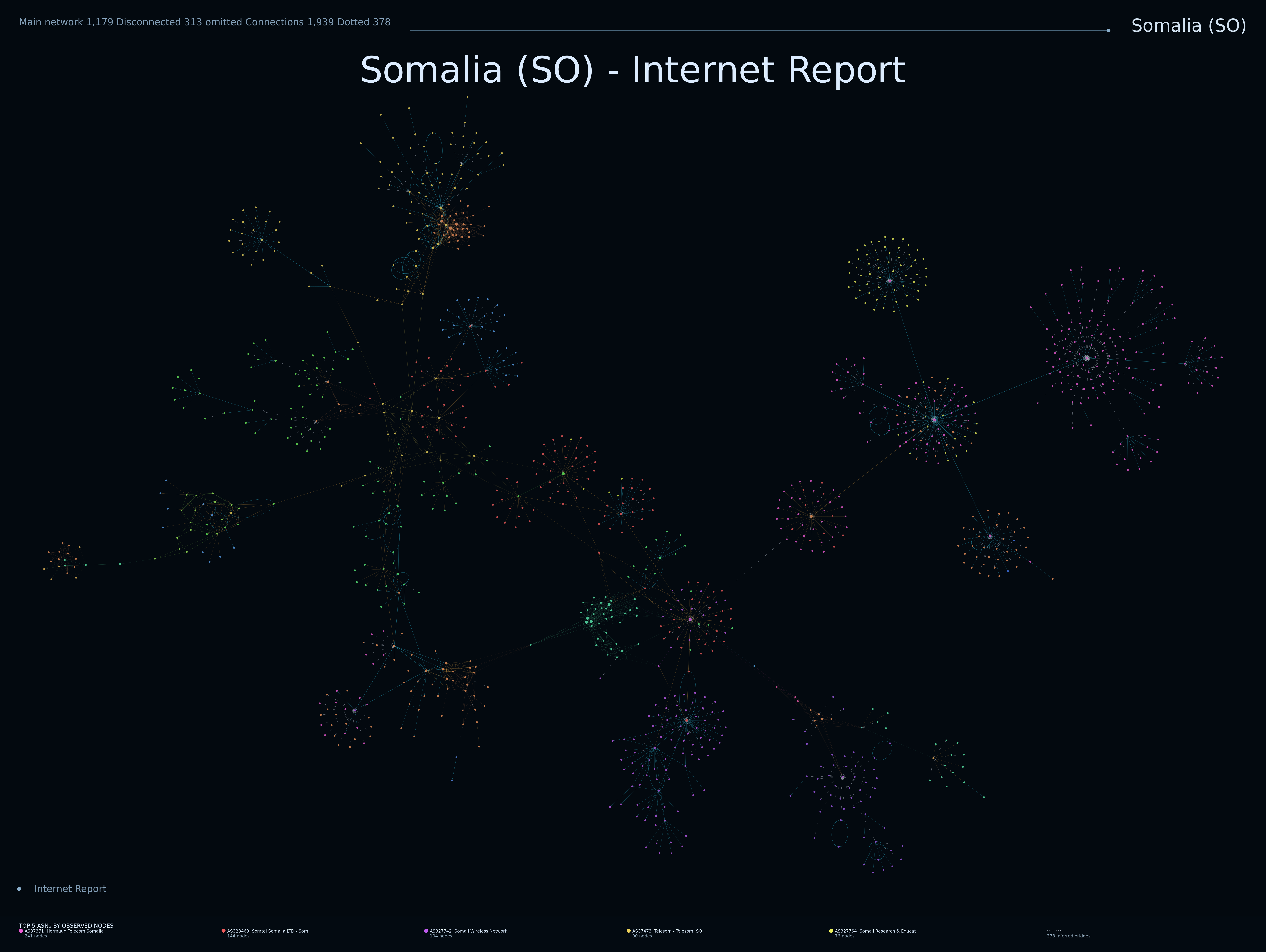
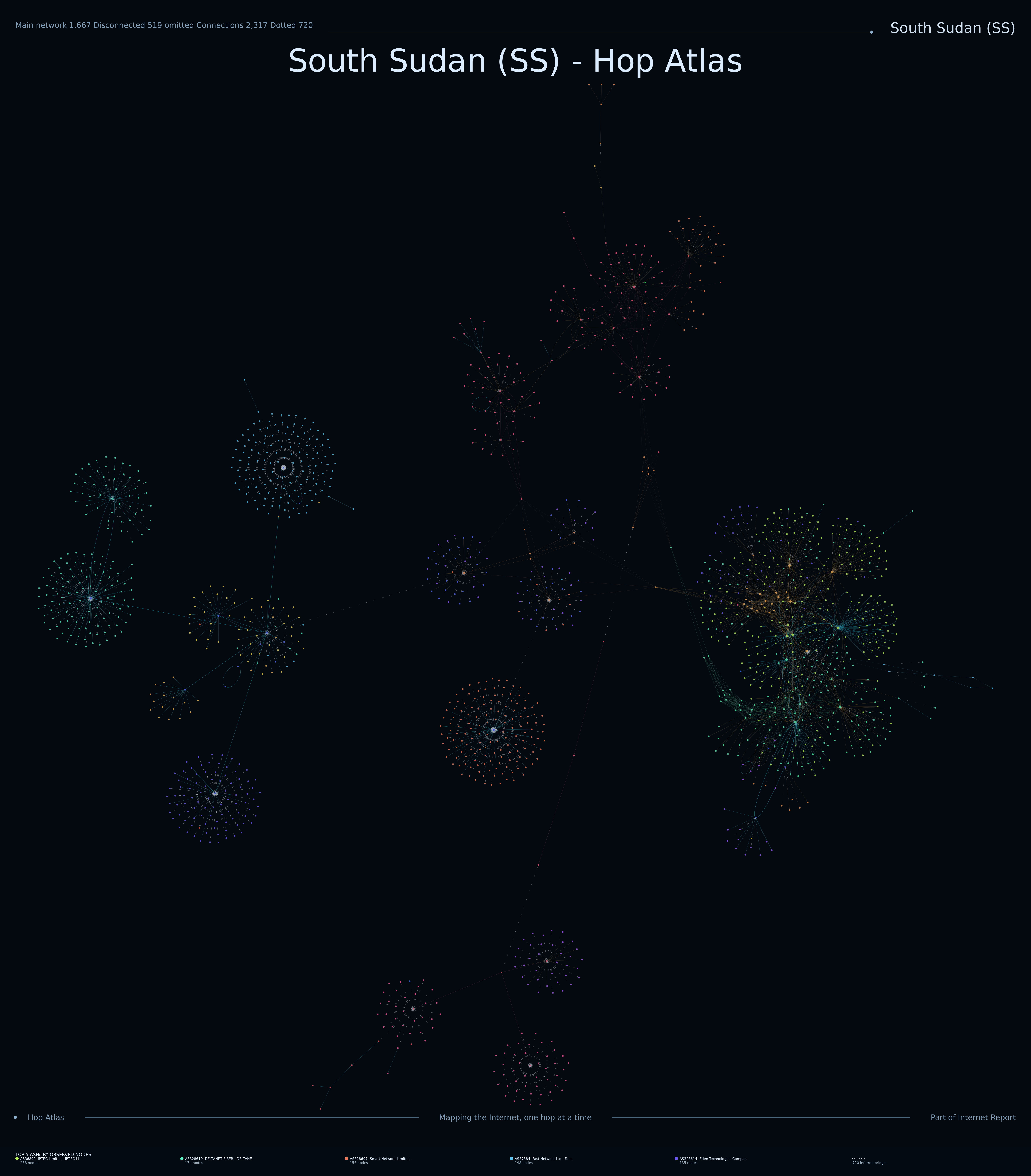
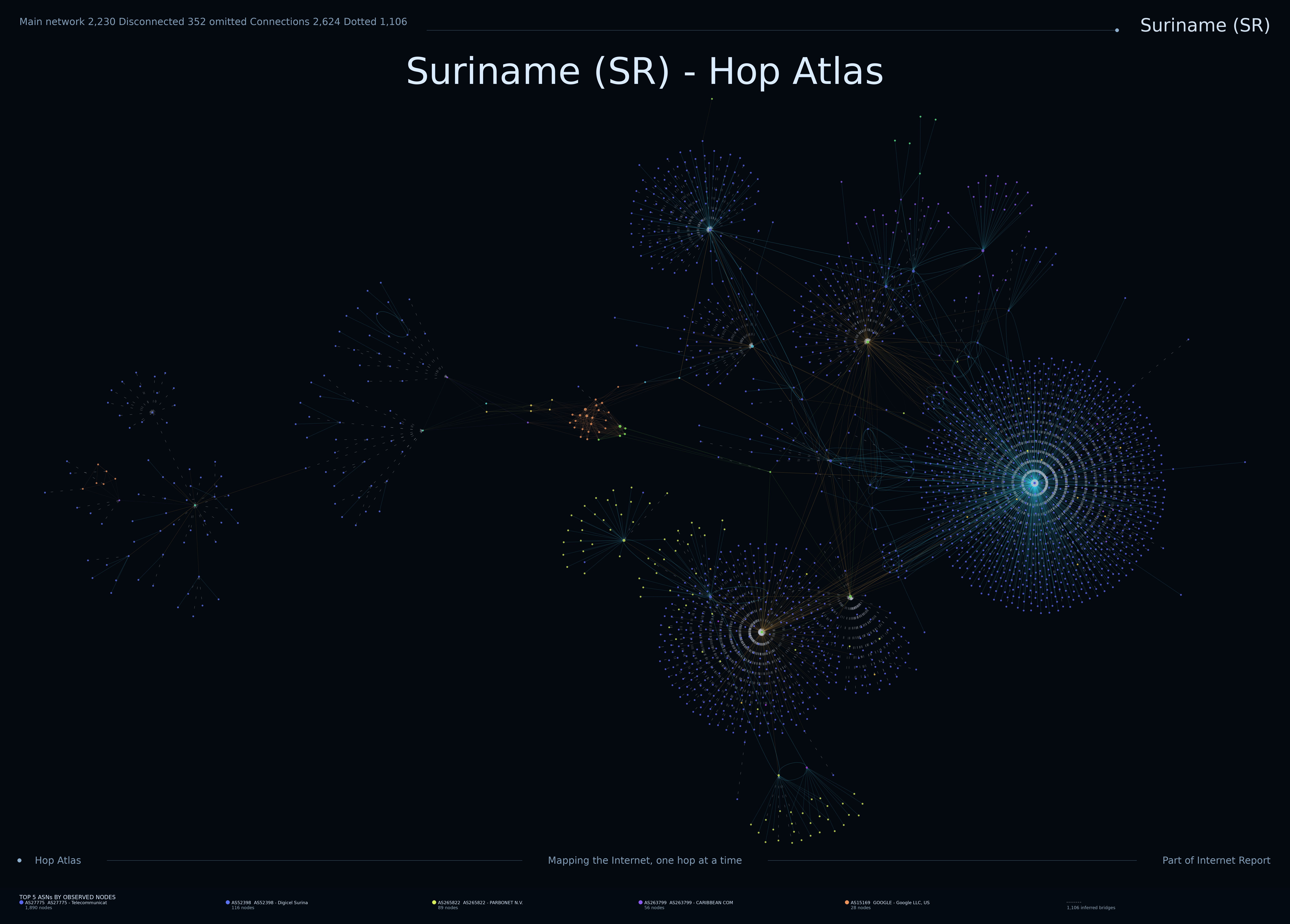
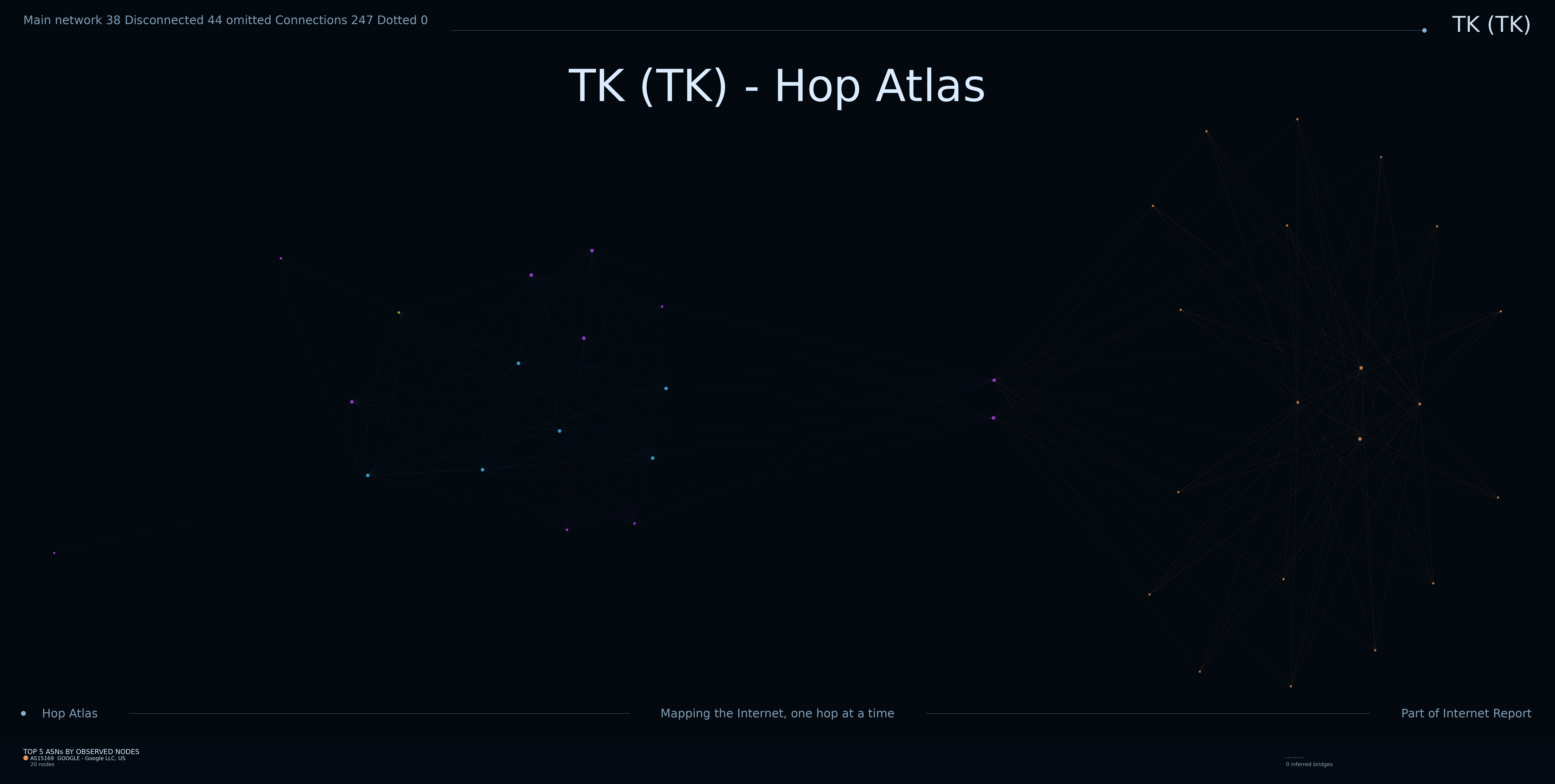
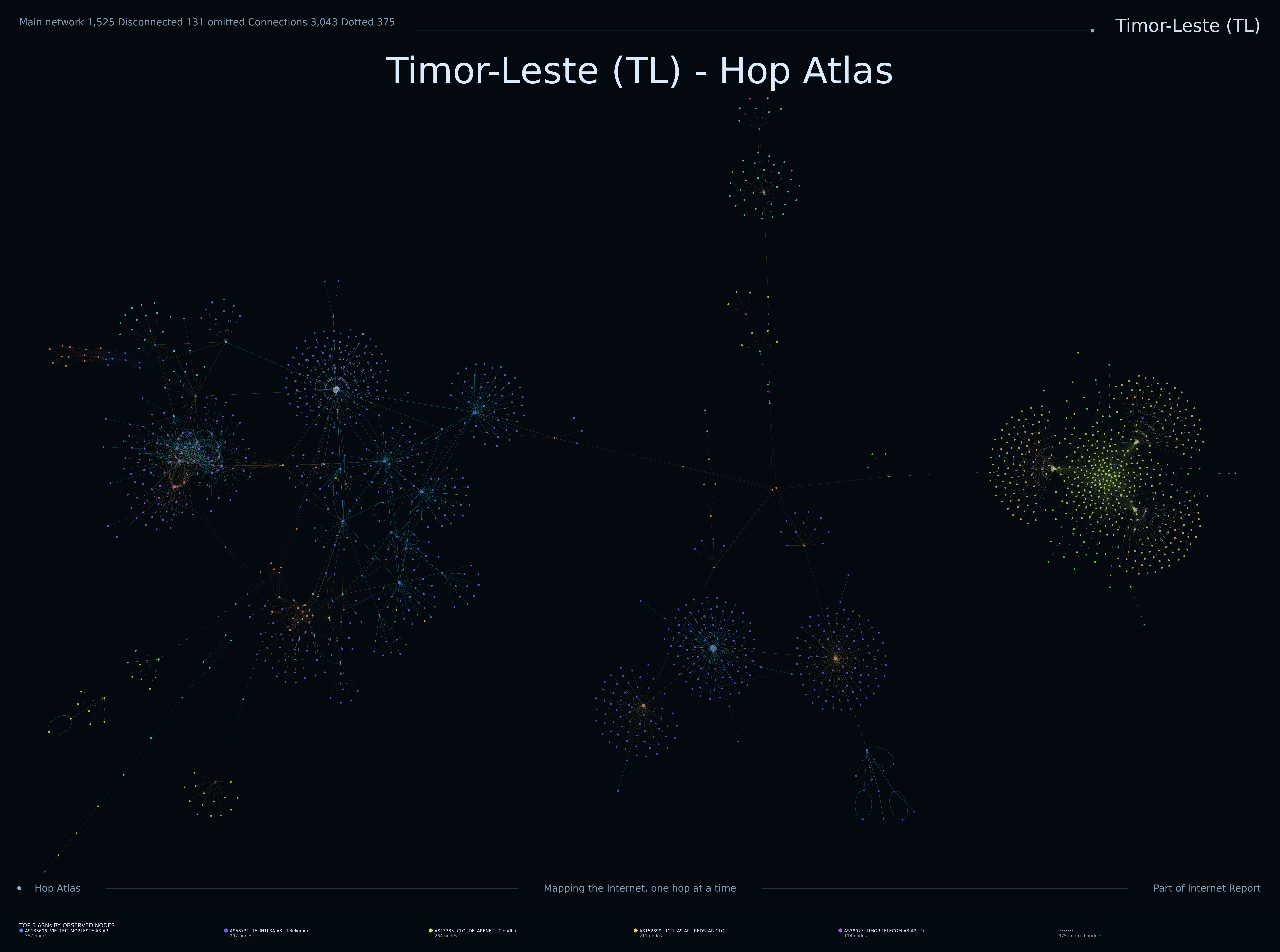
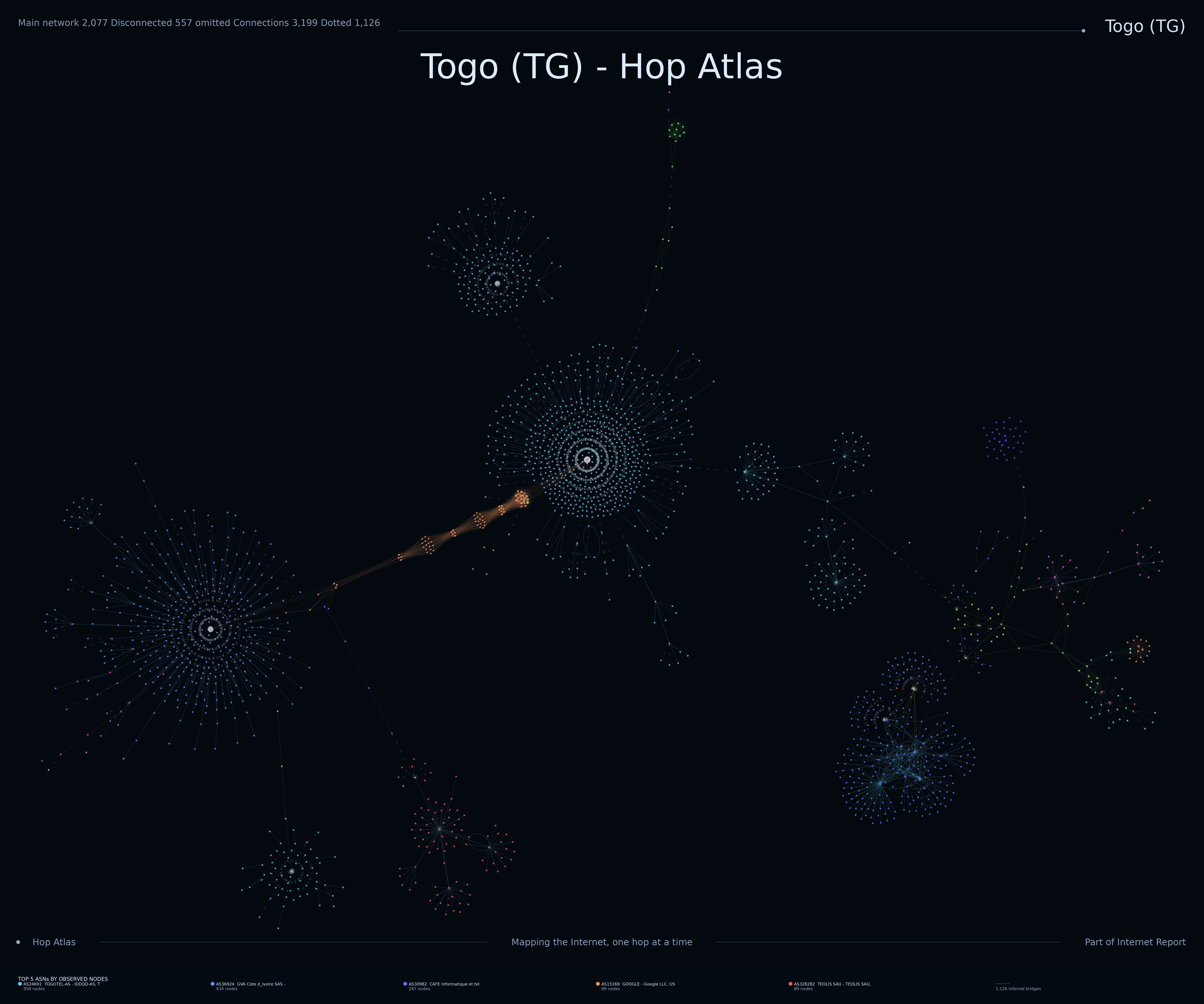
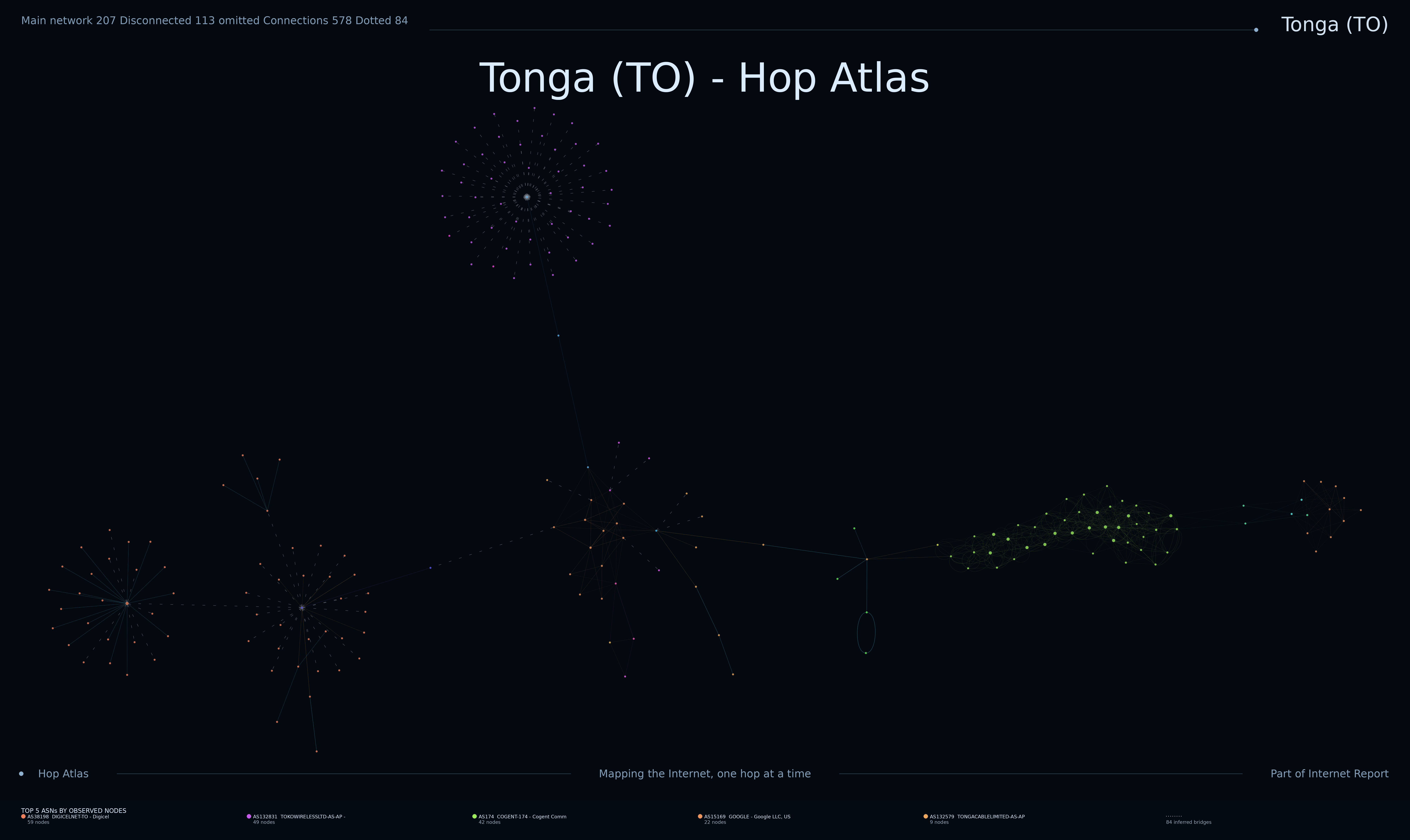
Latest rendered topology for each mapped country.

What are these maps?

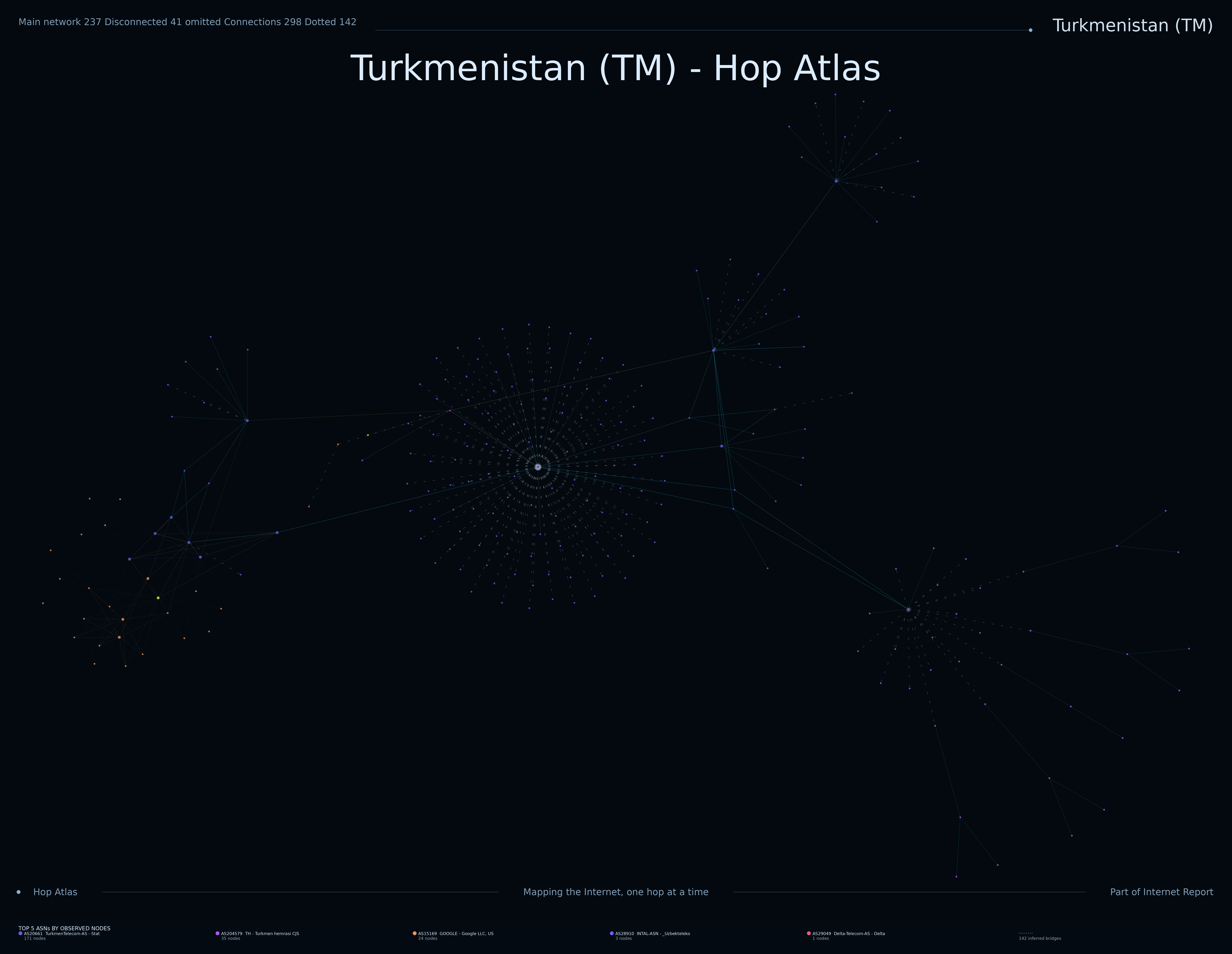
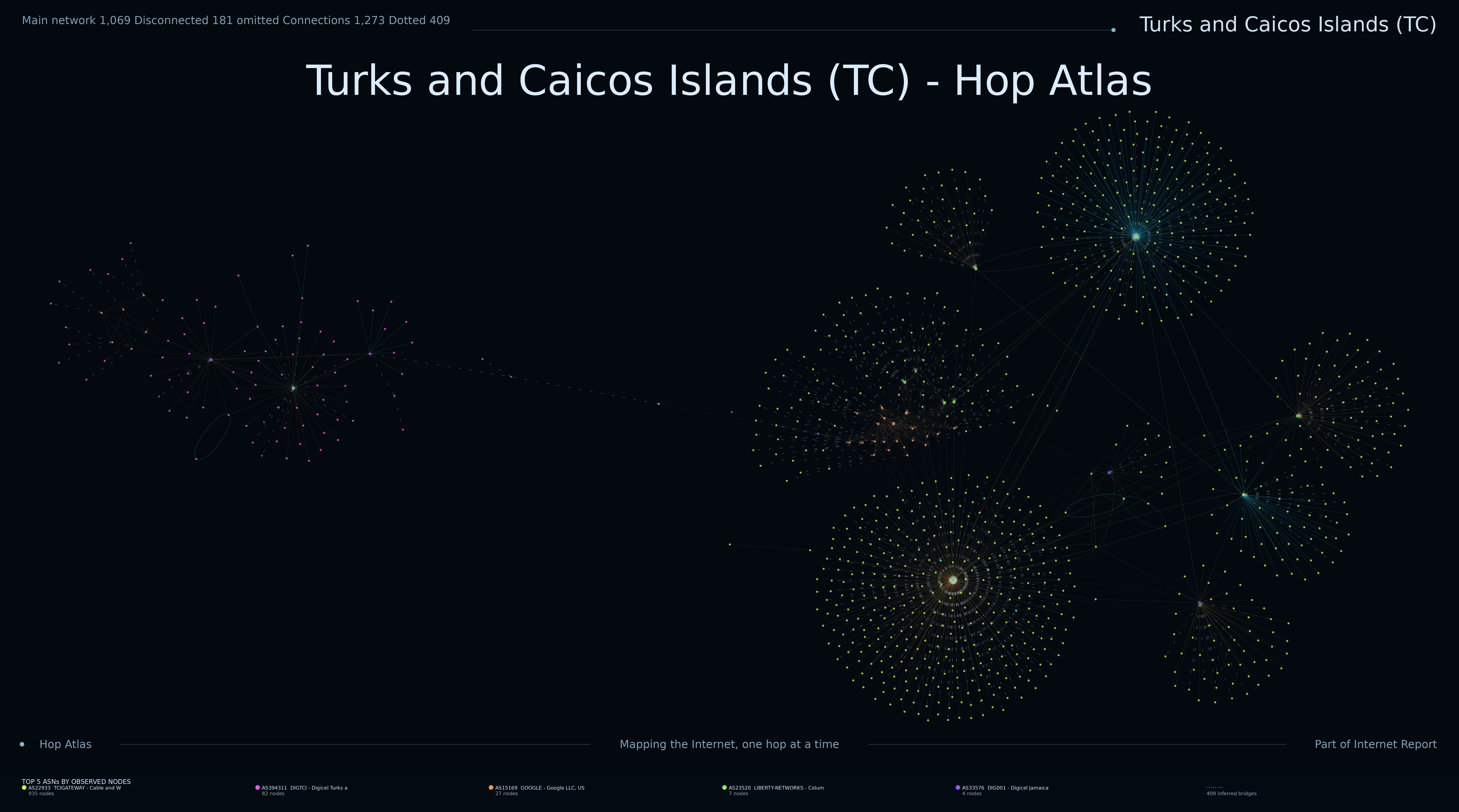
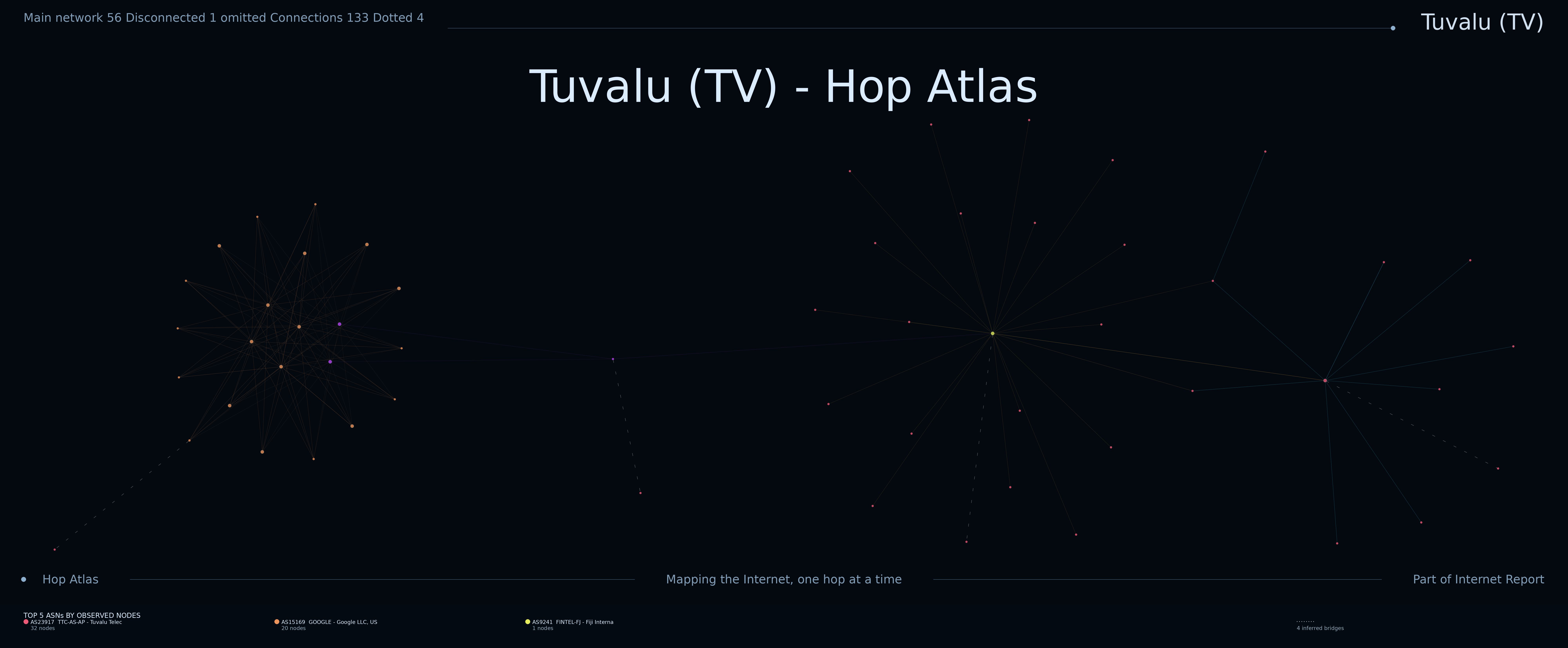
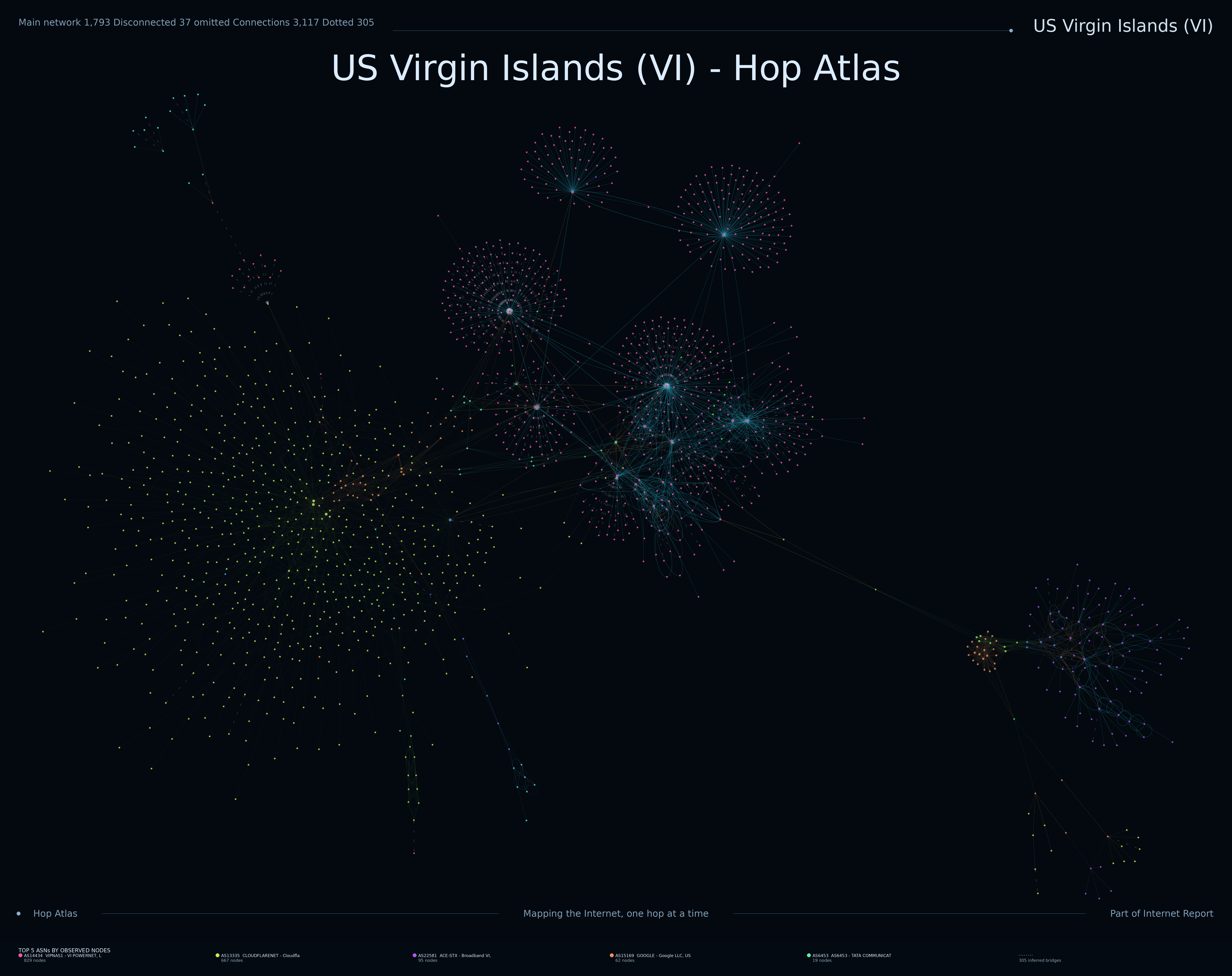

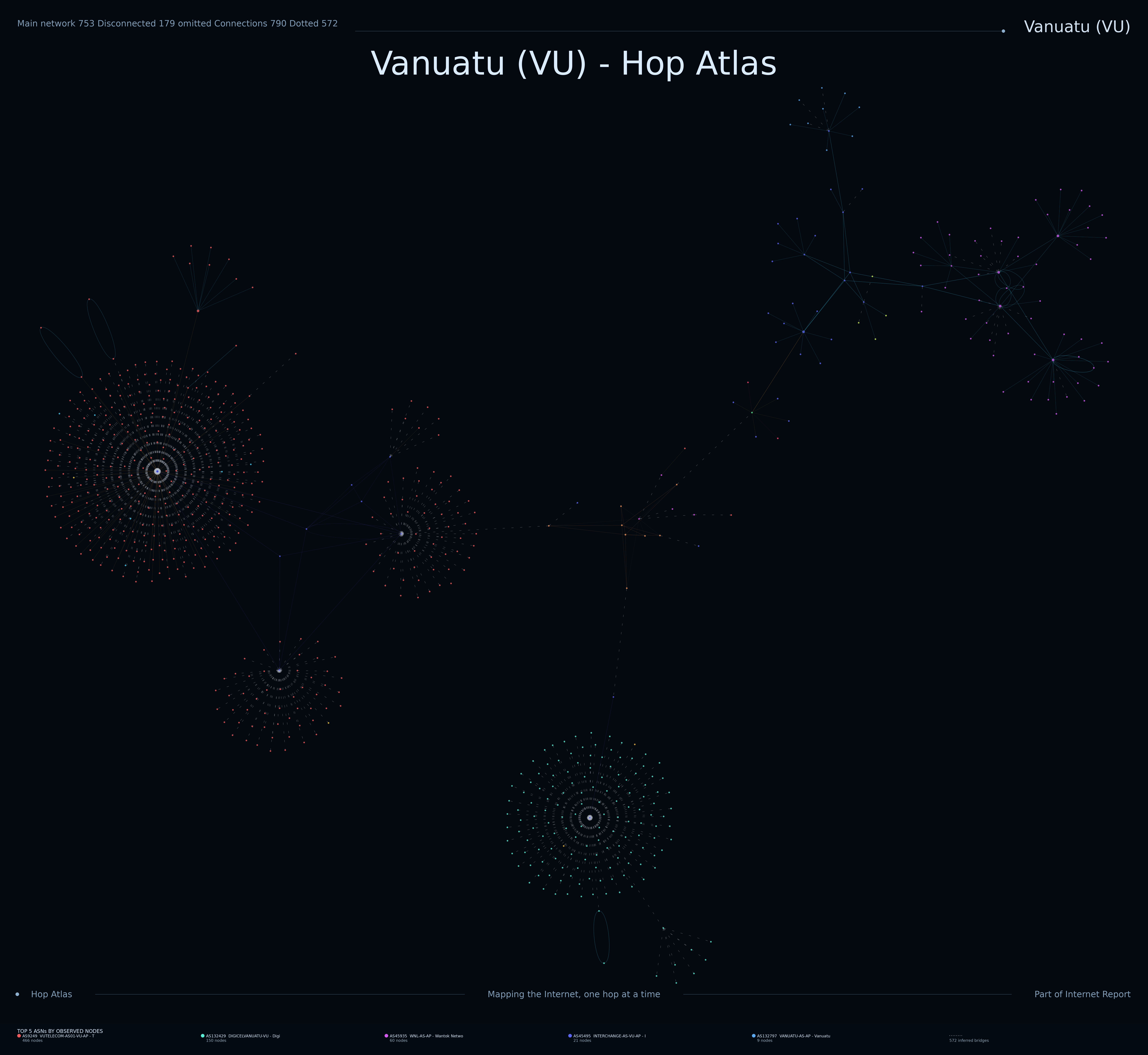
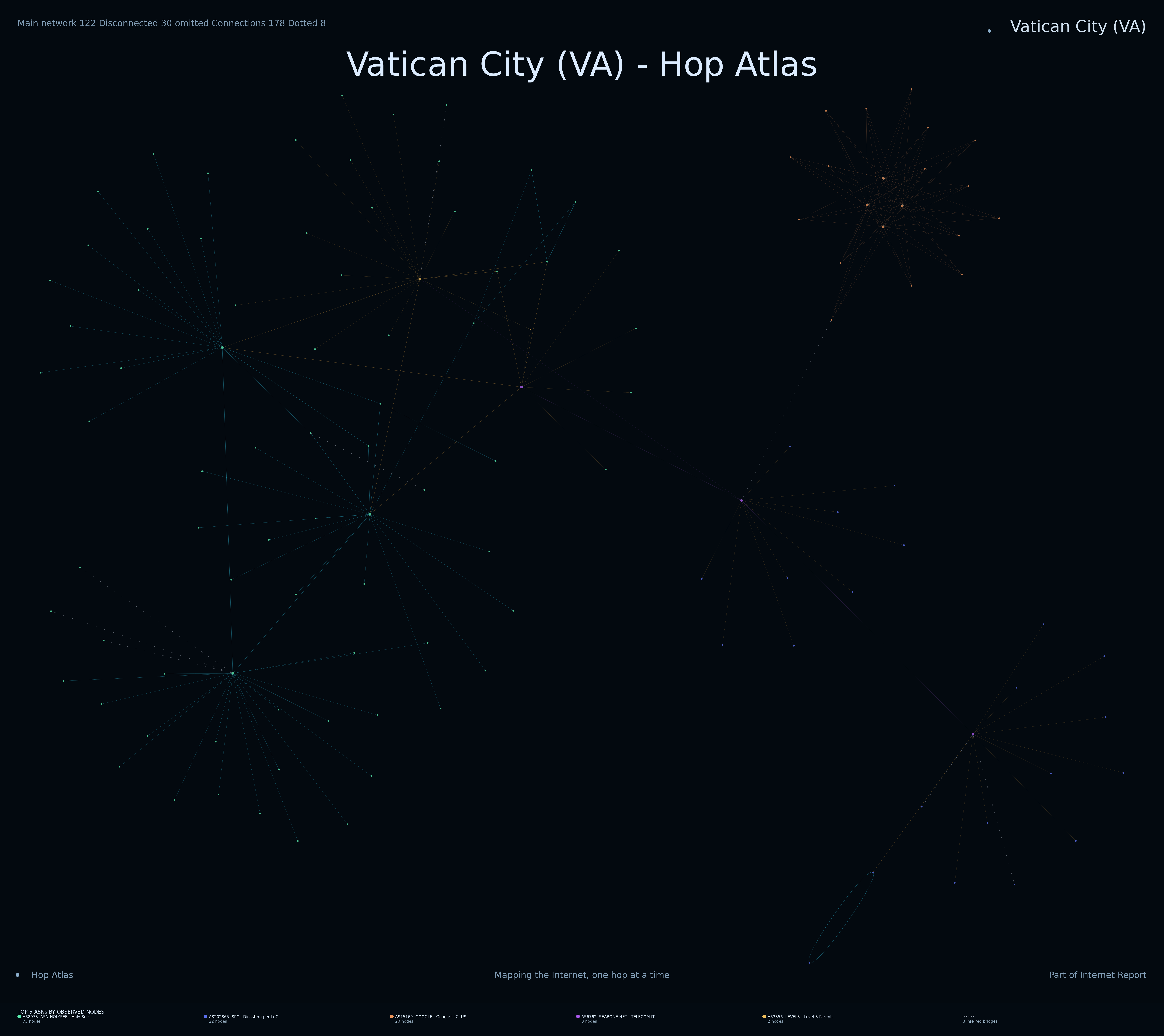

Each image is a graph built from observed traceroute paths. Routers become nodes and observed links between consecutive hops become edges. Repeated observations gradually reveal clusters, transit paths, hubs and the boundaries between networks.

Why do countries look different?

The images reflect what the measurement system can observe, not a literal geographic map. Differences in network architecture, routing, addressing, transit providers, filtering and probe location can all affect the resulting shape.

What does “country” mean?

Campaign destinations are selected from address space associated with a country or territory. IP allocation data is an administrative classification and must not be interpreted as a guarantee of the physical location of a device.

Method

The project uses distributed traceroute collectors to sample destination addresses. Results are deduplicated and stored as a growing topology graph. Country campaigns are processed in bounded batches; large address spaces can be fed progressively rather than materialised as one enormous work queue. Completed traces are then rendered into the artwork shown here.

These maps are observations from particular measurement points at particular times. They are not intended to be a complete representation of the Internet, an inventory of devices, or proof of physical geography.

Different network structures can produce dramatically different visual patterns. Missing traceroute responses, load balancing and incomplete measurement coverage may also affect the appearance of the resulting graphs.

Our detailed methodology explains how to interpret nodes, connections, fans, clusters, disconnected components and other commonly observed structures.

Understanding the Maps — Full Guide